\n
## Area Charts: Unlabeled Dual-Panel Visualization
### Overview
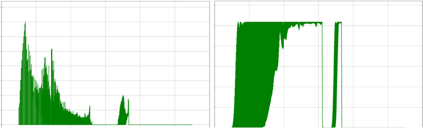
The image displays two separate, unlabeled area charts positioned side-by-side on a white background with a light gray grid. Both charts are filled with a solid, dark green color. There are no visible titles, axis labels, legends, numerical markers, or any other textual information present in the image. The charts appear to be raw data visualizations, possibly from a monitoring tool, scientific instrument, or financial software, but their context and meaning cannot be determined from the visual information alone.
### Components/Axes
- **Chart Layout:** Two distinct chart panels arranged horizontally.
- **Background:** White with a faint, light gray grid composed of horizontal and vertical lines.
- **Data Representation:** Solid green-filled area under a curve for both charts.
- **Textual Elements:** **None identified.** No titles, axis labels (X or Y), tick marks, legends, or annotations are visible.
- **Color:** A single, consistent dark green is used for the data area in both panels.
### Detailed Analysis
**Left Chart:**
- **Spatial Grounding:** Occupies the left half of the image.
- **Trend Verification:** The data series begins with a very sharp, high peak on the far left. Following this initial spike, the trend shows a rapid, jagged decay with several smaller, secondary peaks. The overall trajectory slopes steeply downward from left to right, eventually flattening into a low-level, noisy baseline with a minor, isolated bump towards the right side before ending.
- **Key Data Points (Approximate Visual Estimation):**
- **Initial Peak:** Reaches the highest vertical point in the entire image, near the top of the chart frame.
- **Secondary Peaks:** Several smaller peaks occur during the initial decay phase, each progressively lower than the last.
- **Baseline:** After the major decay, the signal settles at a low amplitude, roughly 10-15% of the initial peak's height.
- **Minor Bump:** A small, isolated increase occurs approximately 75% across the chart's width.
**Right Chart:**
- **Spatial Grounding:** Occupies the right half of the image.
- **Trend Verification:** The data series shows a rapid, near-vertical rise to a high plateau. This plateau is sustained for a significant portion of the chart's width, exhibiting minor fluctuations or noise along its top edge. The trend then features a sharp, near-vertical drop to a very low level, followed by a period of minimal activity. Finally, there is a second, very narrow and sharp spike that rises to a height comparable to the initial plateau before dropping back to the baseline.
- **Key Data Points (Approximate Visual Estimation):**
- **Plateau Level:** Maintains a high, relatively stable value, estimated at 85-95% of the chart's vertical range.
- **Drop Point:** The sharp decline occurs slightly past the midpoint of the chart's width.
- **Low Period:** Following the drop, the signal remains near the baseline for a short interval.
- **Final Spike:** A very narrow, high-amplitude spike occurs near the right edge of the chart, reaching a height similar to the main plateau.
### Key Observations
1. **Complete Absence of Metadata:** The most significant observation is the total lack of contextual information. Without labels, scales, or a legend, the charts are abstract representations of data trends.
2. **Contrasting Patterns:** The two charts display fundamentally different behaviors. The left chart is characterized by an impulsive event followed by decay, while the right chart shows a sustained state, a dropout, and a brief reactivation.
3. **Identical Visual Encoding:** Both datasets are rendered with the same color and style, suggesting they may be related measurements from the same system or experiment, viewed over different time windows or under different conditions.
4. **High-Frequency Detail:** The jagged edges and noise on the plateaus and decay curves indicate the data has high temporal resolution or contains significant high-frequency components.
### Interpretation
The data suggests two distinct system behaviors or signal types:
- The **left chart** pattern is classic for an impulse response, a decaying radioactive signal, a fading echo, or the dissipation of energy after a single event. The initial spike represents a strong, immediate reaction, and the subsequent decay shows the system returning to equilibrium, albeit with some residual noise or minor secondary events.
- The **right chart** pattern resembles a system that can enter a sustained "on" or high-activity state (the plateau), experiences a sudden failure or interruption (the drop), and then demonstrates a brief recovery or glitch (the final spike). This could represent a process with a stable operating phase, a fault, and a momentary restart attempt.
**Peircean Investigation:** The charts are *icons* in the Peircean sense—they resemble the temporal structure of the phenomena they represent. However, without being *indices* (having a direct, labeled connection to specific variables) or *symbols* (being interpreted by convention, like a labeled graph), their precise meaning is locked. The viewer can infer dynamic behavior (rise, fall, sustain, spike) but cannot assign real-world significance. The side-by-side placement invites comparison, strongly implying the two patterns are related facets of a single underlying system or experiment. The critical missing information is the *grounding*: what is being measured, over what scale, and in what units?