## Chart Type: Time Series Charts
### Overview
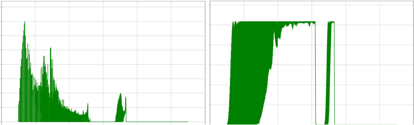
The image presents two time series charts, both displaying data as green lines against a grid background. The left chart shows a decaying signal with initial high amplitude, while the right chart shows a signal that rises sharply, plateaus, and then drops sharply. Neither chart has axis labels or numerical scales.
### Components/Axes
* **Axes:** Both charts have horizontal and vertical axes, but they are unlabeled and lack numerical scales. The grid lines provide a visual reference for relative changes in the data.
* **Data Series:** Both charts display a single data series represented by a green line.
* **Background:** Both charts have a light gray grid background.
### Detailed Analysis
**Left Chart:**
* **Trend:** The green line starts with high amplitude and rapidly decays over time, with several peaks and valleys. After the initial decay, the signal remains near zero, with a small burst of activity towards the end.
* **Specific Values:**
* Initial peak: Reaches approximately 80% of the chart's vertical height.
* Decay: Rapidly decreases to near zero within the first third of the chart's horizontal length.
* Small burst: Occurs in the last quarter of the chart, reaching approximately 20% of the chart's vertical height.
**Right Chart:**
* **Trend:** The green line starts near zero, rises sharply to a plateau, remains at the plateau for a period, and then drops sharply back to near zero.
* **Specific Values:**
* Rise: Occurs rapidly at the beginning of the chart.
* Plateau: Reaches approximately 95% of the chart's vertical height and remains there for about two-thirds of the chart's horizontal length.
* Drop: Occurs rapidly in the last third of the chart.
### Key Observations
* Both charts lack axis labels and numerical scales, making it impossible to determine the specific units or values represented.
* The left chart shows a decaying signal, while the right chart shows a signal with a sharp rise, plateau, and sharp drop.
### Interpretation
The charts likely represent some kind of time-dependent process or signal. The left chart could represent the decay of a physical quantity, such as radiation or signal strength. The right chart could represent a process that activates quickly, remains active for a period, and then deactivates quickly, such as a switch being turned on and off. Without axis labels or numerical scales, it is impossible to determine the specific nature of the processes represented. The lack of labels limits the interpretability of the data.