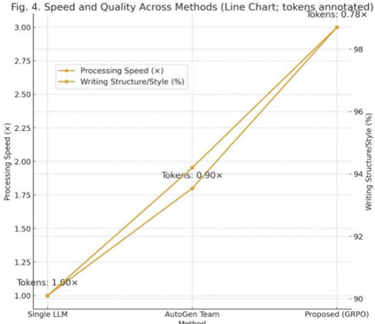
## Line Chart: Speed and Quality Across Methods
### Overview
This is a dual-axis line chart titled "Fig. 4. Speed and Quality Across Methods (Line Chart; tokens annotated)". It compares three different methods—Single LLM, AutoGen Team, and Proposed (GRPO)—across two performance metrics: Processing Speed (a multiplier, 'x') and Writing Structure/Style (a percentage, '%'). Both metrics show a positive, upward trend from left to right.
### Components/Axes
* **Title:** "Fig. 4. Speed and Quality Across Methods (Line Chart; tokens annotated)"
* **X-Axis (Horizontal):** Labeled "Methods". It has three categorical data points:
1. Single LLM
2. AutoGen Team
3. Proposed (GRPO)
* **Primary Y-Axis (Left):** Labeled "Processing Speed (x)". The scale ranges from 1.00 to 3.00, with major tick marks at 0.25 intervals (1.00, 1.25, 1.50, 1.75, 2.00, 2.25, 2.50, 2.75, 3.00).
* **Secondary Y-Axis (Right):** Labeled "Writing Structure/Style (%)". The scale ranges from 90 to 98, with major tick marks at 2% intervals (90, 92, 94, 96, 98).
* **Legend:** Located in the top-left corner of the chart area.
* An orange line with circular markers represents "Processing Speed (x)".
* A yellow line with square markers represents "Writing Structure/Style (%)".
* **Data Annotations:** Each data point on the chart is annotated with a "Tokens:" value, placed near the corresponding marker.
### Detailed Analysis
The chart plots two data series, each connecting three points corresponding to the methods on the x-axis.
**1. Processing Speed (Orange Line, Left Axis):**
* **Trend:** The line slopes sharply upward from left to right, indicating a consistent increase in processing speed across the methods.
* **Data Points:**
* **Single LLM:** The orange circular marker is at the bottom-left, aligned with **1.00x** on the left y-axis. Annotation: "Tokens: 1.00x".
* **AutoGen Team:** The orange circular marker is in the center, aligned with approximately **1.80x** on the left y-axis. Annotation: "Tokens: 0.90x".
* **Proposed (GRPO):** The orange circular marker is at the top-right, aligned with **3.00x** on the left y-axis. Annotation: "Tokens: 0.78x".
**2. Writing Structure/Style (Yellow Line, Right Axis):**
* **Trend:** The line also slopes upward from left to right, indicating a consistent improvement in the writing structure/style score.
* **Data Points:**
* **Single LLM:** The yellow square marker is at the bottom-left, aligned with **90%** on the right y-axis.
* **AutoGen Team:** The yellow square marker is in the center, aligned with **94%** on the right y-axis.
* **Proposed (GRPO):** The yellow square marker is at the top-right, aligned with **98%** on the right y-axis.
### Key Observations
1. **Positive Correlation:** Both performance metrics (speed and quality) improve simultaneously as one moves from the Single LLM to the AutoGen Team to the Proposed (GRPO) method. There is no visible trade-off between speed and quality in this comparison.
2. **Magnitude of Improvement:** The Proposed (GRPO) method shows the most significant gains. Processing speed triples (from 1.00x to 3.00x), and the writing quality score increases by 8 percentage points (from 90% to 98%) compared to the Single LLM baseline.
3. **Token Efficiency Annotation:** The "Tokens:" annotations suggest a decreasing trend in token usage or cost relative to the baseline (1.00x). The values decrease from 1.00x to 0.90x to 0.78x, implying the more advanced methods may be more token-efficient.
4. **Visual Convergence:** The two lines are nearly parallel, indicating that the rate of improvement for both speed and quality is similar across the methods presented.
### Interpretation
The chart demonstrates a clear performance hierarchy among the evaluated methods. The "Proposed (GRPO)" method is presented as superior, offering a substantial, simultaneous boost in both operational efficiency (processing speed) and output quality (writing structure/style). The inclusion of the "Tokens" annotation adds a third dimension, suggesting that these performance gains may also come with improved resource (token) efficiency.
The data argues that the advancements from a single model to a team-based approach (AutoGen), and further to the proposed GRPO method, yield compounding benefits. This visualization is likely used to justify the adoption or development of the "Proposed (GRPO)" system by showcasing its dominant performance across multiple key metrics without compromise. The lack of any downward trend in either line is a strong visual argument for the effectiveness of the proposed approach.