## Bar Chart: Normalized Speedup vs. Threshold
### Overview
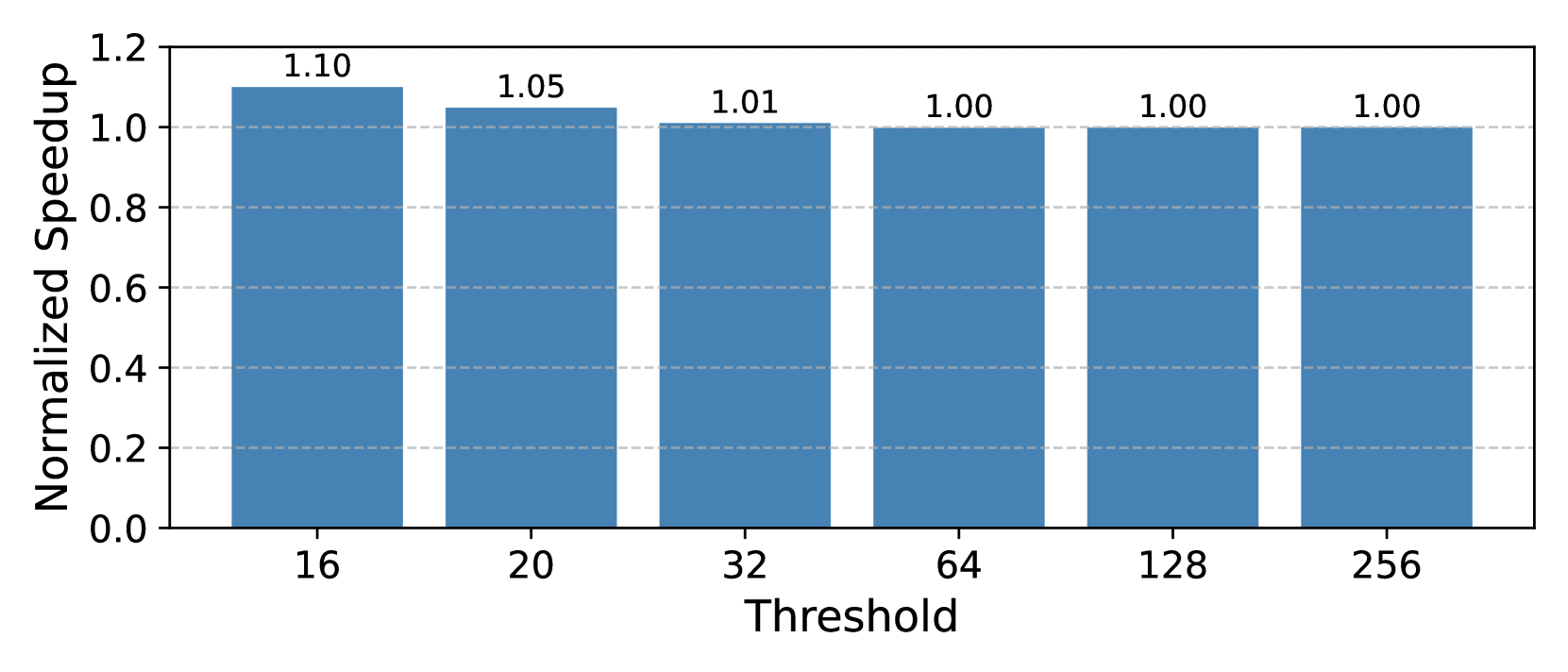
The image is a bar chart that displays the normalized speedup for different threshold values. The x-axis represents the threshold, and the y-axis represents the normalized speedup. The chart shows that the normalized speedup is highest at a threshold of 16, then decreases slightly at 20 and 32, and then remains constant at 1.00 for thresholds of 64, 128, and 256.
### Components/Axes
* **X-axis:** Threshold, with values 16, 20, 32, 64, 128, and 256.
* **Y-axis:** Normalized Speedup, ranging from 0.0 to 1.2, with gridlines at intervals of 0.2.
* **Bars:** Each bar represents a threshold value and its corresponding normalized speedup. The bars are a consistent blue color.
* **Values:** Numerical values are displayed above each bar, indicating the exact normalized speedup for each threshold.
### Detailed Analysis
* **Threshold 16:** Normalized Speedup = 1.10
* **Threshold 20:** Normalized Speedup = 1.05
* **Threshold 32:** Normalized Speedup = 1.01
* **Threshold 64:** Normalized Speedup = 1.00
* **Threshold 128:** Normalized Speedup = 1.00
* **Threshold 256:** Normalized Speedup = 1.00
### Key Observations
* The normalized speedup is highest at a threshold of 16.
* The normalized speedup decreases slightly as the threshold increases from 16 to 32.
* The normalized speedup remains constant at 1.00 for thresholds of 64, 128, and 256.
### Interpretation
The chart suggests that a lower threshold (16) results in a higher normalized speedup compared to higher thresholds. As the threshold increases from 16 to 32, the normalized speedup decreases, indicating a potential trade-off between threshold value and performance. Beyond a threshold of 64, there is no further improvement in normalized speedup, as it remains constant at 1.00. This implies that increasing the threshold beyond 64 does not provide any additional performance benefits in this context.