TECHNICAL ASSET FINGERPRINT
d66d75038d584d4b8c86e629
Click to view fullscreen
Press ESC or click to close
FOUND IN PAPERS
EXPERT: healer-alpha-free VERSION 1
RUNTIME: free/openrouter/healer-alpha
INTEL_VERIFIED
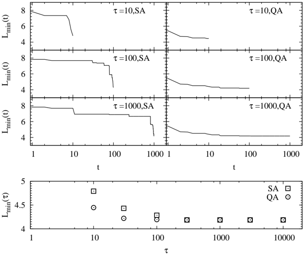
## Line Graphs and Scatter Plot: Comparison of SA and QA Optimization Methods
### Overview
The image is a technical figure containing seven plots that compare the performance of two methods, labeled **SA** and **QA**, across different parameter values. The top section consists of six line graphs arranged in a 3x2 grid, showing the time evolution of a minimum value metric, \( L_{\text{min}}(t) \), for three distinct values of a parameter \( \tau \). The bottom section is a single scatter plot summarizing the final minimum value, \( L_{\text{min}}(\tau) \), as a function of \( \tau \) for both methods. The overall purpose is to analyze and contrast the convergence behavior and final solution quality of the two methods.
### Components/Axes
**Top Section (Six Line Graphs):**
* **Layout:** 3 rows × 2 columns.
* **Y-axis (All plots):** Label is **\( L_{\text{min}}(t) \)**. Scale is linear, with major tick marks at 4, 6, and 8.
* **X-axis (All plots):** Label is **\( t \)** (time or iteration). Scale is logarithmic, with major tick marks at 1, 10, 100, and 1000.
* **Panel Labels (Top-right corner of each subplot):**
* Top-Left: **\( \tau=10, SA \)**
* Top-Right: **\( \tau=10, QA \)**
* Middle-Left: **\( \tau=100, SA \)**
* Middle-Right: **\( \tau=100, QA \)**
* Bottom-Left: **\( \tau=1000, SA \)**
* Bottom-Right: **\( \tau=1000, QA \)**
* **Data Series:** Each plot contains a single black line representing the trajectory of \( L_{\text{min}}(t) \) for the specified method and \( \tau \).
**Bottom Section (Scatter Plot):**
* **Y-axis:** Label is **\( L_{\text{min}}(\tau) \)**. Scale is linear, with major tick marks at 4, 4.5, and 5.
* **X-axis:** Label is **\( \tau \)**. Scale is logarithmic, with major tick marks at 1, 10, 100, 1000, and 10000.
* **Legend (Top-right corner):**
* **SA** is represented by a **square (□)** symbol.
* **QA** is represented by a **circle (○)** symbol.
* **Data Points:** Discrete symbols plotted at specific \( \tau \) values (10, 100, 1000, 10000, and possibly 100000, though the axis ends at 10000).
### Detailed Analysis
**Top Line Graphs - SA Method (Left Column):**
* **Trend:** The lines exhibit a **stepwise, descending pattern**. They remain flat for periods before making abrupt, near-vertical drops.
* **\( \tau=10, SA \):** Starts near \( L_{\text{min}} \approx 8 \). Shows a sharp drop just before \( t=10 \), ending at \( L_{\text{min}} \approx 5 \) at \( t \approx 10 \). The line terminates early.
* **\( \tau=100, SA \):** Starts near 8. Shows a small drop around \( t=10 \), a plateau, then a major drop between \( t=100 \) and \( t=200 \), ending near \( L_{\text{min}} \approx 4.5 \) at \( t=1000 \).
* **\( \tau=1000, SA \):** Starts near 8. Shows a drop around \( t=10 \), a long plateau, another drop near \( t=500 \), and a final drop near \( t=1000 \), ending near \( L_{\text{min}} \approx 4.2 \).
**Top Line Graphs - QA Method (Right Column):**
* **Trend:** The lines show a **smoother, more continuous decay**. The descent is more gradual compared to SA.
* **\( \tau=10, QA \):** Starts lower than SA, around \( L_{\text{min}} \approx 5.5 \). Decays smoothly, flattening out near \( L_{\text{min}} \approx 4.5 \) by \( t=100 \).
* **\( \tau=100, QA \):** Starts around 5.5. Decays smoothly and steadily, approaching \( L_{\text{min}} \approx 4.2 \) by \( t=1000 \).
* **\( \tau=1000, QA \):** Starts around 5.5. Shows a very smooth, asymptotic decay, approaching \( L_{\text{min}} \approx 4.1 \) by \( t=1000 \).
**Bottom Scatter Plot - \( L_{\text{min}}(\tau) \):**
* **SA (Squares):** At \( \tau=10 \), \( L_{\text{min}} \approx 4.8 \). At \( \tau=100 \), \( L_{\text{min}} \approx 4.4 \). At \( \tau=1000 \), \( L_{\text{min}} \approx 4.2 \). At \( \tau=10000 \), \( L_{\text{min}} \approx 4.15 \). The value decreases with increasing \( \tau \).
* **QA (Circles):** At \( \tau=10 \), \( L_{\text{min}} \approx 4.45 \). At \( \tau=100 \), \( L_{\text{min}} \approx 4.25 \). At \( \tau=1000 \), \( L_{\text{min}} \approx 4.15 \). At \( \tau=10000 \), \( L_{\text{min}} \approx 4.15 \). The value also decreases with \( \tau \) but starts lower than SA and appears to converge to a similar floor.
### Key Observations
1. **Convergence Behavior:** SA converges via discrete, large improvements (steps), while QA converges via a continuous, smooth process.
2. **Initial Performance:** For a given \( \tau \), QA consistently starts at a lower (better) \( L_{\text{min}}(t) \) value than SA at early times (\( t \approx 1 \)).
3. **Final Performance:** Both methods approach similar final \( L_{\text{min}} \) values for large \( t \) and large \( \tau \), though QA may achieve slightly lower values marginally faster.
4. **Parameter \( \tau \) Effect:** Increasing \( \tau \) allows both methods to reach lower final \( L_{\text{min}} \) values. For SA, larger \( \tau \) delays the major drops but leads to a lower final value. For QA, larger \( \tau \) results in a smoother and slightly lower asymptotic curve.
5. **Data Density:** The scatter plot shows data points at \( \tau = 10, 100, 1000, 10000 \). The points for both methods converge closely at \( \tau=1000 \) and \( \tau=10000 \).
### Interpretation
This figure likely compares two optimization algorithms—**SA** (commonly Simulated Annealing) and **QA** (commonly Quantum Annealing)—on a minimization problem where \( L_{\text{min}} \) is the cost or energy to be minimized.
* **What the data suggests:** The stepwise descent of SA is characteristic of a stochastic process that occasionally finds significantly better solutions after periods of stagnation. The smooth decay of QA suggests a more deterministic or guided optimization path. QA's advantage in early-time performance implies it finds good solutions faster initially.
* **Relationship between elements:** The top plots show the *process* of optimization over time for fixed \( \tau \), while the bottom plot summarizes the *outcome* (final solution quality) as a function of the control parameter \( \tau \). The parameter \( \tau \) could represent a time scale, a temperature schedule, or a problem difficulty parameter.
* **Notable trends/anomalies:** The most striking trend is the fundamental difference in convergence dynamics (stepwise vs. smooth). The convergence of both methods to similar final values at high \( \tau \) suggests that given sufficient resources (time or parameter tuning), both can find comparable solutions, but their paths and efficiency differ. The early termination of the \( \tau=10, SA \) plot might indicate the algorithm got stuck or the run was shorter.
DECODING INTELLIGENCE...