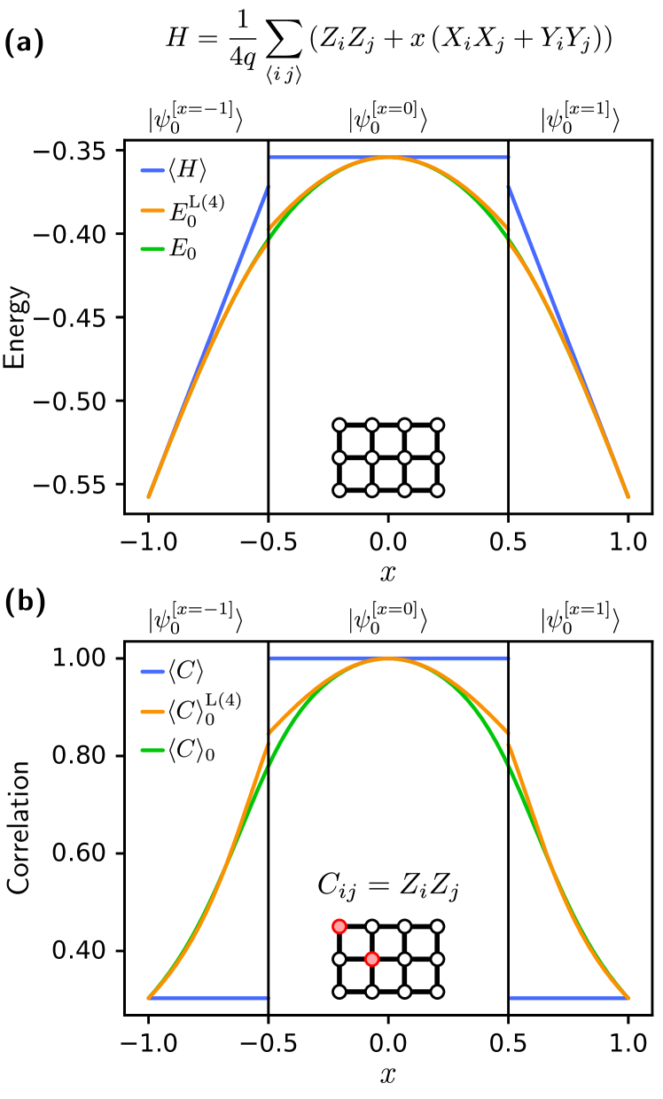
## Charts: Energy and Correlation as a Function of x
### Overview
The image presents two charts, labeled (a) and (b), displaying the relationship between energy and correlation with a parameter 'x'. Both charts share the same x-axis scale, ranging from -1.0 to 1.0, and are accompanied by schematic diagrams of a lattice structure. Chart (a) shows energy levels, while chart (b) depicts correlation values. A Hamiltonian equation is present at the top of the image.
### Components/Axes
**Chart (a): Energy**
* **X-axis:** 'x', ranging from -1.0 to 1.0, with tick marks at -1.0, -0.5, 0.0, 0.5, and 1.0.
* **Y-axis:** 'Energy', ranging from approximately -0.55 to -0.35, with tick marks at -0.55, -0.50, -0.45, -0.40, -0.35.
* **Data Series:**
* `<H>` (Blue Line)
* `E_0^(L)(4)` (Orange Line)
* `E_0` (Green Line)
* **Vertical Lines:** Three vertical dashed lines are present at x = -1.0, x = 0.0, and x = 1.0. Labels above these lines indicate states: `|ψ_0^(x=-1)|`, `|ψ_0^(x=0)|`, and `|ψ_0^(x=1)|`.
**Chart (b): Correlation**
* **X-axis:** 'x', ranging from -1.0 to 1.0, with tick marks at -1.0, -0.5, 0.0, 0.5, and 1.0.
* **Y-axis:** 'Correlation', ranging from approximately 0.40 to 1.00, with tick marks at 0.40, 0.60, 0.80, and 1.00.
* **Data Series:**
* `<C>` (Blue Line)
* `<C>^(L)(4)` (Orange Line)
* `<C>_0` (Green Line)
* **Vertical Lines:** Three vertical dashed lines are present at x = -1.0, x = 0.0, and x = 1.0. Labels above these lines indicate states: `|ψ_0^(x=-1)|`, `|ψ_0^(x=0)|`, and `|ψ_0^(x=1)|`.
**Equation:**
* `H = 1/(4q) * Σ_(<i,j>) (Z_i Z_j + x(X_i X_j + Y_i Y_j))`
**Diagrams:**
* Both charts include a schematic diagram of a hexagonal lattice in the center.
* Chart (b) also includes the equation `C_ij = Z_i Z_j` next to the lattice diagram.
### Detailed Analysis or Content Details
**Chart (a): Energy**
* The blue line (`<H>`) starts at approximately -0.42 at x = -1.0, decreases to a minimum of approximately -0.54 at x = -0.5, then increases to approximately -0.38 at x = 1.0. It exhibits a roughly parabolic shape.
* The orange line (`E_0^(L)(4)`) starts at approximately -0.36 at x = -1.0, remains relatively constant around -0.36 to -0.37 until x = 0.5, then increases to approximately -0.35 at x = 1.0.
* The green line (`E_0`) starts at approximately -0.37 at x = -1.0, decreases to approximately -0.40 at x = -0.5, then increases to approximately -0.36 at x = 1.0.
**Chart (b): Correlation**
* The blue line (`<C>`) starts at approximately 0.44 at x = -1.0, increases rapidly to approximately 0.98 at x = 0.0, then decreases to approximately 0.44 at x = 1.0.
* The orange line (`<C>^(L)(4)`) starts at approximately 0.85 at x = -1.0, increases to approximately 0.99 at x = 0.0, then decreases to approximately 0.85 at x = 1.0.
* The green line (`<C>_0`) starts at approximately 0.95 at x = -1.0, remains relatively constant around 0.98 to 0.99 between x = -0.5 and x = 0.5, then decreases to approximately 0.95 at x = 1.0.
### Key Observations
* In Chart (a), `<H>` exhibits a clear minimum around x = -0.5, suggesting a stable energy configuration at that point.
* In Chart (b), `<C>` shows a strong peak at x = 0.0, indicating maximum correlation at that value.
* The vertical lines at x = -1.0, 0.0, and 1.0 highlight the energy and correlation values at these specific states.
* The lattice diagrams suggest a physical system with interactions between sites.
### Interpretation
The data suggests an investigation into the energy and correlation properties of a system described by the given Hamiltonian. The parameter 'x' likely controls the strength of certain interactions within the system.
The energy plot (a) shows how the average energy of the system changes as 'x' varies. The minimum energy at x = -0.5 indicates a preferred configuration for the system under those conditions. The other two energy curves represent different approximations or levels of calculation.
The correlation plot (b) reveals how the correlation between sites in the lattice changes with 'x'. The peak correlation at x = 0.0 suggests a strong alignment or coupling between sites at that value. The different correlation curves likely represent different types of correlation or approximations.
The lattice diagrams provide a visual representation of the system being studied, and the equation `C_ij = Z_i Z_j` in chart (b) suggests that the correlation is related to the product of some variables (Z) at different lattice sites.
The vertical lines and associated labels indicate that the system's behavior is being analyzed at specific boundary conditions or states. The Hamiltonian equation at the top defines the system's energy, and the charts explore how this energy and the correlations within the system change as a function of the parameter 'x'. The use of `L(4)` in the labels suggests a specific level of approximation or calculation used in the model.