\n
## Line Charts: Generalization Error vs. Gradient Updates
### Overview
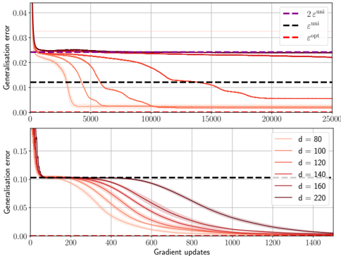
The image contains two vertically stacked line charts. Both charts plot "Generalisation error" (y-axis) against "Gradient updates" (x-axis), illustrating the training dynamics of machine learning models. The top chart compares several training runs against three theoretical error bounds. The bottom chart isolates the effect of a parameter "d" (likely model dimension or width) on the convergence trajectory.
### Components/Axes
**Top Chart:**
* **Y-axis:** Label: "Generalisation error". Scale: 0.00 to 0.04, with major ticks at 0.00, 0.01, 0.02, 0.03, 0.04.
* **X-axis:** Label: "Gradient updates". Scale: 0 to 25,000, with major ticks every 5,000.
* **Legend (Top-Right):** Contains three dashed horizontal lines:
* `2e^min` (Purple dashed line)
* `e^min` (Black dashed line)
* `e^opt` (Red dashed line)
* **Data Series:** Multiple solid lines in shades of orange/red, representing different training runs. They all start at a high error (>0.04) and decrease over time.
**Bottom Chart:**
* **Y-axis:** Label: "Generalisation error". Scale: 0.00 to 0.15, with major ticks at 0.00, 0.05, 0.10, 0.15.
* **X-axis:** Label: "Gradient updates". Scale: 0 to 1,400, with major ticks every 200.
* **Legend (Top-Right):** Contains seven solid lines, each corresponding to a different value of `d`:
* `d = 80` (Lightest orange)
* `d = 100`
* `d = 120`
* `d = 140`
* `d = 160`
* `d = 180`
* `d = 220` (Darkest red/brown)
* **Reference Line:** A black dashed line at y ≈ 0.10, consistent with the `e^min` line from the top chart's scale.
### Detailed Analysis
**Top Chart Trends & Data Points:**
* **Trend Verification:** All solid orange/red lines show a steep initial drop in generalization error within the first ~1,000 updates, followed by a slower, asymptotic decline.
* **Convergence Points:** The lines converge to different final error levels.
* A subset of lines (appearing to be the ones corresponding to lower `d` values from the bottom chart) drop rapidly and converge to a very low error, near the `e^opt` (red dashed) line at y ≈ 0.00.
* Another subset of lines (appearing to be higher `d` values) descend more slowly and plateau at a higher error level, clustering just above the `e^min` (black dashed) line at y ≈ 0.012.
* **Theoretical Bounds:**
* `e^opt` (Red dashed): Positioned at y ≈ 0.00. This appears to be the optimal achievable error.
* `e^min` (Black dashed): Positioned at y ≈ 0.012. This is a higher error bound.
* `2e^min` (Purple dashed): Positioned at y ≈ 0.024. This is double the `e^min` bound.
**Bottom Chart Trends & Data Points (Parameter `d`):**
* **Trend Verification:** All lines for different `d` values start at a high error (~0.15) and decrease monotonically. The rate of decrease is strongly dependent on `d`.
* **Convergence Speed vs. `d`:** There is a clear inverse relationship between `d` and convergence speed.
* `d = 80` (Lightest): Fastest convergence. Reaches near-zero error by ~600 updates.
* `d = 220` (Darkest): Slowest convergence. At 1,400 updates, its error is still ~0.02 and declining slowly.
* The lines for intermediate `d` values (100, 120, 140, 160, 180) are ordered sequentially between these two extremes.
* **Final Error Level:** By the end of the plotted updates (1,400), all lines appear to be heading towards the same low error floor (near 0.00), but the higher `d` models require significantly more updates to get there.
### Key Observations
1. **Two Convergence Regimes (Top Chart):** The data suggests the existence of two distinct final outcomes: a fast-converging, low-error regime and a slow-converging, higher-error regime (plateauing near `e^min`).
2. **`d` Controls Convergence Rate (Bottom Chart):** The parameter `d` is the primary factor determining which regime a model falls into and how fast it learns. Lower `d` leads to faster convergence.
3. **Consistency of Bounds:** The black dashed `e^min` line at y≈0.012 in the top chart aligns with the plateau level of the slower-converging runs. The same line at y≈0.10 in the bottom chart serves as a starting reference, not a convergence target for those runs.
4. **Timescale Difference:** The top chart spans 25,000 updates to show long-term plateaus, while the bottom chart zooms in on the first 1,400 updates to detail the initial, `d`-dependent descent.
### Interpretation
These charts demonstrate a fundamental trade-off in model training related to model complexity (parameterized by `d`). The data suggests that **simpler models (lower `d`) generalize quickly to a near-optimal solution (`e^opt`)**. In contrast, **more complex models (higher `d`) learn much slower**. While they may eventually reach the same low error, they spend a long time in a sub-optimal state, potentially stuck near a higher error bound (`e^min`).
This could be interpreted through the lens of optimization landscape geometry: simpler models may have a smoother loss landscape, allowing for rapid gradient descent to the global minimum. More complex models might have a more rugged landscape with many shallow minima, slowing progress. The `e^min` and `2e^min` lines likely represent theoretical generalization bounds derived from statistical learning theory (e.g., based on model capacity or dataset size). The fact that some runs plateau at `e^min` indicates they are trapped by this theoretical limit, while others that break through to `e^opt` have found a way to surpass it, possibly through implicit regularization effects that are more effective at lower `d`. The practical implication is that increasing model size (`d`) without other adjustments may not improve final accuracy and can drastically increase training time.