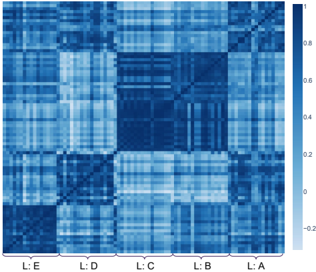
## Heatmap: Correlation Matrix
### Overview
The image is a heatmap representing a correlation matrix. The heatmap uses a color gradient from dark blue to light blue to indicate the strength and direction of correlations between different variables or categories. The categories are labeled L: A, L: B, L: C, L: D, and L: E along the bottom axis. The color bar on the right indicates the correlation values, ranging from approximately -0.2 to 1.
### Components/Axes
* **X-axis:** Categories labeled L: E, L: D, L: C, L: B, L: A (from left to right).
* **Y-axis:** Implicitly represents the same categories as the X-axis, forming a square matrix.
* **Color Bar:** Ranges from -0.2 to 1, with dark blue representing negative correlations and light blue representing positive correlations.
* -0.2
* 0
* 0.2
* 0.4
* 0.6
* 0.8
* 1
### Detailed Analysis
The heatmap shows the correlation between the categories L: A, L: B, L: C, L: D, and L: E. The diagonal elements represent the correlation of each category with itself, which is always 1 (represented by the lightest blue).
* **L: A vs. L: A:** Correlation is 1 (lightest blue).
* **L: B vs. L: B:** Correlation is 1 (lightest blue).
* **L: C vs. L: C:** Correlation is 1 (lightest blue).
* **L: D vs. L: D:** Correlation is 1 (lightest blue).
* **L: E vs. L: E:** Correlation is 1 (lightest blue).
The off-diagonal elements represent the correlations between different categories.
* **L: A vs. L: B:** Appears to have a moderate positive correlation (light blue).
* **L: A vs. L: C:** Appears to have a weak positive correlation (light blue).
* **L: A vs. L: D:** Appears to have a weak positive correlation (light blue).
* **L: A vs. L: E:** Appears to have a weak positive correlation (light blue).
* **L: B vs. L: A:** Appears to have a moderate positive correlation (light blue).
* **L: B vs. L: C:** Appears to have a moderate positive correlation (light blue).
* **L: B vs. L: D:** Appears to have a moderate positive correlation (light blue).
* **L: B vs. L: E:** Appears to have a weak positive correlation (light blue).
* **L: C vs. L: A:** Appears to have a weak positive correlation (light blue).
* **L: C vs. L: B:** Appears to have a moderate positive correlation (light blue).
* **L: C vs. L: D:** Appears to have a strong positive correlation (light blue).
* **L: C vs. L: E:** Appears to have a weak positive correlation (light blue).
* **L: D vs. L: A:** Appears to have a weak positive correlation (light blue).
* **L: D vs. L: B:** Appears to have a moderate positive correlation (light blue).
* **L: D vs. L: C:** Appears to have a strong positive correlation (light blue).
* **L: D vs. L: E:** Appears to have a moderate positive correlation (light blue).
* **L: E vs. L: A:** Appears to have a weak positive correlation (light blue).
* **L: E vs. L: B:** Appears to have a weak positive correlation (light blue).
* **L: E vs. L: C:** Appears to have a weak positive correlation (light blue).
* **L: E vs. L: D:** Appears to have a moderate positive correlation (light blue).
### Key Observations
* The diagonal elements are all the lightest blue, indicating a perfect positive correlation of 1.
* L: C and L: D have a strong positive correlation.
* L: A and L: E have the weakest correlations with other categories.
* There are no strong negative correlations (dark blue).
### Interpretation
The heatmap visualizes the relationships between five categories (L: A, L: B, L: C, L: D, L: E). The color intensity indicates the strength of the correlation, with lighter shades of blue indicating stronger positive correlations. The data suggests that L: C and L: D are highly related, while L: A and L: E have weaker relationships with the other categories. This could indicate that L: C and L: D share common characteristics or are influenced by similar factors. The absence of strong negative correlations suggests that none of the categories are strongly inversely related.