## Heatmap: Correlation Matrix
### Overview
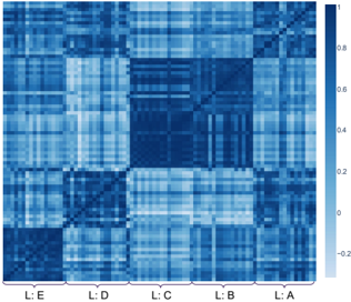
The image presents a heatmap visualizing a correlation matrix. The matrix appears to represent the relationships between five variables labeled L:A, L:B, L:C, L:D, and L:E. The color intensity indicates the strength and direction of the correlation, with darker blues representing stronger negative correlations and lighter blues/whites representing stronger positive correlations.
### Components/Axes
* **X-axis:** L:A, L:B, L:C, L:D, L:E. These labels appear at the bottom of the heatmap.
* **Y-axis:** L:E, L:D, L:C, L:B, L:A. These labels appear on the left side of the heatmap.
* **Color Scale (Legend):** Located on the right side of the heatmap. The scale ranges from approximately -0.2 to 1.0.
* -0.2: Dark Blue
* 0: Light Blue
* 0.2: Very Light Blue
* 0.4: Pale Blue
* 0.6: Light Pale Blue
* 0.8: Very Light Pale Blue
* 1.0: White
### Detailed Analysis
The heatmap is a 5x5 grid. Due to the resolution of the image, precise numerical values are difficult to extract, but approximate values based on color intensity are provided.
* **Diagonal:** The diagonal elements (L:A-L:A, L:B-L:B, L:C-L:C, L:D-L:D, L:E-L:E) are all white, indicating a perfect positive correlation (value of approximately 1.0) of each variable with itself.
* **L:A vs. L:B:** The correlation is approximately 0.6, indicated by a light pale blue color.
* **L:A vs. L:C:** The correlation is approximately 0.4, indicated by a pale blue color.
* **L:A vs. L:D:** The correlation is approximately 0.2, indicated by a very light blue color.
* **L:A vs. L:E:** The correlation is approximately 0.0, indicated by a light blue color.
* **L:B vs. L:C:** The correlation is approximately 0.6, indicated by a light pale blue color.
* **L:B vs. L:D:** The correlation is approximately 0.4, indicated by a pale blue color.
* **L:B vs. L:E:** The correlation is approximately 0.0, indicated by a light blue color.
* **L:C vs. L:D:** The correlation is approximately 0.6, indicated by a light pale blue color.
* **L:C vs. L:E:** The correlation is approximately -0.2, indicated by a dark blue color.
* **L:D vs. L:E:** The correlation is approximately 0.0, indicated by a light blue color.
The matrix appears to be symmetrical around the diagonal, meaning the correlation between L:X and L:Y is the same as the correlation between L:Y and L:X.
### Key Observations
* The strongest positive correlations are observed between L:A and L:B, and L:B and L:C.
* The strongest negative correlation is observed between L:C and L:E.
* L:E appears to have relatively weak correlations with the other variables, with a negative correlation to L:C and near-zero correlations to L:A, L:B, and L:D.
### Interpretation
The heatmap suggests that the variables L:A, L:B, and L:C are positively correlated with each other, forming a cluster. L:D is somewhat correlated with L:A and L:B, but less so with L:C. L:E is largely independent of the other variables, and even negatively correlated with L:C. This could indicate that L:E represents a different underlying factor or process than the others.
The data suggests a potential underlying structure where L:A, L:B, and L:C are influenced by similar factors, while L:E operates independently or in opposition to L:C. The heatmap provides a visual summary of these relationships, allowing for quick identification of strong correlations and potential dependencies between the variables. The lack of precise numerical values limits a more detailed quantitative analysis, but the overall pattern is clear.