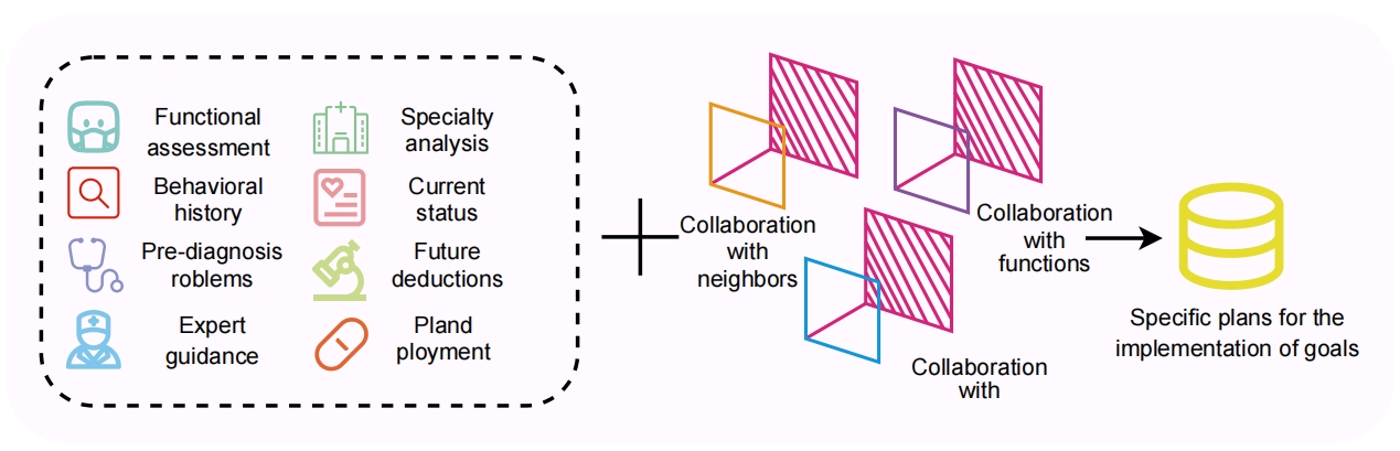
## Diagram: Healthcare Collaboration and Planning Workflow
### Overview
The diagram illustrates a structured process for healthcare planning, divided into two interconnected sections. The left section outlines **input factors** (e.g., assessments, analyses, and guidance), while the right section depicts **collaborative workflows** leading to **specific implementation plans**.
### Components/Axes
#### Left Section (Input Factors):
- **Dashed Box**: Contains eight labeled icons representing input factors:
1. **Functional assessment** (teal mask icon)
2. **Behavioral history** (red magnifying glass icon)
3. **Pre-diagnosis problems** (blue stethoscope icon)
4. **Expert guidance** (light blue medical professional icon)
5. **Specialty analysis** (green hospital icon)
6. **Current status** (pink heart icon)
7. **Future deductions** (green microscope icon)
8. **Planned ployment** (orange pill icon)
#### Right Section (Collaborative Workflow):
- **Three 3D Cubes**:
- **Yellow cube**: Labeled "Collaboration with neighbors"
- **Purple cube**: Labeled "Collaboration with functions"
- **Blue cube**: Labeled "Collaboration with" (incomplete label)
- **Arrows**: Connect cubes to a **yellow cylinder** labeled "Specific plans for the implementation of goals."
### Detailed Analysis
- **Left Section**:
- Icons are arranged vertically, with colors and symbols representing distinct healthcare domains (e.g., teal for functional assessment, red for behavioral history).
- Labels are concise, focusing on diagnostic and planning stages (e.g., "Pre-diagnosis problems," "Future deductions").
- **Right Section**:
- Cubes are interconnected via arrows, suggesting iterative collaboration.
- The yellow cylinder acts as the endpoint, representing actionable plans derived from collaborative efforts.
- The blue cube’s incomplete label ("Collaboration with") may indicate a missing or implied stakeholder (e.g., "Collaboration with stakeholders").
### Key Observations
1. **Color Coding**:
- Left section uses distinct colors for each input factor (e.g., teal, red, blue).
- Right section uses yellow, purple, and blue for cubes, with yellow for the final output.
2. **Flow Direction**:
- Input factors (left) → Collaboration (right) → Implementation plans (cylinder).
3. **Ambiguity**:
- The blue cube’s label is truncated, leaving its collaboration target unspecified.
### Interpretation
The diagram models a **systems-thinking approach** to healthcare planning, emphasizing:
1. **Holistic Inputs**: Combining functional, behavioral, and expert insights to inform decisions.
2. **Collaborative Dynamics**: Highlighting the role of interdisciplinary ("neighbors") and functional ("functions") partnerships in refining plans.
3. **Goal-Oriented Outcomes**: The yellow cylinder symbolizes the translation of collaborative efforts into concrete implementation strategies.
**Notable Insight**: The truncated label on the blue cube suggests a potential oversight in the diagram’s design, possibly omitting a critical collaboration partner (e.g., "patients" or "technology"). This ambiguity could undermine the model’s completeness.
**Peircean Perspective**: The diagram reflects a **pragmatic framework** where data (input factors) and collaboration (process) co-evolve to produce actionable knowledge (plans). The missing label hints at an incomplete semiotic process, where not all signs (e.g., stakeholder input) are fully represented.