TECHNICAL ASSET FINGERPRINT
d73a1727dc80f84220bb8319
Click to view fullscreen
Press ESC or click to close
FOUND IN PAPERS
EXPERT: gemini-2.0-flash VERSION 1
RUNTIME: nugit/gemini/gemini-2.0-flash
INTEL_VERIFIED
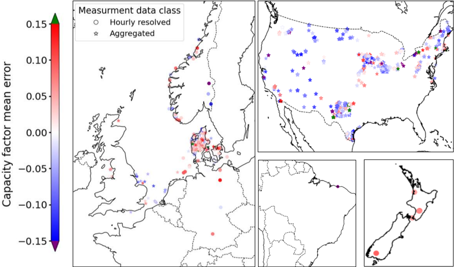
## Map with Capacity Factor Mean Error
### Overview
The image presents a series of maps displaying the capacity factor mean error across different geographical regions. The error is represented using a color gradient, ranging from blue (negative error) to red (positive error). Data points are categorized as either "Hourly resolved" (circles) or "Aggregated" (stars). The maps focus on Europe, the United States, South America, and New Zealand.
### Components/Axes
* **Title:** Capacity factor mean error
* **Y-axis (Color Bar):** Capacity factor mean error, ranging from -0.15 to 0.15. The color gradient transitions from blue (-0.15) to red (0.15), with green at 0.00.
* **Legend (Top-Right):**
* "Measurment data class"
* Circle: "Hourly resolved"
* Star: "Aggregated"
* **Maps:**
* Europe (Main Map): Focuses on Scandinavia, the UK, and surrounding areas.
* United States (Top-Right): Shows data points across the continental US.
* South America (Bottom-Center): Shows a few data points along the northern coast.
* New Zealand (Bottom-Right): Shows data points across the two main islands.
### Detailed Analysis
**Color Bar Values:**
* 0.15: Red
* 0.10: Light Red
* 0.05: Pale Red
* 0.00: Green
* -0.05: Pale Blue
* -0.10: Light Blue
* -0.15: Blue
**Europe Map:**
* Denmark: Predominantly red circles and stars, indicating a positive capacity factor mean error.
* UK: Mix of blue and red points, with a slight bias towards blue (negative error).
* Scandinavia: Mostly blue points, indicating a negative capacity factor mean error.
**United States Map:**
* West Coast: Primarily blue stars, indicating a negative capacity factor mean error for aggregated data.
* Midwest: Mix of blue and red stars, with a tendency towards blue.
* East Coast: Mix of blue and red stars, with a tendency towards red.
* Texas: Green star.
**South America Map:**
* Northern Coast: A single purple star.
**New Zealand Map:**
* Both Islands: Red circles, indicating a positive capacity factor mean error.
### Key Observations
* **Europe:** Denmark shows a significant positive error, while Scandinavia shows a negative error.
* **United States:** The West Coast has a negative error, while the East Coast has a positive error.
* **Data Type:** Both hourly resolved (circles) and aggregated (stars) data are present in most regions, allowing for a comparison of error based on data resolution.
### Interpretation
The maps illustrate the spatial distribution of capacity factor mean error, highlighting regional differences. The color gradient provides a clear visual representation of the error magnitude and direction (positive or negative). The distinction between hourly resolved and aggregated data allows for an assessment of how data resolution affects the error.
The data suggests that certain regions, such as Denmark and New Zealand, consistently overestimate capacity factors, while others, such as Scandinavia and the US West Coast, underestimate them. The mix of positive and negative errors in the US Midwest and East Coast indicates a more complex pattern.
The presence of both hourly resolved and aggregated data points in the same regions suggests that the aggregation process may introduce systematic biases in the capacity factor estimation. Further analysis would be needed to determine the specific factors contributing to these regional differences and the impact of data aggregation on the error.
DECODING INTELLIGENCE...
EXPERT: gemma-3-27b-it-free VERSION 1
RUNTIME: google-free/gemma-3-27b-it
INTEL_VERIFIED
\n
## Map: Capacity Factor Mean Error
### Overview
The image presents a geographical map of Europe, with a focus on Northern and Central Europe, and a smaller inset map of New Zealand. The map displays the "Capacity Factor Mean Error" using a color scale, with data points representing different measurement data classes. The data points are overlaid on a geographical outline of the region.
### Components/Axes
* **Color Scale:** A vertical color bar on the left side represents the "Capacity Factor Mean Error". The scale ranges from approximately -0.15 (blue) to 0.15 (red).
* **Legend:** Located in the top-right corner, the legend defines the measurement data classes:
* "Hourly resolved" - represented by a white circle with a black outline.
* "Aggregated" - represented by a purple star.
* **Geographical Map:** The main map depicts the coastlines and borders of European countries.
* **Inset Map:** A smaller map of New Zealand is located in the bottom-right corner.
* **Axis:** There are no explicit axes, but the color scale serves as a proxy for the y-axis representing the error value. The x and y axes are defined by the geographical coordinates.
### Detailed Analysis
The map displays a distribution of "Capacity Factor Mean Error" values across Europe. The data points are color-coded according to the color scale.
* **Northern Europe (Scandinavia):** Predominantly shows blue and light blue data points, indicating negative capacity factor mean errors. The errors range from approximately -0.15 to 0.05. Both "Hourly resolved" and "Aggregated" data points are present.
* **Central Europe (Germany, Poland, Czech Republic):** Displays a mix of red, pink, and blue data points. Errors range from approximately -0.10 to 0.10. A higher concentration of "Aggregated" data points is observed in this region.
* **Western Europe (France, UK, Benelux):** Shows a mix of colors, with a tendency towards lighter shades of blue and pink. Errors range from approximately -0.05 to 0.05.
* **Southern Europe (Spain, Italy):** Primarily displays light blue and pink data points, indicating errors close to zero.
* **New Zealand (Inset Map):** Shows a scattered distribution of blue and pink data points, with errors ranging from approximately -0.10 to 0.10.
Specific data point observations (approximate values based on color matching):
* **Norway (Northernmost point):** Approximately -0.15 (dark blue), "Hourly resolved".
* **Southern Sweden:** Approximately -0.10 (light blue), "Hourly resolved".
* **Northern Germany:** Approximately 0.05 (pink), "Aggregated".
* **Central Poland:** Approximately -0.05 (light blue), "Aggregated".
* **Eastern France:** Approximately 0.00 (white), "Aggregated".
* **North Island, New Zealand:** Approximately 0.05 (pink), "Aggregated".
* **South Island, New Zealand:** Approximately -0.05 (light blue), "Hourly resolved".
### Key Observations
* Negative capacity factor mean errors are more prevalent in Northern Europe and parts of New Zealand.
* Central Europe exhibits a wider range of errors, with both positive and negative values.
* "Aggregated" data points appear to be more common in Central Europe, while both data classes are present in other regions.
* The distribution of errors appears somewhat clustered, suggesting regional patterns.
### Interpretation
The map illustrates the spatial distribution of errors in estimating the capacity factor, likely for renewable energy sources (e.g., wind or solar). The negative errors in Northern Europe suggest that the actual capacity factor is consistently lower than the predicted value in that region. This could be due to factors such as underestimation of weather variability, inaccurate modeling of resource availability, or limitations in the measurement techniques. The higher concentration of "Aggregated" data in Central Europe might indicate that the errors are more pronounced when using aggregated data compared to hourly resolved data. The inset map of New Zealand suggests similar error patterns exist in that region, potentially due to similar challenges in capacity factor estimation. The spatial patterns observed could be valuable for improving the accuracy of capacity factor predictions and optimizing energy resource management. The differences between "Hourly resolved" and "Aggregated" data suggest that temporal resolution is an important factor in the accuracy of these estimations.
DECODING INTELLIGENCE...
EXPERT: healer-alpha-free VERSION 1
RUNTIME: free/openrouter/healer-alpha
INTEL_VERIFIED
## Geographical Map Chart: Capacity Factor Mean Error Distribution
### Overview
The image is a multi-panel geographical map chart displaying the spatial distribution of "Capacity factor mean error" across different global regions. The data points are overlaid on simplified continental outlines and are differentiated by both color (indicating error magnitude and direction) and symbol shape (indicating data resolution class). The chart appears to compare model or measurement errors for a specific metric (likely related to energy or resource capacity) across various locations.
### Components/Axes
1. **Color Scale (Left Panel):**
* **Title:** "Capacity factor mean error"
* **Scale:** A vertical color bar ranging from **-0.15** (dark blue) at the bottom to **+0.15** (dark red) at the top, with a white/light midpoint at **0.00**.
* **Gradient:** The scale transitions from dark blue (-0.15) through light blue, to white (0.00), then to light red, and finally to dark red (+0.15). Green arrowheads are present at the very top and bottom of the bar, pointing outward.
2. **Legend (Top-Left of Main Panel):**
* **Title:** "Measurement data class"
* **Symbols:**
* **Circle (○):** "Hourly resolved"
* **Star (☆):** "Aggregated"
3. **Map Panels:**
* **Main Panel (Left):** Shows Europe, with a focus on Northern and Central Europe. Coastlines and major borders are outlined in black.
* **Top-Right Panel:** Shows North America, primarily the United States and Southern Canada.
* **Bottom-Right Inset 1 (Left):** Shows the northern part of South America.
* **Bottom-Right Inset 2 (Right):** Shows New Zealand.
### Detailed Analysis
The data consists of discrete points plotted on the maps. Each point has a color corresponding to the "Capacity factor mean error" scale and a shape corresponding to its "Measurement data class."
**Spatial Distribution and Trends:**
* **Europe (Main Panel):**
* A dense cluster of points is visible in **Denmark** and surrounding areas. This cluster contains a mix of red (positive error) and blue (negative error) points, with a notable concentration of **red circles and stars**.
* Scattered points appear across the UK, Scandinavia, Germany, Poland, and the Baltic states. These show a wide range of errors, from strong negative (blue) in parts of the UK and Scandinavia to positive (red) in Central Europe.
* A few isolated points are visible in Southern Europe (e.g., Italy, Greece) and North Africa.
* **North America (Top-Right Panel):**
* A high density of points is spread across the **Eastern United States**, particularly the Midwest and Northeast. This region shows a very mixed distribution of errors, with many **blue stars (aggregated, negative error)** and **red circles (hourly, positive error)** intermingled.
* The **Western US** has a sparser distribution, with clusters in California and the Pacific Northwest showing a mix of errors.
* Points in **Southern Canada** are mostly blue, indicating negative mean errors.
* **South America (Bottom-Right Inset 1):**
* Very few data points are visible. One **purple star** (indicating an error value near the extreme negative end of the scale, ≈ -0.15) is located in the northern region (possibly Venezuela/Colombia area).
* **New Zealand (Bottom-Right Inset 2):**
* A small number of points are present. A prominent **large red circle** (indicating a strong positive error, ≈ +0.10 to +0.15) is located on the South Island. A few smaller, lighter red points are on the North Island.
**Data Class Distribution:**
* Both circles ("Hourly resolved") and stars ("Aggregated") are present across all regions with significant data.
* There is no immediately obvious, strict geographical segregation between the two data classes; both types are often found in close proximity within clusters (e.g., Eastern US, Denmark).
### Key Observations
1. **High Regional Variability:** Errors are not uniform within regions. Neighboring locations can show strongly opposing error signs (e.g., red and blue points side-by-side in the Eastern US and Denmark).
2. **Cluster Density:** The highest densities of data points are in **Northern Europe (especially Denmark)** and the **Eastern United States**. These are likely regions of particular interest for the study.
3. **Extreme Values:** The most extreme negative error (dark purple star) is in northern South America. The most extreme positive errors (dark red circles) are found in New Zealand and Denmark.
4. **Data Class Co-location:** The "Hourly resolved" and "Aggregated" data classes are not separated geographically; they are used to measure the same locations, suggesting a direct comparison of methodologies at each site.
### Interpretation
This chart visualizes the performance bias (mean error) of a model or measurement system for estimating a "capacity factor" across a global network of stations. The "capacity factor" is a common metric in energy (e.g., wind, solar) representing actual output vs. maximum possible output.
* **What the Data Suggests:** The model/system does not have a consistent global bias. Instead, its errors are highly location-dependent. Regions like Denmark and the Eastern US show a complex mix of over-prediction (positive error, red) and under-prediction (negative error, blue), which could be linked to local weather patterns, terrain, or model parameterization issues.
* **Relationship Between Elements:** The dual encoding (color for error, shape for data class) allows for a multi-faceted analysis. One can investigate if "Hourly resolved" data (circles) tends to have different error characteristics than temporally "Aggregated" data (stars) at the same location. The lack of clear separation suggests the error source may be common to both data resolutions or is dominated by other factors.
* **Notable Anomalies:** The single, extreme negative error in South America is an outlier that may warrant investigation—it could indicate a station malfunction, a unique local condition the model fails to capture, or a data processing error. The strong positive errors in New Zealand are also notable.
* **Underlying Purpose:** This type of analysis is critical for validating and improving predictive models. By mapping errors geographically, researchers can identify systematic regional biases, diagnose potential causes (e.g., coastal vs. inland effects, model resolution limits), and target model improvements for specific areas. The comparison between hourly and aggregated data helps assess whether temporal resolution significantly impacts accuracy.
DECODING INTELLIGENCE...
EXPERT: nemotron-free VERSION 1
RUNTIME: free/nvidia/nemotron-nano-12b-v2-vl:free
INTEL_VERIFIED
## Composite Map: Capacity Factor Mean Error by Region
### Overview
The image presents a composite map visualization of capacity factor mean error across four regions: Europe, the United States, South America, and New Zealand. Data points are color-coded using a gradient scale from -0.15 (blue) to +0.15 (red), with green at the top. Two data classes are distinguished: "Hourly resolved" (circles) and "Aggregated" (stars). The visualization emphasizes spatial distribution and measurement accuracy variations.
### Components/Axes
1. **Primary Map (Europe)**:
- **Legend**: Located in the top-left corner, with:
- **Color Scale**: Vertical gradient from blue (-0.15) to red (+0.15), labeled "Capacity factor mean error."
- **Data Class Symbols**:
- Circles (blue to red gradient) for "Hourly resolved" data.
- Stars (blue to red gradient) for "Aggregated" data.
- **Markers**:
- Red, blue, and green circles/stars distributed across Europe, with higher density in Northern and Central Europe.
- Notable clusters in Scandinavia (red), UK (blue), and Central Europe (mixed).
2. **Sub-Maps**:
- **USA**:
- Mixed markers (red, blue, green) with higher density in the Midwest and Northeast.
- Aggregated data (stars) dominate in Texas and California.
- **South America**:
- Sparse markers, primarily blue (negative error) in Brazil and Argentina.
- **New Zealand**:
- Two red circles (positive error) in the North Island and one blue circle in the South Island.
3. **Color Scale**:
- Positioned left of the Europe map, with a green arrowhead at the top (0.15) and a purple arrowhead at the bottom (-0.15).
### Detailed Analysis
- **Europe**:
- **Hourly Resolved Data**:
- Red circles (positive error) concentrated in Scandinavia and the UK.
- Blue circles (negative error) in Southern Europe (e.g., Spain, Italy).
- **Aggregated Data**:
- Red stars in Germany and France; blue stars in Eastern Europe.
- **Color Scale Alignment**: Red markers align with the upper end of the scale (+0.10 to +0.15), while blue markers align with the lower end (-0.10 to -0.05).
- **USA**:
- **Hourly Resolved Data**:
- Red circles in the Midwest (e.g., Illinois, Ohio) and blue circles in the Southwest (e.g., Arizona).
- **Aggregated Data**:
- Red stars in Texas and California; blue stars in the Midwest.
- **Notable**: Mixed data types in the Northeast (e.g., New York, Pennsylvania).
- **South America**:
- **Hourly Resolved Data**:
- Blue circles in Brazil and Argentina, indicating negative errors (-0.05 to -0.10).
- **Aggregated Data**:
- No stars present; all markers are circles.
- **New Zealand**:
- **Hourly Resolved Data**:
- Red circles in the North Island (positive error, ~+0.05) and a blue circle in the South Island (-0.05).
### Key Observations
1. **Data Density**: Europe has the highest density of markers, suggesting more granular measurement data.
2. **Error Distribution**:
- Positive errors (+0.05 to +0.15) dominate in Northern Europe and the US Midwest.
- Negative errors (-0.10 to -0.05) are prevalent in Southern Europe, South America, and New Zealand.
3. **Data Class Distribution**:
- Aggregated data (stars) are more common in the US and Europe, while South America relies solely on hourly data.
4. **Outliers**:
- A single red circle in South America (Brazil) deviates from the general negative error trend.
### Interpretation
The visualization highlights regional disparities in capacity factor measurement accuracy:
- **Europe**: High-resolution data (hourly) shows mixed errors, with Northern regions experiencing overestimation (red) and Southern regions underestimation (blue). Aggregated data aligns with these trends but with broader spatial coverage.
- **USA**: Mixed data types suggest varied measurement approaches. The Midwest’s positive errors may reflect grid instability, while the Southwest’s negative errors could indicate underreporting.
- **South America**: Sparse data and consistent negative errors may indicate limited measurement infrastructure or systemic underestimation.
- **New Zealand**: Isolated positive errors in the North Island suggest localized measurement challenges.
The capacity factor mean error range (-0.15 to +0.15) underscores significant variability in renewable energy measurement accuracy, with implications for grid management and policy. The dominance of aggregated data in the US and Europe highlights a preference for coarser resolution, potentially sacrificing granular insights for broader trends.
DECODING INTELLIGENCE...