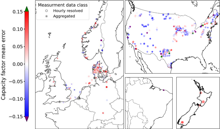
## Map with Capacity Factor Mean Error
### Overview
The image presents a series of maps displaying the capacity factor mean error across different geographical regions. The error is represented using a color gradient, ranging from blue (negative error) to red (positive error). Data points are categorized as either "Hourly resolved" (circles) or "Aggregated" (stars). The maps focus on Europe, the United States, South America, and New Zealand.
### Components/Axes
* **Title:** Capacity factor mean error
* **Y-axis (Color Bar):** Capacity factor mean error, ranging from -0.15 to 0.15. The color gradient transitions from blue (-0.15) to red (0.15), with green at 0.00.
* **Legend (Top-Right):**
* "Measurment data class"
* Circle: "Hourly resolved"
* Star: "Aggregated"
* **Maps:**
* Europe (Main Map): Focuses on Scandinavia, the UK, and surrounding areas.
* United States (Top-Right): Shows data points across the continental US.
* South America (Bottom-Center): Shows a few data points along the northern coast.
* New Zealand (Bottom-Right): Shows data points across the two main islands.
### Detailed Analysis
**Color Bar Values:**
* 0.15: Red
* 0.10: Light Red
* 0.05: Pale Red
* 0.00: Green
* -0.05: Pale Blue
* -0.10: Light Blue
* -0.15: Blue
**Europe Map:**
* Denmark: Predominantly red circles and stars, indicating a positive capacity factor mean error.
* UK: Mix of blue and red points, with a slight bias towards blue (negative error).
* Scandinavia: Mostly blue points, indicating a negative capacity factor mean error.
**United States Map:**
* West Coast: Primarily blue stars, indicating a negative capacity factor mean error for aggregated data.
* Midwest: Mix of blue and red stars, with a tendency towards blue.
* East Coast: Mix of blue and red stars, with a tendency towards red.
* Texas: Green star.
**South America Map:**
* Northern Coast: A single purple star.
**New Zealand Map:**
* Both Islands: Red circles, indicating a positive capacity factor mean error.
### Key Observations
* **Europe:** Denmark shows a significant positive error, while Scandinavia shows a negative error.
* **United States:** The West Coast has a negative error, while the East Coast has a positive error.
* **Data Type:** Both hourly resolved (circles) and aggregated (stars) data are present in most regions, allowing for a comparison of error based on data resolution.
### Interpretation
The maps illustrate the spatial distribution of capacity factor mean error, highlighting regional differences. The color gradient provides a clear visual representation of the error magnitude and direction (positive or negative). The distinction between hourly resolved and aggregated data allows for an assessment of how data resolution affects the error.
The data suggests that certain regions, such as Denmark and New Zealand, consistently overestimate capacity factors, while others, such as Scandinavia and the US West Coast, underestimate them. The mix of positive and negative errors in the US Midwest and East Coast indicates a more complex pattern.
The presence of both hourly resolved and aggregated data points in the same regions suggests that the aggregation process may introduce systematic biases in the capacity factor estimation. Further analysis would be needed to determine the specific factors contributing to these regional differences and the impact of data aggregation on the error.