\n
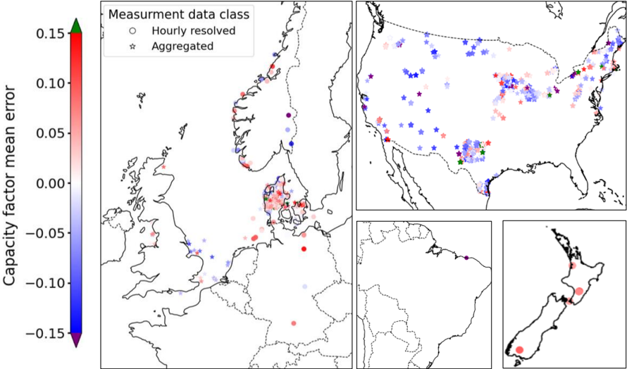
## Map: Capacity Factor Mean Error
### Overview
The image presents a geographical map of Europe, with a focus on Northern and Central Europe, and a smaller inset map of New Zealand. The map displays the "Capacity Factor Mean Error" using a color scale, with data points representing different measurement data classes. The data points are overlaid on a geographical outline of the region.
### Components/Axes
* **Color Scale:** A vertical color bar on the left side represents the "Capacity Factor Mean Error". The scale ranges from approximately -0.15 (blue) to 0.15 (red).
* **Legend:** Located in the top-right corner, the legend defines the measurement data classes:
* "Hourly resolved" - represented by a white circle with a black outline.
* "Aggregated" - represented by a purple star.
* **Geographical Map:** The main map depicts the coastlines and borders of European countries.
* **Inset Map:** A smaller map of New Zealand is located in the bottom-right corner.
* **Axis:** There are no explicit axes, but the color scale serves as a proxy for the y-axis representing the error value. The x and y axes are defined by the geographical coordinates.
### Detailed Analysis
The map displays a distribution of "Capacity Factor Mean Error" values across Europe. The data points are color-coded according to the color scale.
* **Northern Europe (Scandinavia):** Predominantly shows blue and light blue data points, indicating negative capacity factor mean errors. The errors range from approximately -0.15 to 0.05. Both "Hourly resolved" and "Aggregated" data points are present.
* **Central Europe (Germany, Poland, Czech Republic):** Displays a mix of red, pink, and blue data points. Errors range from approximately -0.10 to 0.10. A higher concentration of "Aggregated" data points is observed in this region.
* **Western Europe (France, UK, Benelux):** Shows a mix of colors, with a tendency towards lighter shades of blue and pink. Errors range from approximately -0.05 to 0.05.
* **Southern Europe (Spain, Italy):** Primarily displays light blue and pink data points, indicating errors close to zero.
* **New Zealand (Inset Map):** Shows a scattered distribution of blue and pink data points, with errors ranging from approximately -0.10 to 0.10.
Specific data point observations (approximate values based on color matching):
* **Norway (Northernmost point):** Approximately -0.15 (dark blue), "Hourly resolved".
* **Southern Sweden:** Approximately -0.10 (light blue), "Hourly resolved".
* **Northern Germany:** Approximately 0.05 (pink), "Aggregated".
* **Central Poland:** Approximately -0.05 (light blue), "Aggregated".
* **Eastern France:** Approximately 0.00 (white), "Aggregated".
* **North Island, New Zealand:** Approximately 0.05 (pink), "Aggregated".
* **South Island, New Zealand:** Approximately -0.05 (light blue), "Hourly resolved".
### Key Observations
* Negative capacity factor mean errors are more prevalent in Northern Europe and parts of New Zealand.
* Central Europe exhibits a wider range of errors, with both positive and negative values.
* "Aggregated" data points appear to be more common in Central Europe, while both data classes are present in other regions.
* The distribution of errors appears somewhat clustered, suggesting regional patterns.
### Interpretation
The map illustrates the spatial distribution of errors in estimating the capacity factor, likely for renewable energy sources (e.g., wind or solar). The negative errors in Northern Europe suggest that the actual capacity factor is consistently lower than the predicted value in that region. This could be due to factors such as underestimation of weather variability, inaccurate modeling of resource availability, or limitations in the measurement techniques. The higher concentration of "Aggregated" data in Central Europe might indicate that the errors are more pronounced when using aggregated data compared to hourly resolved data. The inset map of New Zealand suggests similar error patterns exist in that region, potentially due to similar challenges in capacity factor estimation. The spatial patterns observed could be valuable for improving the accuracy of capacity factor predictions and optimizing energy resource management. The differences between "Hourly resolved" and "Aggregated" data suggest that temporal resolution is an important factor in the accuracy of these estimations.