\n
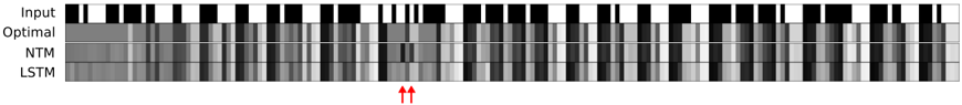
## Heatmap: Model Performance Visualization
### Overview
The image presents a heatmap comparing the performance of four different models – Input, Optimal, NTM (Neural Turing Machine), and LSTM (Long Short-Term Memory) – across a sequence of data points. The heatmap uses grayscale shading to represent the model's output or activation level, with darker shades indicating higher values and lighter shades indicating lower values. Two red arrows point to a specific region of the heatmap, likely highlighting an area of interest or a point of comparison.
### Components/Axes
* **Rows:** Represent the different models: Input, Optimal, NTM, LSTM.
* **Columns:** Represent the sequence of data points or time steps. The number of data points is approximately 30.
* **Color Scale:** Grayscale, where darker shades represent higher values and lighter shades represent lower values. There is no explicit legend, but the grayscale gradient is implied.
* **Annotations:** Two red arrows pointing to a specific region in the NTM and LSTM rows, around the 15th-20th column.
### Detailed Analysis
The heatmap displays the activation patterns of each model over the sequence.
* **Input:** Shows a clear alternating pattern of black and white, suggesting a binary or discrete input signal.
* **Optimal:** Displays a more complex pattern with varying shades of gray, indicating a more nuanced response.
* **NTM:** Shows a pattern that initially resembles the Input, but becomes more complex and variable over time. The region highlighted by the red arrows shows a strong activation (darker shade) in the NTM model.
* **LSTM:** Similar to NTM, the LSTM model starts with a pattern resembling the Input, but evolves into a more complex pattern. The red arrows highlight a region where the LSTM also shows a strong activation, though potentially less intense than the NTM.
Visually, the NTM and LSTM models appear to "learn" or adapt to the input sequence, as their patterns diverge from the simple alternating pattern of the Input. The Optimal model shows the most complex and varied pattern, suggesting it is the most capable of representing the underlying data.
### Key Observations
* The Input signal is a simple alternating pattern.
* The Optimal model exhibits the most complex activation pattern.
* Both NTM and LSTM models show increasing complexity in their activation patterns over time.
* The red arrows highlight a region where both NTM and LSTM models exhibit strong activation, suggesting a point of significant processing or response.
* The NTM appears to have a slightly stronger activation in the highlighted region compared to the LSTM.
### Interpretation
This heatmap likely visualizes the internal state or activation patterns of different models as they process a sequence of data. The "Optimal" model likely represents a theoretical or ideal solution, serving as a benchmark for the other models. The NTM and LSTM models are attempting to approximate the behavior of the Optimal model.
The red arrows draw attention to a specific point in the sequence where the NTM and LSTM models demonstrate a significant response. This could indicate a challenging or important part of the input sequence that requires more processing power or attention from the models. The difference in activation intensity between NTM and LSTM in this region suggests that the NTM might be slightly better at handling this specific aspect of the data.
The heatmap demonstrates the ability of NTM and LSTM models to learn and adapt to complex input sequences, but also highlights the gap between their performance and the "Optimal" solution. The visualization provides insights into the internal workings of these models and can be used to identify areas for improvement.