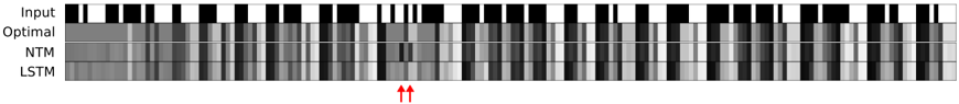
## Sequence Alignment Heatmap: Model Performance Comparison
### Overview
The image displays a horizontal heatmap comparing four different sequences or model outputs across a series of discrete time steps or positions. The visualization uses a grayscale color scheme to represent values, with black typically indicating a high value (e.g., 1, activation, or presence) and white indicating a low value (e.g., 0, inactivation, or absence). Two red arrows at the bottom highlight a specific column of interest.
### Components/Axes
* **Vertical Axis (Labels):** Four rows are labeled on the far left. From top to bottom:
1. `Input`
2. `Optimal`
3. `NTM` (Neural Turing Machine)
4. `LSTM` (Long Short-Term Memory)
* **Horizontal Axis:** Represents a sequence of approximately 60-70 discrete positions or time steps. There are no numerical markers or labels on this axis.
* **Legend/Color Scale:** No explicit legend is present. The value mapping is inferred: black = high/active, white = low/inactive, with intermediate grays representing values in between.
* **Annotations:** Two red, upward-pointing arrows (`↑↑`) are positioned at the bottom center of the image, directly below a specific column in the sequence.
### Detailed Analysis
The image is segmented into four horizontal rows, each representing a different data series. The analysis proceeds row by row.
1. **Row 1: `Input`**
* **Trend/Pattern:** This row shows a clear, binary-like pattern. It consists of distinct blocks of solid black and solid white, with very sharp transitions. This suggests the input is a clean, discrete signal (e.g., a binary sequence or one-hot encoded data).
* **Spatial Grounding:** The pattern is consistent across the entire width of the chart.
2. **Row 2: `Optimal`**
* **Trend/Pattern:** This row is predominantly solid black across almost its entire length. There are a few very thin, isolated white vertical lines or gaps. This represents the target or ideal output sequence, which is mostly "active" or "1".
* **Spatial Grounding:** The near-uniform black band sits directly below the `Input` row.
3. **Row 3: `NTM`**
* **Trend/Pattern:** This row displays a complex, noisy grayscale pattern. It does not cleanly replicate the `Optimal` row. There are broad regions of medium to dark gray, interspersed with lighter gray and white vertical streaks. The pattern appears more "smeared" or continuous compared to the sharp `Input`.
* **Key Data Point (Arrow Alignment):** The two red arrows point to a column where the `NTM` row shows a distinct, narrow white vertical line (a low value) surrounded by darker grays. This is a notable deviation from the `Optimal` row's solid black at that position.
4. **Row 4: `LSTM`**
* **Trend/Pattern:** Similar to the `NTM`, this row shows a noisy, grayscale pattern. However, its texture appears slightly different—perhaps with more frequent, thinner vertical striations. It also fails to perfectly match the `Optimal` pattern.
* **Key Data Point (Arrow Alignment):** At the column indicated by the red arrows, the `LSTM` row shows a medium-gray value, which is also a deviation from the `Optimal` black but is less stark than the `NTM`'s white.
### Key Observations
1. **Model Divergence:** Both the `NTM` and `LSTM` models produce outputs that are approximations of the `Optimal` sequence. Neither achieves a perfect, binary match. Their outputs are characterized by uncertainty (grayscale values) and noise.
2. **Highlighted Anomaly:** The red arrows explicitly draw attention to a specific time step where both models err, but in different ways. The `NTM` produces a strong negative error (white, likely ~0), while the `LSTM` produces a moderate error (gray, likely ~0.5).
3. **Input vs. Output Complexity:** The `Input` is a clean, structured signal. The `Optimal` output is a simple, mostly constant signal. The model outputs (`NTM`, `LSTM`) are complex and noisy, indicating the task of mapping the given input to the optimal output is non-trivial for these architectures.
4. **Spatial Layout:** The direct vertical alignment allows for column-wise comparison. One can scan down any column to see the `Input`, the target `Optimal` value, and the two models' predictions for that exact step.
### Interpretation
This image is a technical diagnostic tool used to evaluate and compare the performance of two neural network architectures—likely on a sequence modeling or memory-based task.
* **What the Data Suggests:** The visualization demonstrates that for this specific task and input sequence, neither the NTM nor the LSTM perfectly learns the optimal mapping. The presence of grayscale values in their output rows indicates the models are outputting probabilistic or continuous values where a binary decision might be expected, revealing a confidence issue or a limitation in the model's final activation layer.
* **Relationship Between Elements:** The `Input` is the source data. The `Optimal` row defines the ground truth. The `NTM` and `LSTM` rows are the hypotheses being tested. The red arrows serve as a forensic tool, pinpointing a specific failure mode for closer inspection. The fact that the arrows highlight a column where the `NTM` is confidently wrong (white) while the `LSTM` is uncertain (gray) could be a key finding, suggesting different failure characteristics between the architectures.
* **Notable Anomalies:** The most significant anomaly is the column marked by the arrows. In a sequence that is almost entirely "active" (black) in the optimal case, the `NTM`'s strong "inactive" (white) prediction is a critical error. This could indicate a specific pattern in the `Input` that the NTM consistently misinterprets.
* **Underlying Purpose:** This type of visualization is common in research papers for algorithms like Neural Turing Machines or differentiable memory networks. It provides an intuitive, visual proof of a model's capabilities and shortcomings that a single accuracy metric cannot convey. The investigator is meant to conclude that while both models capture the general trend, they make distinct, interpretable errors at specific points, guiding future model refinement.