## Line Chart: Performance Comparison of PIKL and PINN
### Overview
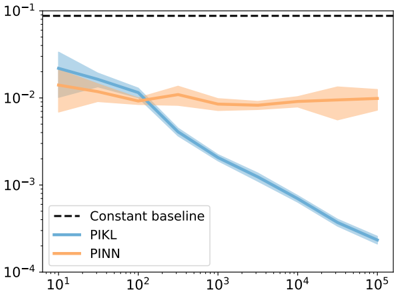
The image is a line chart comparing the performance of two methods, PIKL and PINN, against a constant baseline. The chart displays the performance (likely error or loss) on a logarithmic scale as a function of some unspecified variable on a logarithmic scale. The chart includes shaded regions around the lines, representing the uncertainty or variance in the performance of each method.
### Components/Axes
* **X-axis:** Logarithmic scale, ranging from 10^1 (10) to 10^5 (100,000). Axis label is not provided.
* **Y-axis:** Logarithmic scale, ranging from 10^-4 (0.0001) to 10^-1 (0.1). Axis label is not provided.
* **Legend:** Located in the bottom-left corner.
* **Constant baseline:** Represented by a black dashed line.
* **PIKL:** Represented by a blue line with a light blue shaded region.
* **PINN:** Represented by an orange line with a light orange shaded region.
### Detailed Analysis
* **Constant Baseline:** A horizontal dashed black line at approximately y = 0.1.
* **PIKL (Blue):**
* Starts at approximately (10, 0.025) with a shaded region extending from approximately 0.015 to 0.035.
* Decreases to approximately (100, 0.01) with a shaded region extending from approximately 0.008 to 0.012.
* Decreases sharply to approximately (200, 0.005) with a shaded region extending from approximately 0.004 to 0.006.
* Continues to decrease to approximately (10^3, 0.0025) with a shaded region extending from approximately 0.002 to 0.003.
* Continues to decrease to approximately (10^4, 0.0007) with a shaded region extending from approximately 0.0005 to 0.0009.
* Ends at approximately (10^5, 0.0002) with a shaded region extending from approximately 0.00015 to 0.00025.
* **PINN (Orange):**
* Starts at approximately (10, 0.015) with a shaded region extending from approximately 0.01 to 0.02.
* Decreases to approximately (100, 0.009) with a shaded region extending from approximately 0.007 to 0.011.
* Remains relatively constant around 0.008 to 0.01 with a shaded region extending from approximately 0.006 to 0.012.
* Ends at approximately (10^5, 0.008) with a shaded region extending from approximately 0.006 to 0.01.
### Key Observations
* PIKL consistently outperforms PINN as the x-axis value increases beyond 100.
* PIKL shows a significant decrease in value as the x-axis value increases.
* PINN's value remains relatively stable after the x-axis value reaches 100.
* The shaded regions indicate the uncertainty associated with each method. PIKL's uncertainty decreases as the x-axis value increases, while PINN's uncertainty remains relatively constant.
* Both PIKL and PINN start with similar values at the beginning of the chart.
### Interpretation
The chart suggests that PIKL is a more effective method than PINN for the task being evaluated, especially as the x-axis value increases. The decreasing value of PIKL indicates that its performance improves with increasing x-axis value, while PINN's stable value suggests that its performance plateaus. The constant baseline provides a reference point, indicating that both methods initially perform worse than the baseline, but PIKL eventually surpasses it. The x-axis is not labeled, so it is difficult to determine what it represents. It could be the number of iterations, the size of the dataset, or some other relevant parameter.