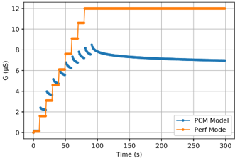
## Line Chart: G (µs) vs. Time (s)
### Overview
This image presents a line chart comparing two data series, "PCM Model" and "Perf Mode", plotted against time. The y-axis represents 'G' measured in microseconds (µs), and the x-axis represents time in seconds (s). The chart displays the change in 'G' over time for both models.
### Components/Axes
* **X-axis:** Time (s), ranging from 0 to 300 seconds.
* **Y-axis:** G (µs), ranging from 0 to 13 µs.
* **Data Series 1:** "PCM Model" - Represented by a blue line with triangular markers.
* **Data Series 2:** "Perf Mode" - Represented by an orange line with square markers.
* **Legend:** Located in the bottom-right corner, identifying the two data series and their corresponding colors.
### Detailed Analysis
**PCM Model (Blue Line):**
The blue line starts at approximately 2.2 µs at time 0s. It initially increases rapidly, reaching around 7.5 µs by 80s. After 80s, the line exhibits a decreasing trend, leveling off to approximately 7 µs by 300s. The slope of the line decreases over time, indicating a slowing rate of change.
* (0s, 2.2 µs)
* (20s, 3.8 µs)
* (40s, 5.4 µs)
* (60s, 6.6 µs)
* (80s, 7.5 µs)
* (100s, 7.8 µs)
* (150s, 7.3 µs)
* (200s, 7.1 µs)
* (250s, 7.0 µs)
* (300s, 7.0 µs)
**Perf Mode (Orange Line):**
The orange line starts at approximately 0.2 µs at time 0s. It increases in a series of steps, reaching approximately 12.5 µs by 80s. From 80s to 300s, the line remains relatively constant at around 12.5 µs.
* (0s, 0.2 µs)
* (10s, 1.0 µs)
* (20s, 2.0 µs)
* (30s, 3.0 µs)
* (40s, 4.0 µs)
* (50s, 5.0 µs)
* (60s, 6.0 µs)
* (70s, 8.0 µs)
* (80s, 12.5 µs)
* (90s, 12.5 µs)
* (150s, 12.5 µs)
* (200s, 12.5 µs)
* (250s, 12.5 µs)
* (300s, 12.5 µs)
### Key Observations
* The "Perf Mode" consistently exhibits a higher 'G' value than the "PCM Model" throughout the entire duration of the chart.
* The "PCM Model" shows a decreasing rate of increase in 'G' over time, while "Perf Mode" plateaus after an initial rapid increase.
* The "Perf Mode" increases in discrete steps, suggesting a quantized or staged adjustment process.
### Interpretation
The chart likely represents the performance characteristics of two different systems or modes of operation. "PCM Model" could be a predictive or simulated model, while "Perf Mode" represents the actual performance of a system. The initial increase in both models suggests a warm-up or initialization phase. The plateau in "Perf Mode" indicates that the system has reached a stable operating point. The decreasing rate of increase in "PCM Model" might suggest that the model is converging towards a steady state or that the system is experiencing diminishing returns. The significant difference in 'G' values between the two suggests that "Perf Mode" is significantly more efficient or capable than the "PCM Model" in terms of the measured parameter 'G'. The stepped increases in "Perf Mode" could indicate discrete performance levels or adjustments made by the system.