## Line Graph: Performance Comparison of PCM Model and Perf Mode Over Time
### Overview
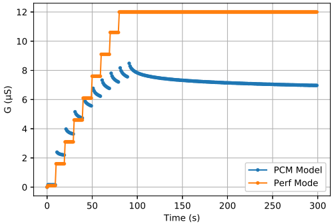
The image is a line graph comparing the performance of two systems, the **PCM Model** (blue line) and **Perf Mode** (orange line), over a 300-second time span. The y-axis represents a metric labeled **G (µs)**, while the x-axis represents **Time (s)**. The graph highlights distinct behavioral trends between the two systems, with the PCM Model exhibiting gradual stepwise increases and the Perf Mode showing abrupt stabilization.
---
### Components/Axes
- **X-axis (Time)**: Labeled "Time (s)", ranging from 0 to 300 seconds in increments of 50.
- **Y-axis (G)**: Labeled "G (µs)", ranging from 0 to 12 µs in increments of 2.
- **Legend**: Located at the **bottom-right** of the graph.
- **PCM Model**: Represented by a **blue line** with stepwise markers.
- **Perf Mode**: Represented by an **orange line** with a flat plateau.
---
### Detailed Analysis
#### PCM Model (Blue Line)
- **Initial Behavior**: Starts at 0 µs at time 0s.
- **Stepwise Increases**:
- Increases by ~1.5 µs at approximately **10s, 20s, 30s, 40s, and 50s**.
- Reaches a plateau of **~7.5 µs** after 50s.
- **Post-50s**: Remains flat at ~7.5 µs until 300s.
#### Perf Mode (Orange Line)
- **Initial Behavior**: Starts at 0 µs at time 0s.
- **Abrupt Jump**:
- Jumps to **12 µs** at **50s**.
- **Post-50s**: Remains flat at **12 µs** until 300s.
---
### Key Observations
1. **Perf Mode Stabilizes Faster**: Reaches its maximum value (12 µs) at 50s, while the PCM Model takes 50s to plateau at 7.5 µs.
2. **PCM Model Gradual Adjustment**: Exhibits incremental increases, suggesting a controlled or iterative process.
3. **Performance Disparity**: Perf Mode achieves a higher G value (12 µs vs. 7.5 µs) and maintains it consistently.
---
### Interpretation
- **System Efficiency**: The Perf Mode likely represents an optimized system designed for rapid stabilization and higher performance, while the PCM Model may prioritize gradual adjustments, possibly for stability or precision.
- **Trade-offs**: The PCM Model’s stepwise behavior could indicate resource constraints or safety mechanisms, whereas Perf Mode’s abrupt jump suggests prioritization of speed over incremental refinement.
- **Anomalies**: The Perf Mode’s flat plateau at 12 µs implies no further changes post-50s, which may indicate a ceiling effect or saturation of the system’s capacity.
---
### Spatial Grounding
- **Legend**: Bottom-right corner, clearly associating colors with labels.
- **Lines**:
- Blue (PCM Model) occupies the lower half of the graph.
- Orange (Perf Mode) dominates the upper half after 50s.
- **Axis Alignment**: Both axes are labeled with clear units and scales, ensuring unambiguous interpretation.
---
### Content Details
- **PCM Model Values**:
- 0 µs (0s), 1.5 µs (10s), 3.0 µs (20s), 4.5 µs (30s), 6.0 µs (40s), 7.5 µs (50s+).
- **Perf Mode Values**:
- 0 µs (0s), 12 µs (50s+).
---
### Final Notes
The graph underscores a fundamental difference in system behavior: Perf Mode achieves higher performance quickly but plateaus, while the PCM Model progresses gradually but at a lower maximum. This could reflect design priorities (e.g., speed vs. precision) or operational constraints in real-world applications.