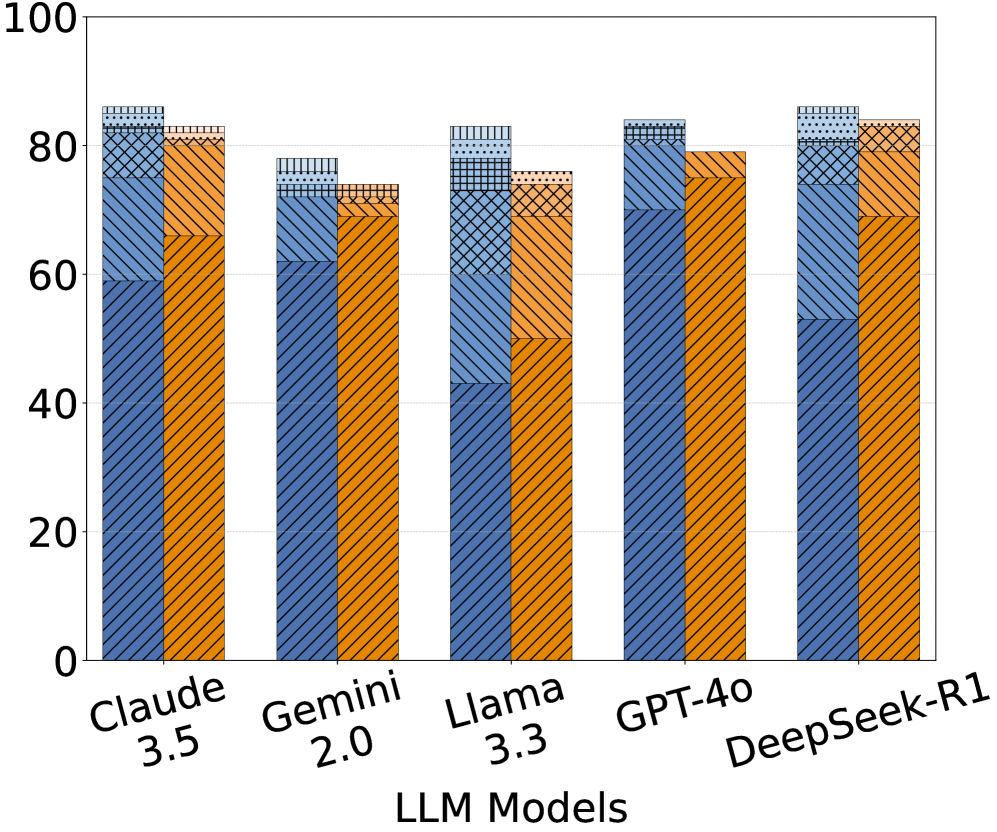
## Bar Chart: LLM Model Comparison
### Overview
The image is a bar chart comparing the performance of several Large Language Models (LLMs): Claude 3.5, Gemini 2.0, Llama 3.3, GPT-4o, and DeepSeek-R1. Each model's performance is represented by a stacked bar, with different colored segments indicating different performance metrics. The y-axis represents a percentage scale from 0 to 100.
### Components/Axes
* **X-axis:** LLM Models (Claude 3.5, Gemini 2.0, Llama 3.3, GPT-4o, DeepSeek-R1)
* **Y-axis:** Percentage scale from 0 to 100, with increments of 20.
* **Bar Segments (from bottom to top):**
* Orange with diagonal lines
* Light Blue with diagonal lines
* Blue with cross-hatch pattern
* Light Blue with dotted pattern
### Detailed Analysis
**Claude 3.5:**
* Orange (bottom): ~65%
* Light Blue: ~15%
* Blue (cross-hatch): ~3%
* Light Blue (dotted): ~2%
* Total: ~85%
**Gemini 2.0:**
* Orange (bottom): ~45%
* Light Blue: ~25%
* Blue (cross-hatch): ~3%
* Light Blue (dotted): ~2%
* Total: ~75%
**Llama 3.3:**
* Orange (bottom): ~50%
* Light Blue: ~25%
* Blue (cross-hatch): ~5%
* Light Blue (dotted): ~3%
* Total: ~83%
**GPT-4o:**
* Orange (bottom): ~80%
* Light Blue: ~5%
* Blue (cross-hatch): ~0%
* Light Blue (dotted): ~0%
* Total: ~85%
**DeepSeek-R1:**
* Orange (bottom): ~55%
* Light Blue: ~20%
* Blue (cross-hatch): ~5%
* Light Blue (dotted): ~5%
* Total: ~85%
### Key Observations
* All models have a similar total percentage, around 85%, except for Gemini 2.0, which is around 75%.
* The orange segment (bottom) varies significantly across models, indicating a difference in the underlying metric it represents.
* The other segments (light blue, blue cross-hatch, and light blue dotted) are relatively small and consistent across models.
### Interpretation
The bar chart compares the performance of different LLM models across several metrics, represented by the stacked segments of each bar. The orange segment dominates the overall performance, suggesting it is the most significant factor. GPT-4o has the highest orange segment, indicating strong performance in that specific metric. Gemini 2.0 has the lowest overall performance, primarily due to its lower orange segment value. The other segments contribute relatively little to the overall performance, suggesting they may represent less critical metrics or areas where the models perform similarly. The chart highlights the strengths and weaknesses of each model across the measured metrics.