\n
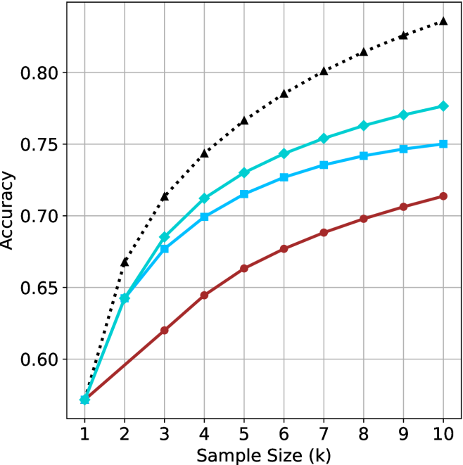
## Line Chart: Accuracy vs. Sample Size
### Overview
The image presents a line chart illustrating the relationship between sample size and accuracy. Four different data series are plotted, each representing a different method or configuration, as indicated by their distinct line styles and colors. The chart demonstrates how accuracy improves with increasing sample size for each series.
### Components/Axes
* **X-axis:** Labeled "Sample Size (k)", ranging from 1 to 10 (in increments of 1).
* **Y-axis:** Labeled "Accuracy", ranging from 0.58 to 0.82 (in increments of 0.02).
* **Data Series:** Four lines are present, differentiated by color and style:
* Black dotted line (▲)
* Cyan solid line (■)
* Blue dashed line (▼)
* Red solid line (●)
* **Grid:** A grid is present to aid in reading values.
### Detailed Analysis
Let's analyze each data series individually, noting trends and approximate values:
* **Black Dotted Line (▲):** This line exhibits the steepest upward slope, indicating the fastest increase in accuracy with sample size.
* At Sample Size = 1k: Accuracy ≈ 0.67
* At Sample Size = 2k: Accuracy ≈ 0.72
* At Sample Size = 3k: Accuracy ≈ 0.76
* At Sample Size = 4k: Accuracy ≈ 0.78
* At Sample Size = 5k: Accuracy ≈ 0.79
* At Sample Size = 6k: Accuracy ≈ 0.80
* At Sample Size = 7k: Accuracy ≈ 0.81
* At Sample Size = 8k: Accuracy ≈ 0.82
* At Sample Size = 9k: Accuracy ≈ 0.82
* At Sample Size = 10k: Accuracy ≈ 0.82
* **Cyan Solid Line (■):** This line shows a moderate upward slope, with accuracy increasing at a slower rate than the black dotted line.
* At Sample Size = 1k: Accuracy ≈ 0.60
* At Sample Size = 2k: Accuracy ≈ 0.68
* At Sample Size = 3k: Accuracy ≈ 0.72
* At Sample Size = 4k: Accuracy ≈ 0.74
* At Sample Size = 5k: Accuracy ≈ 0.75
* At Sample Size = 6k: Accuracy ≈ 0.76
* At Sample Size = 7k: Accuracy ≈ 0.76
* At Sample Size = 8k: Accuracy ≈ 0.77
* At Sample Size = 9k: Accuracy ≈ 0.77
* At Sample Size = 10k: Accuracy ≈ 0.78
* **Blue Dashed Line (▼):** This line demonstrates a similar trend to the cyan line, but with slightly lower accuracy values.
* At Sample Size = 1k: Accuracy ≈ 0.59
* At Sample Size = 2k: Accuracy ≈ 0.66
* At Sample Size = 3k: Accuracy ≈ 0.70
* At Sample Size = 4k: Accuracy ≈ 0.72
* At Sample Size = 5k: Accuracy ≈ 0.73
* At Sample Size = 6k: Accuracy ≈ 0.74
* At Sample Size = 7k: Accuracy ≈ 0.74
* At Sample Size = 8k: Accuracy ≈ 0.75
* At Sample Size = 9k: Accuracy ≈ 0.75
* At Sample Size = 10k: Accuracy ≈ 0.76
* **Red Solid Line (●):** This line exhibits the slowest increase in accuracy with sample size.
* At Sample Size = 1k: Accuracy ≈ 0.58
* At Sample Size = 2k: Accuracy ≈ 0.63
* At Sample Size = 3k: Accuracy ≈ 0.66
* At Sample Size = 4k: Accuracy ≈ 0.68
* At Sample Size = 5k: Accuracy ≈ 0.69
* At Sample Size = 6k: Accuracy ≈ 0.70
* At Sample Size = 7k: Accuracy ≈ 0.70
* At Sample Size = 8k: Accuracy ≈ 0.71
* At Sample Size = 9k: Accuracy ≈ 0.71
* At Sample Size = 10k: Accuracy ≈ 0.72
### Key Observations
* The black dotted line consistently outperforms the other methods across all sample sizes.
* The red solid line consistently underperforms the other methods.
* All lines demonstrate diminishing returns in accuracy as sample size increases. The rate of accuracy improvement slows down with larger sample sizes.
* The differences in accuracy between the methods are most pronounced at smaller sample sizes.
### Interpretation
The chart suggests that increasing the sample size generally improves accuracy for all methods tested. However, the effectiveness of increasing sample size varies significantly depending on the method used. The black dotted line represents a method that benefits most from larger sample sizes, while the red solid line shows limited improvement. This could indicate that the black dotted line method is more sensitive to data availability or that the red solid line method has reached a performance plateau. The diminishing returns observed across all lines suggest that there is a point beyond which increasing the sample size provides only marginal gains in accuracy. This information is valuable for optimizing resource allocation and determining the appropriate sample size for a given application. The chart implies a trade-off between the cost of acquiring more data and the potential improvement in accuracy.