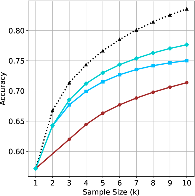
## Line Chart: Accuracy vs. Sample Size (k)
### Overview
The image displays a line chart plotting "Accuracy" on the y-axis against "Sample Size (k)" on the x-axis. It compares the performance of four distinct methods or models, represented by four lines with different colors and markers. All lines show a positive trend, with accuracy increasing as the sample size grows, but at different rates and reaching different final values.
### Components/Axes
* **Chart Type:** Line chart with markers.
* **X-Axis:**
* **Label:** "Sample Size (k)"
* **Scale:** Linear, from 1 to 10.
* **Markers:** Integers 1, 2, 3, 4, 5, 6, 7, 8, 9, 10.
* **Y-Axis:**
* **Label:** "Accuracy"
* **Scale:** Linear, from approximately 0.57 to 0.84.
* **Major Gridlines:** At 0.60, 0.65, 0.70, 0.75, 0.80.
* **Legend:** Located in the top-left quadrant of the plot area, overlapping the gridlines. It contains four entries, each with a colored line segment and a marker symbol.
* **Data Series (from top to bottom at k=10):**
1. **Black, dotted line with upward-pointing triangle markers (▲).**
2. **Cyan (light blue) solid line with diamond markers (◆).**
3. **Blue solid line with square markers (■).**
4. **Red solid line with circle markers (●).**
### Detailed Analysis
**Trend Verification & Data Point Extraction (Approximate Values):**
* **Black Dotted Line (▲):**
* **Trend:** Starts as the lowest line at k=1, increases very steeply until k=4, then continues to increase at a decreasing rate, becoming the highest line from k=3 onward.
* **Data Points:**
* k=1: ~0.57
* k=2: ~0.67
* k=3: ~0.71
* k=4: ~0.74
* k=5: ~0.76
* k=6: ~0.78
* k=7: ~0.80
* k=8: ~0.81
* k=9: ~0.82
* k=10: ~0.83
* **Cyan Line (◆):**
* **Trend:** Starts tied for lowest at k=1, increases steadily, maintaining the second-highest position from k=3 onward.
* **Data Points:**
* k=1: ~0.57
* k=2: ~0.64
* k=3: ~0.68
* k=4: ~0.71
* k=5: ~0.73
* k=6: ~0.74
* k=7: ~0.75
* k=8: ~0.76
* k=9: ~0.77
* k=10: ~0.775
* **Blue Line (■):**
* **Trend:** Starts tied for lowest at k=1, increases steadily but slightly below the cyan line, maintaining the third-highest position from k=3 onward.
* **Data Points:**
* k=1: ~0.57
* k=2: ~0.64
* k=3: ~0.675
* k=4: ~0.70
* k=5: ~0.715
* k=6: ~0.725
* k=7: ~0.735
* k=8: ~0.74
* k=9: ~0.745
* k=10: ~0.75
* **Red Line (●):**
* **Trend:** Starts tied for lowest at k=1, increases at the slowest rate, remaining the lowest line throughout.
* **Data Points:**
* k=1: ~0.57
* k=2: ~0.60
* k=3: ~0.62
* k=4: ~0.645
* k=5: ~0.66
* k=6: ~0.675
* k=7: ~0.69
* k=8: ~0.70
* k=9: ~0.705
* k=10: ~0.71
### Key Observations
1. **Universal Improvement:** All four methods show improved accuracy with increased sample size.
2. **Performance Hierarchy:** A clear and consistent performance ranking is established by k=3 and holds through k=10: Black (▲) > Cyan (◆) > Blue (■) > Red (●).
3. **Convergence at Start:** All methods begin at approximately the same accuracy (~0.57) when the sample size is minimal (k=1).
4. **Diminishing Returns:** The rate of accuracy improvement slows for all lines as k increases, but the effect is most pronounced for the top-performing (Black) line.
5. **Significant Spread:** By k=10, there is a substantial performance gap of approximately 0.12 accuracy units between the best (Black, ~0.83) and worst (Red, ~0.71) methods.
### Interpretation
The chart demonstrates the relationship between data availability (sample size) and model performance (accuracy) for four different approaches. The key insight is that while more data benefits all methods, the **Black (▲) method scales significantly better** than the others. It transforms from the worst performer at k=1 to the best by a wide margin at k=10, suggesting it is a more sophisticated or data-efficient algorithm that can better leverage additional samples.
The **Cyan (◆) and Blue (■) methods** show similar, moderate scaling behavior, with Cyan maintaining a slight but consistent edge. The **Red (●) method** exhibits the poorest scaling, indicating it may be a simpler baseline or a method that hits a performance ceiling more quickly.
The convergence at k=1 suggests that with extremely limited data, the choice of method may be less critical. However, as data becomes more available (k > 2), the selection of the appropriate method (Black in this case) becomes crucial for maximizing performance. The chart argues for the superiority of the Black method in data-rich scenarios within the tested range.