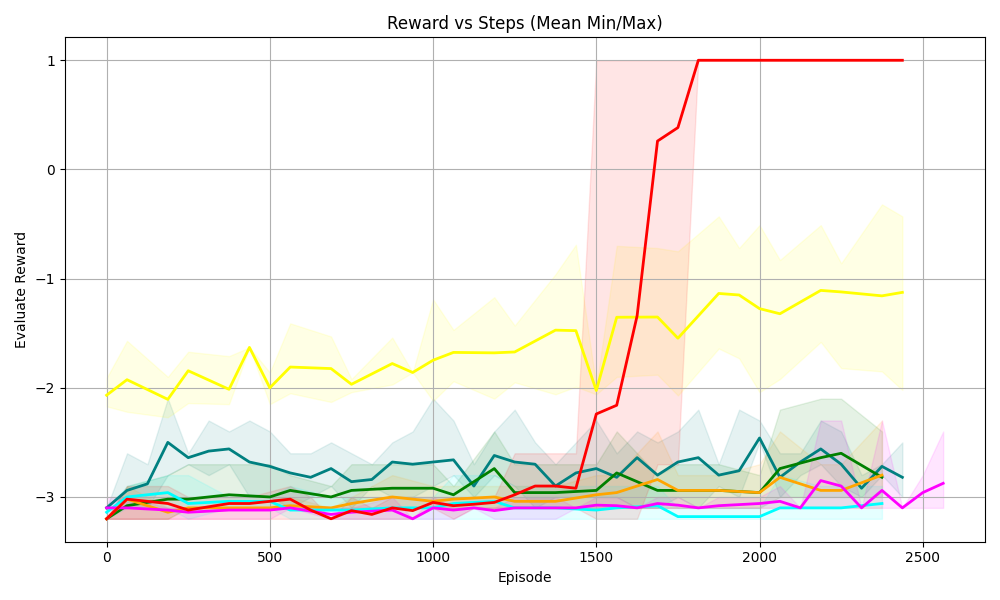
## Line Chart: Reward vs Steps (Mean Min/Max)
### Overview
The image is a line chart displaying the relationship between "Reward" and "Steps" (represented as "Episode"). The chart includes multiple data series, each represented by a different colored line. The chart also displays the mean, minimum, and maximum values for one of the data series, indicated by a shaded region around the line.
### Components/Axes
* **Title:** Reward vs Steps (Mean Min/Max)
* **X-axis:** Episode
* Scale: 0 to 2500, with markers at 0, 500, 1000, 1500, 2000, and 2500.
* **Y-axis:** Evaluate Reward
* Scale: -3 to 1, with markers at -3, -2, -1, 0, and 1.
* **Data Series:** There are multiple data series represented by different colored lines: red, yellow, teal, green, orange, magenta, and cyan.
* **Shaded Regions:** A yellow shaded region surrounds the yellow line, a teal shaded region surrounds the teal line, and a red shaded region surrounds the red line. These shaded regions likely represent the min/max range for each series.
### Detailed Analysis
* **Red Line:** This line starts at approximately -3 around episode 0. It remains relatively flat until around episode 1500, where it sharply increases to 1. It then remains at 1 for the rest of the episodes. The red shaded region is visible after episode 1500.
* **Yellow Line:** This line starts at approximately -2 around episode 0. It fluctuates between -2 and -1.5 until around episode 1500. After episode 1500, it fluctuates between -2 and -1. The yellow shaded region surrounds this line.
* **Teal Line:** This line starts at approximately -3 around episode 0. It fluctuates between -3 and -2.5 until around episode 1500. After episode 1500, it fluctuates between -3 and -2. The teal shaded region surrounds this line.
* **Green Line:** This line starts at approximately -3 around episode 0. It remains relatively flat around -3 for the duration of the episodes.
* **Orange Line:** This line starts at approximately -3 around episode 0. It remains relatively flat around -3 for the duration of the episodes.
* **Magenta Line:** This line starts at approximately -3 around episode 0. It remains relatively flat around -3 for the duration of the episodes, with a slight dip towards -3.2 around episode 2500.
* **Cyan Line:** This line starts at approximately -3 around episode 0. It remains relatively flat around -3 for the duration of the episodes.
### Key Observations
* The red line shows a significant increase in reward around episode 1500, indicating a potential learning point or change in strategy.
* The yellow line shows more fluctuation in reward compared to the other lines, suggesting a less stable performance.
* The green, orange, magenta, and cyan lines remain relatively flat, indicating a consistent but low reward.
* The shaded regions around the yellow, teal, and red lines provide information about the variability of the reward for those series.
### Interpretation
The chart likely represents the performance of different agents or algorithms over a series of episodes. The "Evaluate Reward" indicates the performance metric being used. The red line's sharp increase suggests that the corresponding agent or algorithm learned a successful strategy around episode 1500. The other lines indicate less successful or stable strategies. The shaded regions provide insight into the range of possible rewards for each strategy, with wider regions indicating greater variability. The data suggests that the red line represents the most successful strategy, while the others are less effective.