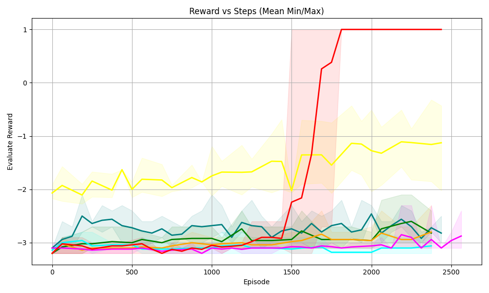
## Line Chart: Reward vs Steps (Mean Min/Max)
### Overview
This is a line chart plotting **Evaluate Reward** (y-axis) against **Episode** (x-axis, representing steps in a learning process). Multiple colored lines (with shaded regions, likely min/max or confidence intervals) represent different data series (e.g., learning agents/algorithms). The title is *“Reward vs Steps (Mean Min/Max)”*.
### Components/Axes
- **X-axis**: Labeled *“Episode”* with ticks at 0, 500, 1000, 1500, 2000, 2500 (steps in the learning process).
- **Y-axis**: Labeled *“Evaluate Reward”* with ticks at -3, -2, -1, 0, 1 (reward values).
- **Legend**: Not explicitly labeled, but multiple colored lines (red, yellow, teal, green, orange, pink, cyan, etc.) with shaded regions (indicating variability).
### Detailed Analysis (Key Data Series)
We analyze each line by color, trend, and key points (approximate values, with uncertainty):
1. **Red Line**
- **Trend**: Starts near -3, remains low until ~1500 episodes, then *sharply increases* to 1 (around 1750 episodes), then plateaus.
- **Shaded Region**: Wide (high variability) during the sharp increase (1500–1750), then narrow (stable) after 1750.
- **Key Points**:
- 0 episodes: ~-3
- 1500 episodes: ~-2.5
- 1750 episodes: ~1
- 2000–2500 episodes: ~1 (stable)
2. **Yellow Line**
- **Trend**: Fluctuates around -2 to -1, with a dip at ~1500 episodes, then *gradually increases* to ~-1.2 by 2500.
- **Shaded Region**: Wide (high variability), especially after 1500 episodes.
- **Key Points**:
- 0 episodes: ~-2
- 500 episodes: ~-1.8
- 1000 episodes: ~-1.7
- 1500 episodes: ~-2
- 2000 episodes: ~-1.3
- 2500 episodes: ~-1.2
3. **Teal Line**
- **Trend**: Fluctuates around -3 to -2.5, with minor peaks.
- **Shaded Region**: Moderate width (moderate variability).
- **Key Points**:
- 0 episodes: ~-3
- 500 episodes: ~-2.7
- 1000 episodes: ~-2.6
- 1500 episodes: ~-2.8
- 2000 episodes: ~-2.7
- 2500 episodes: ~-2.8
4. **Green Line**
- **Trend**: Similar to teal, fluctuates around -3 to -2.5 (slightly lower than teal).
- **Shaded Region**: Moderate width.
- **Key Points**:
- 0 episodes: ~-3
- 500 episodes: ~-2.9
- 1000 episodes: ~-2.8
- 1500 episodes: ~-2.9
- 2000 episodes: ~-2.8
- 2500 episodes: ~-2.9
5. **Orange, Pink, Cyan Lines**
- **Trend**: Cluster around -3 to -2.8, with minimal improvement over episodes.
- **Shaded Region**: Narrow (low variability).
- **Key Points**: All remain near -3 to -2.8 across all episodes (e.g., 0 episodes: ~-3; 2500 episodes: ~-2.9).
### Key Observations
- **Outlier: Red Line**: It is the only series with a *sharp, sustained increase* to a reward of 1 (others stay below -1).
- **Yellow Line**: Second-highest, with moderate improvement (fluctuates around -2 to -1).
- **Clustering of Low-Performing Lines**: Teal, green, orange, pink, and cyan lines cluster around -3 to -2.5, showing little to no improvement.
- **Variability**: Red and yellow lines have wider shaded regions (higher variability), while low-performing lines have narrow ranges.
### Interpretation
- **Red Line**: Likely represents a *successful learning agent* that achieves a high reward (1) after ~1500 episodes, suggesting a “breakthrough” in learning (e.g., a phase transition or effective algorithm).
- **Yellow Line**: Shows moderate improvement but not as drastic as red, indicating partial learning or a less effective algorithm.
- **Low-Performing Lines**: Clustered around -3 to -2.5, these likely represent less effective learning (e.g., random exploration, suboptimal algorithms).
- **Shaded Regions**: Wide ranges for red/yellow during learning (1500–1750) indicate high variability (e.g., trial-and-error), while narrow ranges after 1750 (red) suggest stability.
This chart illustrates how different learning agents/algorithms perform over episodes, with the red line demonstrating a clear, successful learning trajectory.