## Line Chart: Accuracy vs. Sample Size (k)
### Overview
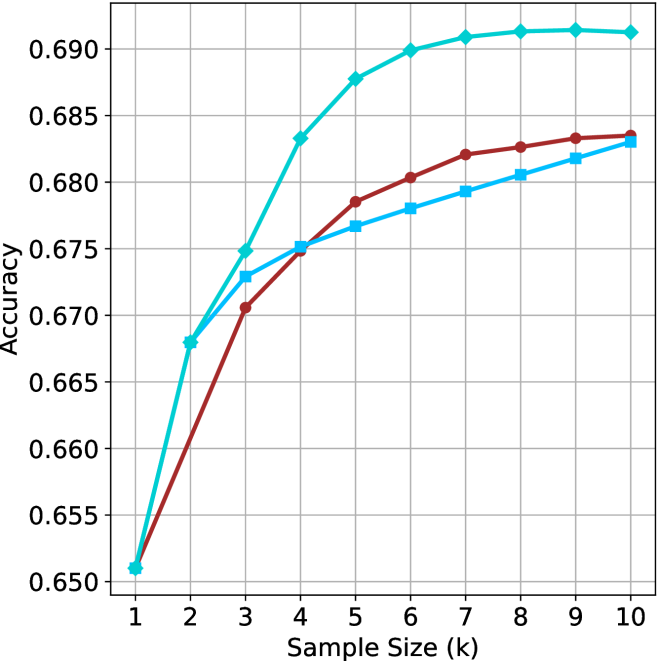
The image displays a line chart plotting "Accuracy" on the vertical y-axis against "Sample Size (k)" on the horizontal x-axis. The chart compares the performance of three distinct methods or models, represented by three colored lines, as the sample size increases from 1 to 10 (in thousands, denoted by 'k'). All three lines show a positive correlation between sample size and accuracy, with diminishing returns as the sample size grows.
### Components/Axes
* **Chart Type:** Multi-line chart with markers.
* **X-Axis:**
* **Label:** "Sample Size (k)"
* **Scale:** Linear, from 1 to 10 in increments of 1.
* **Markers:** Major tick marks at each integer value (1, 2, 3, ..., 10).
* **Y-Axis:**
* **Label:** "Accuracy"
* **Scale:** Linear, from 0.650 to 0.690 in increments of 0.005.
* **Markers:** Major tick marks at 0.650, 0.655, 0.660, 0.665, 0.670, 0.675, 0.680, 0.685, 0.690.
* **Legend:** Located in the top-left corner of the plot area. It contains three entries:
1. A cyan line with a diamond marker (◆).
2. A brown line with a circle marker (●).
3. A light blue line with a square marker (■).
* **Grid:** A light gray grid is present, with both horizontal and vertical lines aligned with the major tick marks.
### Detailed Analysis
**Data Series and Trends:**
1. **Cyan Line (Diamond Markers):**
* **Trend:** This line exhibits the steepest initial ascent and achieves the highest overall accuracy. It shows a rapid increase from k=1 to k=5, after which the rate of improvement slows significantly, plateauing near the top of the chart.
* **Approximate Data Points:**
* k=1: ~0.651
* k=2: ~0.668
* k=3: ~0.675
* k=4: ~0.683
* k=5: ~0.688
* k=6: ~0.690
* k=7: ~0.691
* k=8: ~0.691
* k=9: ~0.691
* k=10: ~0.691
2. **Brown Line (Circle Markers):**
* **Trend:** This line shows a steady, consistent increase in accuracy. It starts at the same point as the other lines at k=1 but grows at a slower rate than the cyan line. It maintains a position between the cyan and light blue lines for most of the chart.
* **Approximate Data Points:**
* k=1: ~0.651
* k=2: ~0.660
* k=3: ~0.671
* k=4: ~0.675
* k=5: ~0.679
* k=6: ~0.681
* k=7: ~0.682
* k=8: ~0.683
* k=9: ~0.684
* k=10: ~0.684
3. **Light Blue Line (Square Markers):**
* **Trend:** This line follows a trajectory very similar to the brown line but consistently achieves slightly lower accuracy values after k=2. The gap between the brown and light blue lines appears to narrow slightly as the sample size increases.
* **Approximate Data Points:**
* k=1: ~0.651
* k=2: ~0.668
* k=3: ~0.673
* k=4: ~0.675
* k=5: ~0.677
* k=6: ~0.678
* k=7: ~0.679
* k=8: ~0.681
* k=9: ~0.682
* k=10: ~0.683
### Key Observations
* **Convergence at Start:** All three methods begin at approximately the same accuracy (~0.651) when the sample size is smallest (k=1).
* **Performance Hierarchy:** A clear performance hierarchy is established by k=3 and maintained thereafter: Cyan > Brown > Light Blue.
* **Diminishing Returns:** All curves demonstrate diminishing marginal returns. The most significant gains in accuracy occur between k=1 and k=5. After k=6 or k=7, the improvements become very small, especially for the top-performing (cyan) method.
* **Plateau Point:** The cyan method's accuracy effectively plateaus after k=7, showing negligible improvement from k=7 to k=10.
* **Close Competition:** The brown and light blue methods perform very similarly, with the brown method maintaining a narrow but consistent lead of approximately 0.001 to 0.002 accuracy points from k=5 onward.
### Interpretation
This chart likely compares the learning curves of three different algorithms, models, or training techniques. The data suggests that the method represented by the **cyan line** is the most data-efficient and effective, achieving superior accuracy with fewer samples and maintaining a significant lead. Its rapid early learning and high plateau indicate a robust model that effectively leverages additional data up to a point.
The **brown and light blue methods** show similar learning patterns but are less effective overall. The narrow gap between them suggests they may be variants of a similar approach, with the brown variant having a slight, consistent advantage. The fact that all methods start at the same point implies they were evaluated under identical initial conditions or with a minimal baseline dataset.
The universal trend of diminishing returns is a critical insight. It indicates that for this particular task, increasing the sample size beyond approximately 6,000 to 7,000 samples (k=6 or 7) yields minimal benefit for any of the tested methods. This has practical implications for resource allocation, suggesting that collecting data beyond this point may not be cost-effective. The chart effectively answers the question: "How much data is enough?" for these specific approaches.