## Line Chart: Accuracy vs. Sample Size (k) for Four Methods
### Overview
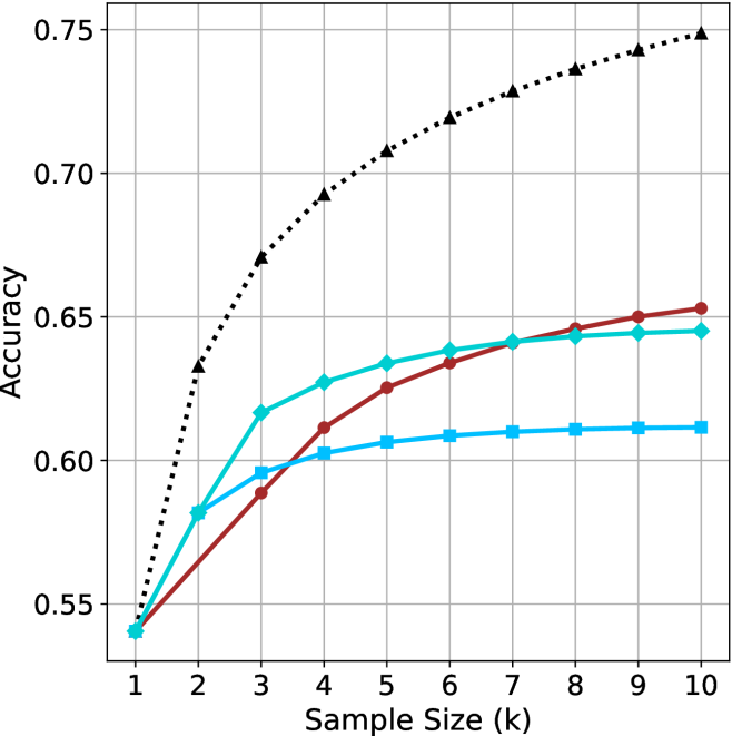
The image is a line chart plotting the performance metric "Accuracy" against "Sample Size (k)" for four distinct methods or algorithms. The chart demonstrates how the accuracy of each method changes as the sample size increases from 1 to 10. All methods begin at approximately the same accuracy point when the sample size is 1, but their performance trajectories diverge significantly as more samples are added.
### Components/Axes
* **X-Axis (Horizontal):** Labeled "Sample Size (k)". It has discrete integer markers from 1 to 10.
* **Y-Axis (Vertical):** Labeled "Accuracy". It has numerical markers at 0.55, 0.60, 0.65, 0.70, and 0.75. The scale is linear.
* **Legend:** Positioned in the top-left corner of the chart area. It contains four entries, each associating a line color and marker style with a method name.
1. **Black dotted line with upward-pointing triangle markers:** Labeled "Method A".
2. **Cyan solid line with diamond markers:** Labeled "Method B".
3. **Red solid line with circle markers:** Labeled "Method C".
4. **Blue solid line with square markers:** Labeled "Method D".
* **Grid:** A light gray grid is present, aligning with the major tick marks on both axes.
### Detailed Analysis
**Trend Verification & Data Point Extraction:**
1. **Method A (Black, Dotted, Triangles):**
* **Trend:** Shows a steep, concave-downward increasing curve. It has the highest accuracy at every sample size after k=1 and continues to show significant gains across the entire range.
* **Approximate Data Points:**
* k=1: ~0.54
* k=2: ~0.63
* k=3: ~0.67
* k=4: ~0.69
* k=5: ~0.71
* k=6: ~0.72
* k=7: ~0.73
* k=8: ~0.74
* k=9: ~0.745
* k=10: ~0.75
2. **Method B (Cyan, Solid, Diamonds):**
* **Trend:** Shows a steady, slightly concave-downward increase. It is initially the second-best performer but is overtaken by Method C around k=7.
* **Approximate Data Points:**
* k=1: ~0.54
* k=2: ~0.58
* k=3: ~0.615
* k=4: ~0.625
* k=5: ~0.635
* k=6: ~0.64
* k=7: ~0.642
* k=8: ~0.643
* k=9: ~0.644
* k=10: ~0.645
3. **Method C (Red, Solid, Circles):**
* **Trend:** Shows a steady, nearly linear increase. It starts as the third-best method but shows consistent improvement, surpassing Method B between k=6 and k=7 to become the second-best method by k=10.
* **Approximate Data Points:**
* k=1: ~0.54
* k=2: ~0.57
* k=3: ~0.59
* k=4: ~0.61
* k=5: ~0.625
* k=6: ~0.635
* k=7: ~0.642
* k=8: ~0.648
* k=9: ~0.65
* k=10: ~0.655
4. **Method D (Blue, Solid, Squares):**
* **Trend:** Shows a shallow, concave-downward increase that plateaus early. It provides the least improvement with additional samples.
* **Approximate Data Points:**
* k=1: ~0.54
* k=2: ~0.58
* k=3: ~0.595
* k=4: ~0.602
* k=5: ~0.605
* k=6: ~0.608
* k=7: ~0.609
* k=8: ~0.61
* k=9: ~0.61
* k=10: ~0.61
### Key Observations
* **Common Starting Point:** All four methods converge at an accuracy of approximately 0.54 when the sample size (k) is 1.
* **Performance Hierarchy:** A clear performance hierarchy is established by k=2 and maintained thereafter: Method A >> Method B ≈ Method C > Method D. The gap between Method A and the others widens substantially.
* **Crossover Event:** Method C (red) overtakes Method B (cyan) between sample sizes 6 and 7. By k=10, Method C is clearly the second-best performer.
* **Diminishing Returns:** All methods show diminishing returns (the rate of accuracy improvement slows as k increases), but this effect is most pronounced for Method D, which nearly flatlines after k=5.
* **Method A's Dominance:** Method A's accuracy at k=10 (~0.75) is approximately 0.10 points higher than the next best method (Method C at ~0.655), representing a significant performance advantage.
### Interpretation
This chart likely compares the sample efficiency of different machine learning or statistical estimation methods. The data suggests:
1. **Superior Scalability of Method A:** Method A is not only the most accurate but also scales the best with increased data. Its steep initial rise indicates it learns very effectively from the first few additional samples. This could represent a more complex model (e.g., a deep neural network) or a more sophisticated algorithm that better leverages available data.
2. **The "Crossover" between B and C:** The point where Method C surpasses Method B is critical. It suggests that while Method B may be more effective with very small datasets (k < 7), Method C has a better long-term learning trajectory. This could indicate that Method C has a higher capacity or a more appropriate inductive bias for the underlying problem as more evidence becomes available.
3. **Limited Potential of Method D:** Method D's rapid plateau indicates it may be a simple model (e.g., a linear model or a naive baseline) that quickly reaches its performance ceiling. Adding more data beyond a small amount provides negligible benefit, suggesting the model is underfitting or has high bias.
4. **Practical Implication:** The choice of method depends on the expected sample size. If data is extremely scarce (k=1-3), the difference between B, C, and D is small. However, for any scenario where k can be increased beyond 5, investing in Method A yields substantial gains, and Method C becomes preferable over Method B. Method D is only justifiable if computational constraints are extreme and sample size is very limited.
**Spatial Grounding Note:** The legend is placed in the top-left quadrant, overlapping the grid lines but not obscuring any data points, as the lines all start in the bottom-left corner. The data series are clearly distinguishable by both color and marker shape, ensuring accessibility.