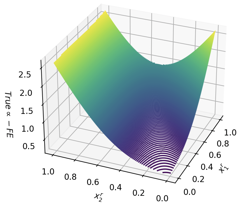
## 3D Surface Plot: Relationship Between x₁, x₂, and True α - FE
### Overview
The image depicts a 3D surface plot illustrating the relationship between two input variables (x₁ and x₂) and a response variable labeled "True α - FE." The plot uses a color gradient (purple to yellow) to represent magnitude, with contour lines overlaid to emphasize gradients. The surface exhibits a saddle-like shape, with peaks at the corners of the input space and a trough at the center.
---
### Components/Axes
1. **Axes**:
- **x₁ (Horizontal Axis, Right)**: Ranges from 0.0 to 1.0 in increments of 0.2.
- **x₂ (Horizontal Axis, Bottom)**: Ranges from 0.0 to 1.0 in increments of 0.2.
- **True α - FE (Vertical Axis, Left)**: Ranges from 0.0 to 2.5 in increments of 0.5.
2. **Surface**:
- **Color Gradient**: Purple (low values) to yellow (high values), indicating the magnitude of "True α - FE."
- **Contour Lines**: Purple lines overlaid on the surface, denser near the trough and sparser near peaks.
3. **Grid**: Gray grid lines define the 3D coordinate system.
---
### Detailed Analysis
1. **Surface Shape**:
- **Peaks**: Located at the corners of the input space:
- (x₁ = 0.0, x₂ = 0.0): True α - FE ≈ 2.5 (yellow).
- (x₁ = 1.0, x₂ = 1.0): True α - FE ≈ 2.5 (yellow).
- **Trough**: Located at the center (x₁ = 0.5, x₂ = 0.5): True α - FE ≈ 0.0 (dark purple).
- **Gradients**: The surface transitions smoothly between peaks and trough, with steeper gradients near the trough (evidenced by dense contour lines).
2. **Color and Contour Correlation**:
- Purple regions (low values) dominate the central trough.
- Yellow regions (high values) dominate the corners.
- Intermediate green-blue regions represent mid-range values (e.g., 1.0–1.5).
3. **Contour Line Density**:
- Denser near the trough (x₁ = 0.5, x₂ = 0.5), indicating rapid changes in "True α - FE."
- Sparser near peaks, reflecting flatter gradients.
---
### Key Observations
1. **Saddle Shape**: The surface forms a saddle, with opposing concavities along the x₁ and x₂ axes.
2. **Extreme Values**: Maximum "True α - FE" occurs at the input extremes (0,0) and (1,1).
3. **Optimal Point**: Minimum "True α - FE" (0.0) occurs at the center (0.5, 0.5).
4. **Gradient Behavior**: The steepest changes occur near the trough, while the peaks exhibit minimal variation.
---
### Interpretation
This plot likely represents a function where "True α - FE" depends nonlinearly on x₁ and x₂. The saddle shape suggests a trade-off: increasing one input variable while decreasing the other leads to opposing effects on the response. The trough at (0.5, 0.5) implies an optimal balance between x₁ and x₂ to minimize "True α - FE," while the peaks indicate scenarios where imbalanced inputs maximize the response. The color gradient and contour lines provide intuitive visualization of how small changes in inputs propagate through the system, with the steepest sensitivity near the optimal point. This could inform optimization strategies or sensitivity analysis in systems governed by such relationships.