## Bar Chart: CiteME Papers by Year Published
### Overview
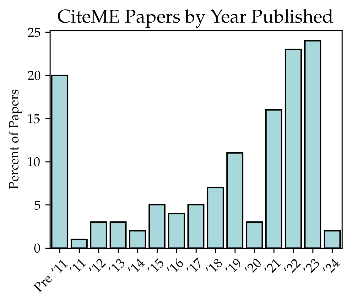
The image is a bar chart displaying the percentage of CiteME papers published per year, from "Pre '11" to "2024". The y-axis represents the "Percent of Papers," ranging from 0 to 25. The bars are light blue with black outlines.
### Components/Axes
* **Title:** CiteME Papers by Year Published
* **Y-axis:** Percent of Papers, ranging from 0 to 25 in increments of 5.
* **X-axis:** Year Published, with categories: Pre '11, '11, '12, '13, '14, '15, '16, '17, '18, '19, '20, '21, '22, '23, '24.
* **Bars:** Light blue with black outlines, representing the percentage of papers published in each year.
### Detailed Analysis
Here's a breakdown of the approximate percentage for each year:
* **Pre '11:** 20%
* **'11:** 1%
* **'12:** 3%
* **'13:** 3%
* **'14:** 2%
* **'15:** 5%
* **'16:** 4%
* **'17:** 5%
* **'18:** 7%
* **'19:** 11%
* **'20:** 3%
* **'21:** 16%
* **'22:** 23%
* **'23:** 24%
* **'24:** 2%
### Key Observations
* There is a significant increase in the percentage of papers published from 2011 to 2023, with peaks in 2022 and 2023.
* The percentage of papers published before 2011 is relatively high.
* There is a noticeable dip in the percentage of papers published in 2024.
* The years 2011, 2012, 2013, 2014, 2016, and 2020 have relatively low percentages of papers published.
### Interpretation
The bar chart indicates a growing interest and activity in CiteME research over the years, particularly in the early 2020s. The high percentage of papers published before 2011 suggests a strong foundation, while the recent surge indicates a potential boom in the field. The dip in 2024 could be due to incomplete data for that year or a temporary slowdown in publications. The low percentages in certain years (e.g., 2011, 2014, 2020) might be attributed to specific events, funding cycles, or other factors affecting research output. Overall, the chart suggests a dynamic and evolving landscape for CiteME research.