\n
## Heatmap: Classification Accuracies
### Overview
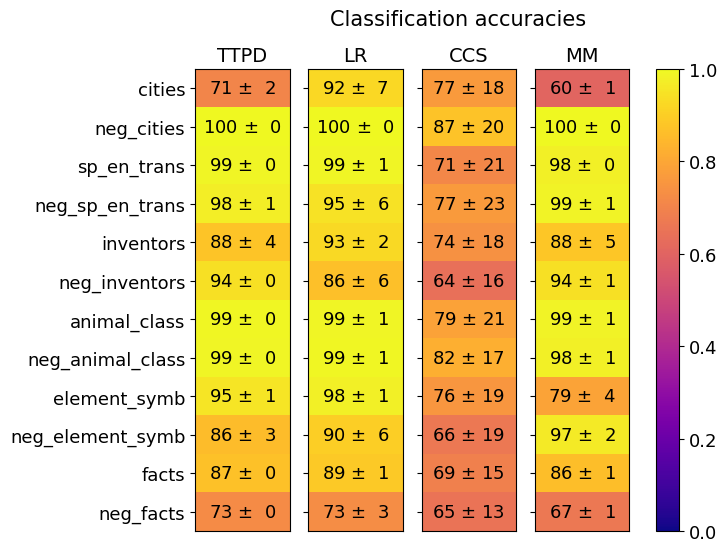
The image is a heatmap titled "Classification accuracies" that compares the performance of four different methods or models (TTPD, LR, CCS, MM) across twelve distinct classification tasks or datasets. Each cell displays a mean accuracy percentage followed by a standard deviation (±). The color of each cell corresponds to its accuracy value, mapped to a vertical color bar on the right side of the chart that ranges from 0.0 (dark purple) to 1.0 (bright yellow).
### Components/Axes
* **Title:** "Classification accuracies" (centered at the top).
* **Column Headers (Methods/Models):** Four columns labeled from left to right: `TTPD`, `LR`, `CCS`, `MM`.
* **Row Labels (Tasks/Datasets):** Twelve rows labeled from top to bottom:
1. `cities`
2. `neg_cities`
3. `sp_en_trans`
4. `neg_sp_en_trans`
5. `inventors`
6. `neg_inventors`
7. `animal_class`
8. `neg_animal_class`
9. `element_symb`
10. `neg_element_symb`
11. `facts`
12. `neg_facts`
* **Color Scale/Legend:** A vertical bar on the right side of the chart. The scale runs from 0.0 at the bottom (dark purple) to 1.0 at the top (bright yellow). Intermediate colors include red/orange around 0.5-0.7 and yellow-green above 0.8.
* **Data Cells:** Each cell contains text in the format `[Accuracy] ± [Standard Deviation]`. The background color of the cell is determined by the accuracy value.
### Detailed Analysis
The following table reconstructs the data presented in the heatmap. Values are percentages.
| Task/Dataset | TTPD Accuracy | LR Accuracy | CCS Accuracy | MM Accuracy |
| :--- | :--- | :--- | :--- | :--- |
| **cities** | 71 ± 2 | 92 ± 7 | 77 ± 18 | 60 ± 1 |
| **neg_cities** | 100 ± 0 | 100 ± 0 | 87 ± 20 | 100 ± 0 |
| **sp_en_trans** | 99 ± 0 | 99 ± 1 | 71 ± 21 | 98 ± 0 |
| **neg_sp_en_trans** | 98 ± 1 | 95 ± 6 | 77 ± 23 | 99 ± 1 |
| **inventors** | 88 ± 4 | 93 ± 2 | 74 ± 18 | 88 ± 5 |
| **neg_inventors** | 94 ± 0 | 86 ± 6 | 64 ± 16 | 94 ± 1 |
| **animal_class** | 99 ± 0 | 99 ± 1 | 79 ± 21 | 99 ± 1 |
| **neg_animal_class** | 99 ± 0 | 99 ± 1 | 82 ± 17 | 98 ± 1 |
| **element_symb** | 95 ± 1 | 98 ± 1 | 76 ± 19 | 79 ± 4 |
| **neg_element_symb** | 86 ± 3 | 90 ± 6 | 66 ± 19 | 97 ± 2 |
| **facts** | 87 ± 0 | 89 ± 1 | 69 ± 15 | 86 ± 1 |
| **neg_facts** | 73 ± 0 | 73 ± 3 | 65 ± 13 | 67 ± 1 |
**Visual Trend Verification by Column:**
* **TTPD:** Predominantly high accuracy (yellow cells), with notable dips for `cities` (71%) and `neg_facts` (73%).
* **LR:** Consistently high accuracy (yellow cells), with the lowest scores for `neg_inventors` (86%) and `neg_facts` (73%).
* **CCS:** Shows the lowest overall performance and highest variability (more orange/red cells). Accuracies are generally 10-30 percentage points lower than the other methods, with very high standard deviations (often ±15 to ±23).
* **MM:** High accuracy across most tasks (yellow cells), similar to TTPD and LR. The lowest scores are for `cities` (60%) and `neg_facts` (67%).
### Key Observations
1. **Performance Disparity:** The `CCS` method is a clear outlier, performing significantly worse and with much higher uncertainty (larger standard deviations) than `TTPD`, `LR`, and `MM` across all tasks.
2. **Task Difficulty:** The `neg_facts` task appears to be the most challenging, yielding the lowest or near-lowest scores for all four methods (73%, 73%, 65%, 67%). The `cities` task is also relatively difficult for `TTPD` and `MM`.
3. **Near-Perfect Performance:** The `neg_cities` task is solved with perfect or near-perfect accuracy (100 ± 0) by `TTPD`, `LR`, and `MM`. The `animal_class` and `neg_animal_class` tasks also show near-perfect results for these three methods.
4. **High Variability in CCS:** The standard deviations for `CCS` are an order of magnitude larger than for the other methods, indicating its performance is highly unstable or sensitive to the specific data split or run.
5. **Negation Pattern:** There is no consistent pattern where "neg_" (negation) tasks are universally harder. For example, `neg_cities` is easier than `cities` for all methods, while `neg_facts` is harder than `facts` for all methods.
### Interpretation
This heatmap provides a comparative benchmark of four classification methods. The data strongly suggests that **TTPD, LR, and MM are robust, high-performing, and stable methods** for the given set of tasks, achieving accuracies often above 90% with minimal variance. They appear to be reliable choices.
In contrast, **CCS is demonstrably inferior** for this specific evaluation. Its low mean accuracies and high standard deviations suggest it may be an ill-suited model for these tasks, suffers from high variance in training, or was perhaps evaluated under different, less favorable conditions. The high uncertainty makes its reported accuracy less trustworthy.
The variation in task difficulty (e.g., `neg_cities` vs. `neg_facts`) implies that the underlying datasets or problem definitions differ significantly in complexity or the models' familiarity with the concepts. The perfect scores on `neg_cities` might indicate a trivial or highly predictable pattern in that specific dataset. Overall, this chart would guide a researcher to prefer TTPD, LR, or MM for deployment on similar tasks and to investigate the causes of CCS's poor and unstable performance.