\n
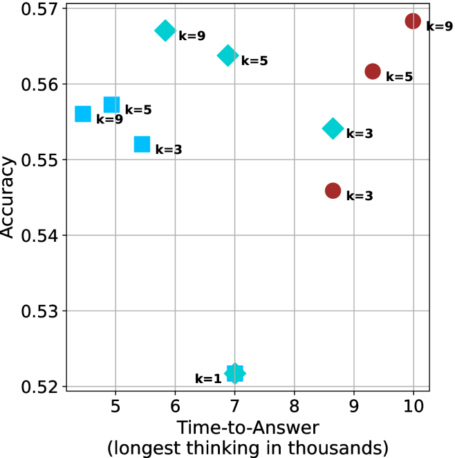
## Scatter Plot: Accuracy vs. Time-to-Answer with k-Value Differentiation
### Overview
This image presents a scatter plot illustrating the relationship between Accuracy and Time-to-Answer, with data points differentiated by the 'k' value. The x-axis represents Time-to-Answer in thousands of units, and the y-axis represents Accuracy. Each data point is a diamond shape, colored either red or blue, and labeled with its corresponding 'k' value.
### Components/Axes
* **X-axis:** Time-to-Answer (longest thinking in thousands) - Scale ranges from approximately 5 to 10.
* **Y-axis:** Accuracy - Scale ranges from approximately 0.52 to 0.57.
* **Data Points:** Diamond-shaped markers, colored red and blue.
* **Labels:** Each data point is labeled with "k=" followed by a numerical value (1, 3, 5, 9).
* **Color Coding:**
* Blue diamonds represent k values of 1, 3, 5, and 9.
* Red diamonds represent k values of 3, 5, and 9.
### Detailed Analysis
The plot contains data points for k values of 1, 3, 5, and 9. Let's analyze each k value's data points:
* **k=1:** One blue diamond located at approximately (6.3, 0.52).
* **k=3:** Two data points:
* One blue diamond located at approximately (5.8, 0.55).
* One red diamond located at approximately (9.2, 0.54).
* **k=5:** Two data points:
* One blue diamond located at approximately (6.7, 0.56).
* One red diamond located at approximately (9.5, 0.56).
* **k=9:** Two data points:
* One blue diamond located at approximately (5.3, 0.56).
* One red diamond located at approximately (10.0, 0.57).
**Trends:**
* Generally, as Time-to-Answer increases, Accuracy tends to increase, but this is not a strict linear relationship.
* For lower Time-to-Answer values (around 5.5-6.5), Accuracy is relatively stable around 0.55-0.56.
* For higher Time-to-Answer values (around 9-10), Accuracy is also relatively stable around 0.56-0.57.
### Key Observations
* There is overlap in data points for k=3, k=5, and k=9, with both red and blue diamonds present for each of these values.
* k=1 has only one data point, making it difficult to draw conclusions about its trend.
* The red and blue diamonds for the same k value do not necessarily have similar Accuracy or Time-to-Answer values. For example, k=3 has a blue point at (5.8, 0.55) and a red point at (9.2, 0.54).
### Interpretation
The data suggests that there is a trade-off between Time-to-Answer and Accuracy. Increasing the Time-to-Answer generally leads to higher Accuracy, but the relationship is not perfectly correlated. The 'k' value appears to influence this relationship, but the effect is complex. The presence of both red and blue diamonds for k=3, 5, and 9 indicates that the color coding (which is not explained in the image) represents another variable or condition that affects the Accuracy and Time-to-Answer.
The scatter plot could be representing the performance of a model or system with a parameter 'k' that controls its complexity or processing time. The red and blue colors might represent different configurations or datasets used to evaluate the model. The fact that higher Time-to-Answer values generally correspond to higher Accuracy suggests that more complex or time-consuming processing can lead to better results, but the benefits may diminish beyond a certain point. The outliers (points that deviate significantly from the general trend) could indicate specific cases where the model performs particularly well or poorly.