## Scatter Plot: Accuracy vs. Time-to-Answer for Different 'k' Values
### Overview
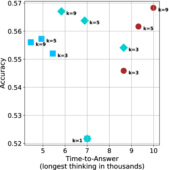
The image is a scatter plot comparing model accuracy against the time taken to generate an answer (measured in thousands of thinking steps). The plot displays data points for three distinct model configurations, differentiated by marker shape and color, across various 'k' values (likely a parameter such as the number of reasoning steps or candidates considered).
### Components/Axes
* **X-Axis:** Labeled **"Time-to-Answer (longest thinking in thousands)"**. The scale runs from approximately 4.5 to 10.5, with major gridlines at intervals of 1 (5, 6, 7, 8, 9, 10).
* **Y-Axis:** Labeled **"Accuracy"**. The scale runs from 0.52 to 0.57, with major gridlines at intervals of 0.01.
* **Data Series & Legend (Inferred from markers):**
* **Series 1 (Light Blue Squares):** Represents one model configuration.
* **Series 2 (Cyan Diamonds):** Represents a second model configuration.
* **Series 3 (Dark Red Circles):** Represents a third model configuration.
* **Data Point Labels:** Each marker is annotated with a text label indicating its 'k' value (e.g., "k=1", "k=3", "k=5", "k=9").
### Detailed Analysis
**Data Points (Approximate Coordinates & Labels):**
* **Light Blue Squares:**
* Point 1: (x ≈ 4.7, y ≈ 0.556) - Label: **k=9**
* Point 2: (x ≈ 5.0, y ≈ 0.557) - Label: **k=5**
* Point 3: (x ≈ 5.5, y ≈ 0.552) - Label: **k=3**
* **Cyan Diamonds:**
* Point 4: (x ≈ 5.8, y ≈ 0.567) - Label: **k=9**
* Point 5: (x ≈ 7.0, y ≈ 0.564) - Label: **k=5**
* Point 6: (x ≈ 7.0, y ≈ 0.522) - Label: **k=1** (This is the lowest accuracy point on the chart).
* Point 7: (x ≈ 8.6, y ≈ 0.554) - Label: **k=3**
* **Dark Red Circles:**
* Point 8: (x ≈ 8.6, y ≈ 0.546) - Label: **k=3**
* Point 9: (x ≈ 9.3, y ≈ 0.562) - Label: **k=5**
* Point 10: (x ≈ 10.0, y ≈ 0.568) - Label: **k=9** (This is the highest accuracy and highest time-to-answer point).
**Trend Verification:**
* **Light Blue Squares:** The trend is not strictly linear. Accuracy is highest for k=5 and k=9 at lower time costs (~4.7-5.0), then dips for k=3 at a slightly higher time (~5.5).
* **Cyan Diamonds:** Shows a complex, non-monotonic relationship. The highest accuracy (k=9) occurs at a moderate time (~5.8). Accuracy drops for k=5 at higher time (~7.0), plummets for k=1 at the same time, and recovers partially for k=3 at an even higher time (~8.6).
* **Dark Red Circles:** Shows a clear positive trend. As time-to-answer increases from ~8.6 to 10.0, accuracy consistently increases from ~0.546 to ~0.568 for k=3, k=5, and k=9 respectively.
### Key Observations
1. **Performance Clusters:** The three marker types occupy distinct regions of the time-accuracy space. Light blue squares are clustered in the low-time, mid-accuracy region. Cyan diamonds are spread across the middle-time range with high variance in accuracy. Dark red circles are clustered in the high-time, high-accuracy region.
2. **The k=1 Outlier:** The cyan diamond labeled "k=1" is a significant outlier, showing the lowest accuracy (~0.522) despite a moderate time cost (~7.0), suggesting this configuration is highly inefficient.
3. **Highest Achiever:** The dark red circle (k=9) at (10.0, 0.568) achieves the peak accuracy but at the highest computational cost.
4. **Efficiency Frontier:** The most efficient points (high accuracy for low time) appear to be the light blue square (k=9) and the cyan diamond (k=9), both achieving accuracy >0.555 with time-to-answer <6.0.
### Interpretation
This chart visualizes the **trade-off between computational cost (time) and performance (accuracy)** for different model settings. The 'k' parameter significantly influences this trade-off.
* **Diminishing Returns:** For the dark red circle series, increasing 'k' from 3 to 9 yields a clear accuracy gain but requires a substantial increase in thinking time. This suggests a region of diminishing returns where more computation leads to better, but not proportionally better, results.
* **Configuration Matters More Than k:** The stark separation between the three marker series indicates that the underlying model configuration (represented by shape/color) is a more fundamental determinant of the time-accuracy profile than the 'k' value alone. A cyan diamond with k=9 is far more efficient than a dark red circle with k=3.
* **The Cost of Low k:** The poor performance of the k=1 point suggests that a minimum level of reasoning or search (a higher 'k') is necessary for competent performance. Setting k too low cripples accuracy without saving meaningful time compared to better configurations.
* **Strategic Choice:** The optimal choice depends on the priority. For speed-critical applications, a light blue square configuration with k=5 or k=9 is optimal. For maximum accuracy regardless of cost, the dark red circle with k=9 is the choice. The cyan diamond series offers a middle ground but with unpredictable performance at certain 'k' values.
In essence, the chart is a tool for **resource allocation**, helping to select the model configuration and 'k' parameter that best balances the need for quick answers against the need for correct answers.