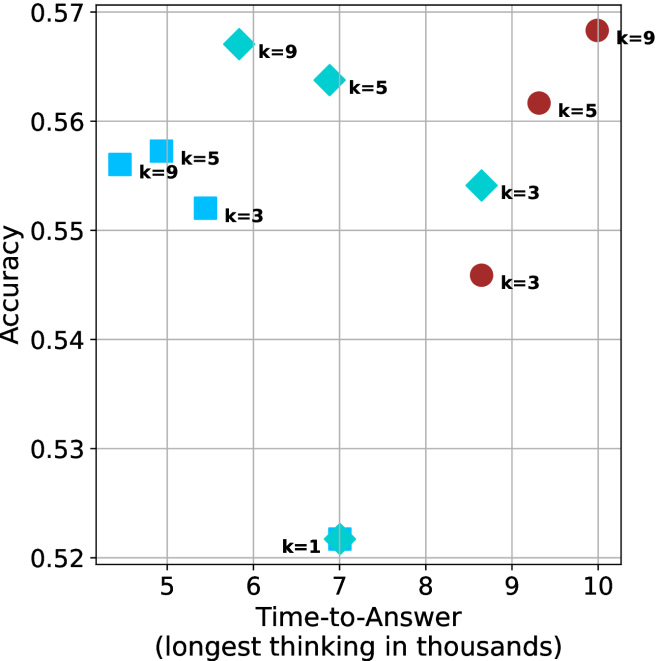
## Scatter Plot: Accuracy vs. Time-to-Answer for Different k Values
### Overview
The image is a scatter plot comparing **accuracy** (y-axis) and **time-to-answer** (x-axis, in thousands of units) for different values of a parameter **k**. Data points are differentiated by color and shape, with a legend indicating the mapping of **k** values to visual properties.
---
### Components/Axes
- **X-axis (Time-to-Answer)**: Labeled "Time-to-Answer (longest thinking in thousands)", ranging from 5 to 10.
- **Y-axis (Accuracy)**: Labeled "Accuracy", ranging from 0.52 to 0.57.
- **Legend**: Located on the right side of the plot. It maps:
- **k=1**: Hexagon (teal)
- **k=3**: Square (blue) and Circle (red)
- **k=5**: Diamond (cyan) and Square (blue)
- **k=9**: Diamond (cyan) and Circle (red)
- **Data Points**: Each point is annotated with its **k** value (e.g., "k=5").
---
### Detailed Analysis
#### Data Points by k Value
1. **k=1**:
- Single hexagon at (7, 0.52).
2. **k=3**:
- Blue square at (5, 0.555).
- Blue square at (5.5, 0.555).
- Red circle at (9.2, 0.545).
3. **k=5**:
- Cyan diamond at (6, 0.565).
- Cyan diamond at (6.5, 0.562).
- Blue square at (5.2, 0.555).
- Blue square at (5.8, 0.555).
4. **k=9**:
- Cyan diamond at (8.8, 0.56).
- Red circle at (9.8, 0.57).
---
### Key Observations
1. **k=1** has the lowest accuracy (0.52) and moderate time-to-answer (7).
2. **k=3** shows moderate accuracy (0.545–0.555) with shorter time-to-answer (5–9.2).
3. **k=5** achieves higher accuracy (0.555–0.565) but with slightly longer time-to-answer (5.2–6.5).
4. **k=9** has the highest accuracy (0.56–0.57) but the longest time-to-answer (8.8–10).
5. **Color-Shape Consistency**:
- Cyan diamonds and red circles are consistently used for **k=5** and **k=9**, respectively.
- Blue squares are used for **k=3** and **k=5**.
---
### Interpretation
- **Trade-off Between Accuracy and Speed**: Higher **k** values (e.g., 9) improve accuracy but increase time-to-answer, suggesting a computational cost for precision.
- **Outliers**: The **k=9** point at (10, 0.57) represents the optimal accuracy but is the slowest, indicating potential inefficiency in extreme cases.
- **Clustering**: Lower **k** values (1–3) cluster in the lower-left quadrant, while higher **k** values (5–9) dominate the upper-right quadrant.
- **Legend Ambiguity**: The legend uses overlapping shapes (e.g., squares for both k=3 and k=5), which could cause confusion without explicit color differentiation.
---
### Conclusion
The plot demonstrates that increasing **k** improves accuracy at the expense of longer processing time. This trade-off is critical for applications requiring real-time performance versus high precision. The use of overlapping shapes in the legend may obscure quick identification of **k** values, suggesting a need for clearer visual encoding.