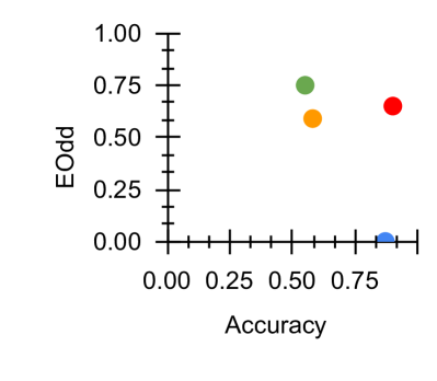
## Scatter Plot: Accuracy vs. EOdd
### Overview
The image is a simple scatter plot displaying four data points on a Cartesian coordinate system. The plot compares two metrics: "Accuracy" on the horizontal axis and "EOdd" on the vertical axis. Both axes use a linear scale ranging from 0.00 to 1.00. The data points are represented by four distinct colored circles (green, orange, red, blue), but no legend is provided to define what each color represents.
### Components/Axes
* **X-Axis (Horizontal):**
* **Label:** "Accuracy"
* **Scale:** Linear, from 0.00 to 1.00.
* **Major Tick Marks:** 0.00, 0.25, 0.50, 0.75, 1.00.
* **Y-Axis (Vertical):**
* **Label:** "EOdd"
* **Scale:** Linear, from 0.00 to 1.00.
* **Major Tick Marks:** 0.00, 0.25, 0.50, 0.75, 1.00.
* **Data Series:** Four colored points. There is no legend, title, or other explanatory text within the plot area.
### Detailed Analysis
The plot contains four data points. Their approximate positions, determined by visual alignment with the axis tick marks, are as follows:
1. **Green Point:**
* **Position:** Upper-middle region of the plot.
* **Approximate Coordinates:** Accuracy ≈ 0.55, EOdd ≈ 0.75.
2. **Orange Point:**
* **Position:** Slightly to the right and below the green point.
* **Approximate Coordinates:** Accuracy ≈ 0.60, EOdd ≈ 0.60.
3. **Red Point:**
* **Position:** Upper-right region of the plot.
* **Approximate Coordinates:** Accuracy ≈ 0.85, EOdd ≈ 0.65.
4. **Blue Point:**
* **Position:** Bottom-right corner of the plot.
* **Approximate Coordinates:** Accuracy ≈ 0.90, EOdd ≈ 0.05.
**Trend Verification:** There is no single, clear linear trend across all four points. The green, orange, and red points are clustered in the upper half of the EOdd range (0.60-0.75) across a mid-to-high Accuracy range (0.55-0.85). The blue point is a significant outlier, showing very high Accuracy but a near-zero EOdd value.
### Key Observations
* **Clustering vs. Outlier:** Three points (green, orange, red) form a loose cluster with moderate-to-high values for both metrics. The blue point is isolated in the bottom-right, indicating a case of high Accuracy coupled with very low EOdd.
* **Missing Context:** The lack of a legend, chart title, or definitions for "Accuracy" and "EOdd" prevents a definitive understanding of what the data represents. "EOdd" is not a standard, universally recognized metric.
* **Spatial Distribution:** The points are not evenly distributed. There is a gap in the lower-left quadrant (low Accuracy, low EOdd) and the upper-left quadrant (low Accuracy, high EOdd).
### Interpretation
This scatter plot visualizes the relationship between two variables, "Accuracy" and "EOdd," for four distinct entities (e.g., models, experiments, categories). The data suggests that for most observed cases (the green, orange, and red points), a moderate-to-high Accuracy score is associated with a moderate-to-high EOdd score. However, the blue point represents a critical anomaly or a different class of entity where high Accuracy is achieved with a minimal EOdd value.
Without definitions, "EOdd" could represent a measure of error, oddity, deviation, or a specific domain metric. The plot's primary message is the existence of this outlier (blue point), which behaves fundamentally differently from the others. It prompts investigation into why this particular case achieves high Accuracy while minimizing EOdd, or conversely, what causes the other three cases to have a higher EOdd despite similar or lower Accuracy. The chart effectively highlights a dichotomy or a trade-off between the two metrics for the entities being compared.