\n
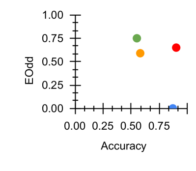
## Scatter Plot: Accuracy vs. Odd
### Overview
This image presents a scatter plot visualizing the relationship between "Accuracy" and "Odd". The plot contains five data points, each represented by a different colored circle. The axes are labeled, and the plot appears to be assessing the performance of a model or system based on these two metrics.
### Components/Axes
* **X-axis:** "Accuracy", ranging from 0.00 to 0.75, with tick marks at 0.00, 0.25, 0.50, and 0.75.
* **Y-axis:** "Odd", ranging from 0.00 to 1.00, with tick marks at 0.00, 0.25, 0.50, 0.75, and 1.00.
* **Data Points:** Five distinct colored circles representing individual data points. No legend is provided, so the meaning of each color is inferred from their position.
### Detailed Analysis
The data points are as follows (approximate values based on visual estimation):
* **Blue Circle:** Located at approximately (0.75, 0.00).
* **Orange Circle:** Located at approximately (0.50, 0.50).
* **Green Circle:** Located at approximately (0.50, 0.75).
* **Red Circle:** Located at approximately (0.75, 0.65).
* **Light Blue Circle:** Located at approximately (0.00, 0.00).
There is no clear trend visible in the data. The points are scattered across the plot area.
### Key Observations
* The light blue point is at the origin (0,0).
* The green point has the highest "Odd" value, at approximately 0.75.
* The blue point has the lowest "Odd" value, at approximately 0.00.
* The red and green points have similar "Odd" values.
* The orange point is positioned centrally in the plot.
### Interpretation
The scatter plot suggests there is no strong linear correlation between "Accuracy" and "Odd". The data points are dispersed, indicating that higher accuracy does not necessarily correspond to a higher or lower "Odd" value, and vice versa. The meaning of "Odd" is unclear without additional context. It could represent a probability, an odds ratio, or another metric related to the performance or characteristics of the system being evaluated. The point at the origin (0,0) suggests a scenario where both accuracy and "Odd" are minimal. The lack of a clear trend implies that these two metrics are relatively independent or influenced by other factors not represented in this plot. Further investigation would be needed to understand the significance of "Odd" and the underlying reasons for the observed distribution of data points.