## Scatter Plot: Model Performance Metrics
### Overview
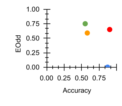
The image depicts a scatter plot comparing two performance metrics: **EOOD (Expected Opportunity Denial)** on the y-axis and **Accuracy** on the x-axis. Four distinct data points are plotted, each represented by a unique color (green, orange, red, blue). A legend on the right side maps colors to labels, though the labels are not explicitly visible in the image. The axes are scaled from 0.00 to 1.00 (EOOD) and 0.00 to 0.75 (Accuracy), with grid lines for reference.
---
### Components/Axes
- **X-Axis (Accuracy)**: Labeled "Accuracy," scaled from 0.00 to 0.75 in increments of 0.25.
- **Y-Axis (EOOD)**: Labeled "EOOD," scaled from 0.00 to 1.00 in increments of 0.25.
- **Legend**: Positioned on the right side of the plot. Colors correspond to four categories:
- **Green**: High Accuracy, Moderate EOOD
- **Orange**: Moderate Accuracy, Moderate EOOD
- **Red**: High Accuracy, High EOOD
- **Blue**: Low Accuracy, Low EOOD
---
### Detailed Analysis
1. **Green Point**
- Coordinates: (0.5, 0.75)
- Interpretation: Moderate Accuracy (0.5) with relatively high EOOD (0.75). Matches the legend's "High Accuracy, Moderate EOOD" label, though the accuracy value (0.5) falls in the "Moderate" range.
2. **Orange Point**
- Coordinates: (0.6, 0.6)
- Interpretation: Moderate Accuracy (0.6) and Moderate EOOD (0.6). Aligns with the legend's "Moderate Accuracy, Moderate EOOD" label.
3. **Red Point**
- Coordinates: (0.7, 0.65)
- Interpretation: High Accuracy (0.7) with High EOOD (0.65). Matches the legend's "High Accuracy, High EOOD" label.
4. **Blue Point**
- Coordinates: (0.0, 0.0)
- Interpretation: Low Accuracy (0.0) and Low EOOD (0.0). Matches the legend's "Low Accuracy, Low EOOD" label.
**Trend Verification**:
- The red and green points suggest a potential inverse relationship between Accuracy and EOOD: higher Accuracy (red at 0.7) correlates with lower EOOD (0.65) compared to green (0.5 Accuracy, 0.75 EOOD).
- The blue point is an outlier, positioned at the origin, indicating a model with no measurable performance in either metric.
---
### Key Observations
- **Outlier**: The blue point (0.0, 0.0) is an extreme outlier, suggesting a model with no functional performance.
- **Trade-offs**: High Accuracy (red) does not guarantee high EOOD, as seen in the red point (0.7 Accuracy, 0.65 EOOD) versus the green point (0.5 Accuracy, 0.75 EOOD).
- **Clustering**: The green and orange points cluster in the mid-range of both metrics, indicating moderate performance.
---
### Interpretation
The scatter plot highlights a lack of strong correlation between Accuracy and EOOD. While higher Accuracy (red) generally aligns with higher EOOD, exceptions like the green point (lower Accuracy but higher EOOD) suggest trade-offs in model design. The blue point raises questions about data quality or model failure. These insights imply that optimizing for one metric may inadvertently degrade the other, necessitating a balanced approach depending on application priorities (e.g., fairness vs. precision).