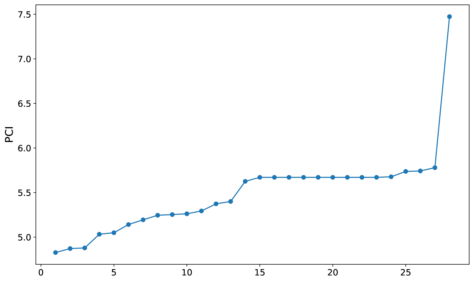
## Line Chart: PCI Trend
### Overview
The image is a line chart displaying the trend of PCI (likely an index or metric) over a series of data points. The x-axis is unlabeled but appears to represent a sequence of observations or categories, while the y-axis represents the PCI value. The line shows a generally increasing trend with a significant spike at the end.
### Components/Axes
* **X-axis:** Numerical, ranging from 0 to approximately 28, with no explicit label. Assumed to represent a sequence or index.
* **Y-axis:** Labeled "PCI", ranging from 5.0 to 7.5, with increments of 0.5.
* **Data Series:** A single blue line connecting data points.
### Detailed Analysis
The blue line represents the PCI values.
* **Initial Trend:** From x=0 to x=14, the PCI value increases gradually.
* At x=0, PCI is approximately 4.85.
* At x=2, PCI is approximately 4.88.
* At x=4, PCI is approximately 5.04.
* At x=6, PCI is approximately 5.05.
* At x=8, PCI is approximately 5.2.
* At x=10, PCI is approximately 5.26.
* At x=12, PCI is approximately 5.38.
* At x=14, PCI is approximately 5.64.
* **Plateau:** From x=14 to x=26, the PCI value remains relatively constant, hovering around 5.67.
* At x=16, PCI is approximately 5.67.
* At x=18, PCI is approximately 5.67.
* At x=20, PCI is approximately 5.67.
* At x=22, PCI is approximately 5.67.
* At x=24, PCI is approximately 5.67.
* At x=26, PCI is approximately 5.75.
* **Sharp Increase:** From x=26 to x=28, the PCI value increases sharply.
* At x=28, PCI is approximately 7.45.
### Key Observations
* The PCI value starts around 4.85 and gradually increases to approximately 5.67.
* There is a period of stability where the PCI remains almost constant.
* A significant spike occurs at the end of the sequence, with the PCI jumping to approximately 7.45.
### Interpretation
The chart suggests that the PCI value experienced an initial growth phase, followed by a period of stabilization. The final, sharp increase indicates a significant event or change that dramatically improved the PCI value at the end of the observed sequence. The x-axis likely represents time or a series of interventions, and the spike suggests a highly effective intervention or a major positive change in the underlying system being measured by the PCI.