## Line Chart: PCI Values over Sequence
### Overview
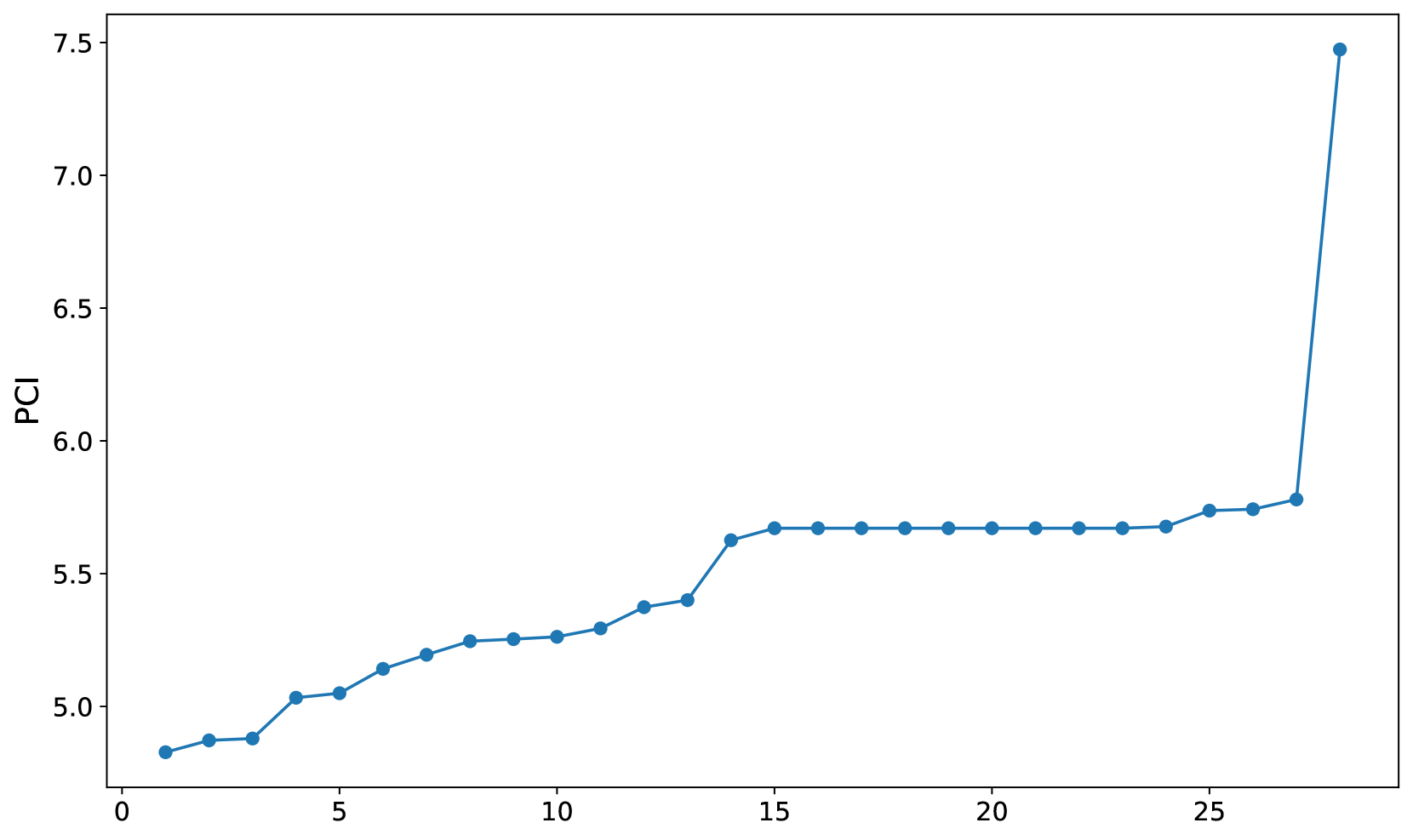
The image displays a line chart with a single data series plotted against an unlabeled sequential index. The chart illustrates a monotonic increase in "PCI" values, characterized by a gradual initial rise, a significant plateau in the middle range, and a sharp, extreme outlier at the final data point.
### Components/Axes
* **Y-Axis:** Labeled "PCI". The scale ranges from 4.5 to 7.5, with major tick marks at intervals of 0.5.
* **X-Axis:** Unlabeled. The scale ranges from 0 to 25, with major tick marks at intervals of 5.
* **Data Series:** A single blue line connecting 28 distinct circular data points.
* **Spatial Positioning:**
* The "PCI" label is centered vertically on the left Y-axis.
* The X-axis labels (0, 5, 10, 15, 20, 25) are positioned along the bottom.
* The data series spans from X=1 to X=28.
### Detailed Analysis
The data appears to be sorted in ascending order, which is a common technique for visualizing the distribution of a dataset. Below is the approximate extraction of the Y-values (PCI) for each sequential X-index.
| X-Index | Approximate PCI Value |
| :--- | :--- |
| 1 | 4.83 |
| 2 | 4.88 |
| 3 | 4.89 |
| 4 | 5.03 |
| 5 | 5.05 |
| 6 | 5.15 |
| 7 | 5.20 |
| 8 | 5.25 |
| 9 | 5.26 |
| 10 | 5.27 |
| 11 | 5.30 |
| 12 | 5.38 |
| 13 | 5.41 |
| 14 | 5.64 |
| 15 | 5.68 |
| 16 | 5.68 |
| 17 | 5.68 |
| 18 | 5.68 |
| 19 | 5.68 |
| 20 | 5.68 |
| 21 | 5.68 |
| 22 | 5.68 |
| 23 | 5.68 |
| 24 | 5.69 |
| 25 | 5.74 |
| 26 | 5.75 |
| 27 | 5.78 |
| 28 | 7.48 |
### Key Observations
* **Trend:** The data exhibits a clear upward trend.
* **Plateau:** There is a distinct, flat region between X=15 and X=23, where the PCI value remains constant at approximately 5.68. This indicates that a significant portion of the dataset (roughly 32% of the points) shares an identical value.
* **Outlier:** The final data point (X=28) represents a significant deviation from the trend. While the previous point (X=27) is at ~5.78, the final point jumps to ~7.48. This is a ~29% increase from the previous value, marking it as a severe outlier.
### Interpretation
* **Data Nature:** This chart is likely a "sorted plot" or a cumulative distribution visualization. By sorting the data, the creator is likely trying to show the distribution of PCI scores across a sample of 28 items.
* **Performance Clustering:** The long plateau (X=15 to X=23) suggests that the majority of the items in this set have very similar performance characteristics. This could represent a "standard" or "baseline" performance level for the items being measured.
* **The Outlier:** The extreme spike at X=28 is highly anomalous. In a technical context, this could represent:
* A "best-in-class" item that significantly outperforms the rest of the group.
* A data entry error or a measurement artifact.
* A different category of item that was included in the same dataset.
* **Conclusion:** The data suggests a system where most items perform within a narrow, predictable band (4.8 to 5.8), with one singular, high-performing exception.