\n
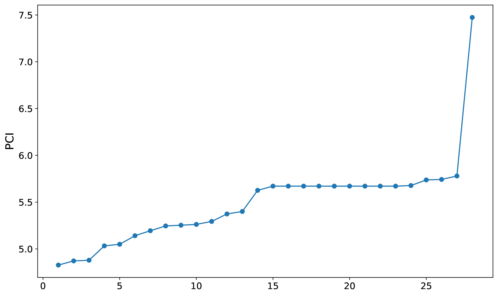
## Line Chart: PCI vs. Unspecified Variable
### Overview
The image presents a line chart displaying the relationship between an unspecified variable on the x-axis and a metric labeled "PCI" on the y-axis. The chart shows a generally increasing trend in PCI with some plateaus and a sharp increase at the very end.
### Components/Axes
* **X-axis:** Unlabeled, representing an independent variable. Scale ranges from approximately 0 to 28.
* **Y-axis:** Labeled "PCI". Scale ranges from approximately 4.7 to 7.6.
* **Data Series:** A single blue line representing the PCI values.
* **Data Points:** Circular markers are placed along the line to indicate specific data points.
### Detailed Analysis
The line begins at approximately (0, 4.8) and exhibits the following trend:
* **0 to 3:** A slight upward slope.
* **3 to 8:** A moderate increase in PCI.
* **8 to 12:** A continued, but less steep, increase.
* **12 to 15:** A sharp increase in PCI.
* **15 to 22:** A plateau, with PCI remaining relatively constant around 5.6.
* **22 to 25:** A slight increase.
* **25 to 28:** A very steep, almost vertical, increase in PCI.
Here's a reconstruction of approximate data points:
| X-Value | PCI Value (Approximate) |
|---|---|
| 0 | 4.8 |
| 2 | 4.9 |
| 3 | 5.0 |
| 5 | 5.1 |
| 7 | 5.2 |
| 8 | 5.3 |
| 10 | 5.4 |
| 12 | 5.5 |
| 14 | 5.6 |
| 15 | 5.65 |
| 16 | 5.65 |
| 17 | 5.65 |
| 18 | 5.65 |
| 19 | 5.65 |
| 20 | 5.65 |
| 21 | 5.65 |
| 22 | 5.7 |
| 24 | 5.75 |
| 25 | 5.8 |
| 28 | 7.4 |
### Key Observations
* The PCI values remain relatively stable between x-values of 15 and 22.
* The most significant change in PCI occurs between x-values of 25 and 28, indicating a rapid increase.
* The initial increase in PCI is gradual, becoming steeper around x-value 12.
### Interpretation
The chart suggests a relationship where the unspecified variable on the x-axis influences the PCI metric. The initial gradual increase could represent a period of slow accumulation or development. The plateau between 15 and 22 might indicate a saturation point or a period of stability. The dramatic increase at the end suggests a threshold has been crossed, leading to a significant change in PCI. Without knowing what the x-axis represents, it's difficult to provide a more specific interpretation. The data could represent a process where a certain input (x-axis) leads to a measurable output (PCI), and the chart illustrates how that output changes as the input varies. The final spike could be a critical event or a point of no return.