\n
## Line Chart: PCI vs. Unlabeled X-Axis
### Overview
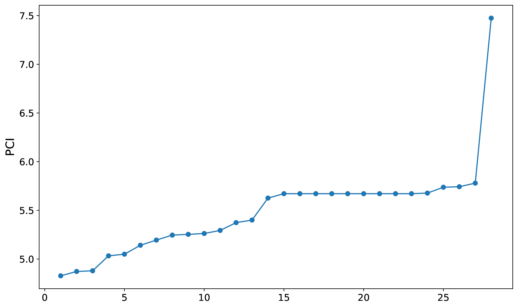
The image displays a simple line chart plotting a variable labeled "PCI" against an unlabeled numerical x-axis. The chart shows a single data series represented by a blue line with circular markers at each data point. The overall trend is a gradual increase, followed by a plateau, and concluding with a sharp, significant spike at the final data point.
### Components/Axes
* **Y-Axis:**
* **Label:** "PCI" (positioned vertically on the left side).
* **Scale:** Linear scale ranging from approximately 4.8 to 7.5.
* **Major Tick Marks:** Labeled at 5.0, 5.5, 6.0, 6.5, 7.0, and 7.5.
* **X-Axis:**
* **Label:** None present.
* **Scale:** Linear scale ranging from 0 to approximately 28.
* **Major Tick Marks:** Labeled at 0, 5, 10, 15, 20, and 25.
* **Data Series:**
* **Representation:** A single blue line connecting circular blue markers.
* **Legend:** None present.
* **Chart Area:** White background with a standard rectangular frame.
### Detailed Analysis
The data series consists of 29 distinct points (from x=0 to x=28). The following table reconstructs the approximate values, with uncertainty noted due to visual estimation from the chart's scale.
| X-Value (Approx.) | PCI Value (Approx.) | Trend Description |
| :--- | :--- | :--- |
| 0 | 4.8 | Starting point. |
| 1 | 4.85 | Slight increase. |
| 2 | 4.87 | Very slight increase. |
| 3 | 5.03 | Noticeable increase. |
| 4 | 5.05 | Slight increase. |
| 5 | 5.15 | Increase. |
| 6 | 5.20 | Increase. |
| 7 | 5.25 | Increase. |
| 8 | 5.27 | Slight increase. |
| 9 | 5.28 | Very slight increase. |
| 10 | 5.30 | Slight increase. |
| 11 | 5.38 | Increase. |
| 12 | 5.40 | Slight increase. |
| 13 | 5.62 | **Notable increase.** |
| 14 | 5.68 | Increase. |
| 15 | 5.68 | Plateau begins. |
| 16 | 5.68 | Plateau. |
| 17 | 5.68 | Plateau. |
| 18 | 5.68 | Plateau. |
| 19 | 5.68 | Plateau. |
| 20 | 5.68 | Plateau. |
| 21 | 5.68 | Plateau. |
| 22 | 5.68 | Plateau. |
| 23 | 5.68 | Plateau. |
| 24 | 5.75 | Slight increase, plateau ends. |
| 25 | 5.75 | Stable. |
| 26 | 5.78 | Slight increase. |
| 27 | 7.48 | **Dramatic, sharp spike.** |
**Trend Verification:**
1. **Phase 1 (x=0 to x=14):** The line shows a consistent, gradual upward slope. The rate of increase is modest but steady.
2. **Phase 2 (x=15 to x=23):** The line becomes perfectly horizontal, indicating a stable plateau where the PCI value remains constant at approximately 5.68.
3. **Phase 3 (x=24 to x=27):** The line resumes a slight upward trend before an extreme, near-vertical ascent at the final point (x=27).
### Key Observations
1. **The Plateau:** A prolonged period of stability (9 consecutive data points) where the PCI metric shows no change is a dominant feature of the chart.
2. **The Final Spike:** The most significant event is the abrupt and massive increase in PCI at the last recorded x-value (27). The value jumps from ~5.78 to ~7.48, an increase of approximately 1.7 units (or ~29%) in a single step.
3. **Lack of Context:** The chart lacks a title, a label for the x-axis, and a legend. This makes it impossible to determine what "PCI" represents (e.g., a performance index, a chemical property, a financial metric) or what the independent variable on the x-axis is (e.g., time, iterations, temperature, concentration).
### Interpretation
The data suggests a system or metric that experiences slow, incremental growth, enters a phase of equilibrium or saturation, and then undergoes a sudden, transformative change.
* **The Plateau** could represent a system reaching a steady state, a process hitting a limit, or a period of consolidation where no new inputs or changes affect the output (PCI).
* **The Dramatic Spike** is the critical anomaly. It indicates a phase transition, a breakthrough, a failure point, or the introduction of a powerful new variable at x=27. Without context, it's impossible to know if this spike is desirable (e.g., a performance breakthrough) or undesirable (e.g., a system failure or error condition).
* **Relationship Between Elements:** The long plateau makes the final spike even more dramatic by contrast. It suggests that the factor causing the spike was either absent or inactive during the plateau phase and was triggered or introduced at the final step. The initial gradual rise may represent a warm-up or learning phase before the stable plateau.
**In summary, the chart tells a story of stability followed by sudden, extreme change. The primary investigative question raised by this visual is: What specific event, condition, or input changed at x=27 to cause the PCI metric to surge so dramatically after a long period of constancy?**