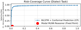
## Risk-Coverage Curve (Dialect Task)
### Overview
The image displays a line chart titled "Risk-Coverage Curve (Dialect Task)". It plots the relationship between "Coverage" on the x-axis and "Selective Risk (1 - Accuracy)" on the y-axis for a machine learning model. The chart illustrates the trade-off between the proportion of data points for which the model makes a prediction (coverage) and the error rate on those predictions (risk).
### Components/Axes
* **Chart Title:** "Risk-Coverage Curve (Dialect Task)"
* **X-Axis:**
* **Label:** "Coverage"
* **Scale:** Linear, ranging from 0.0 to 1.0.
* **Major Ticks:** 0.0, 0.2, 0.4, 0.6, 0.8, 1.0.
* **Y-Axis:**
* **Label:** "Selective Risk (1 - Accuracy)"
* **Scale:** Linear, ranging from 0.0 to 1.0.
* **Major Ticks:** 0.00, 0.25, 0.50, 0.75, 1.00.
* **Legend:** Located in the bottom-right quadrant of the chart area.
* **Blue Line Symbol:** "BiLSTM + Conformal Prediction (CP)"
* **Red Circle Symbol:** "Modal MLNN Reasoner (Fixed Point)"
* **Data Series:**
1. A solid blue line representing the performance of the "BiLSTM + Conformal Prediction (CP)" model.
2. A single red circular data point representing the "Modal MLNN Reasoner (Fixed Point)".
### Detailed Analysis
**Trend Verification (Blue Line - BiLSTM + CP):**
The blue line exhibits a steep, concave-upward decreasing trend. It starts at a very high risk for low coverage and rapidly descends, flattening out as coverage increases.
**Data Point Extraction (Approximate):**
* At **Coverage ≈ 0.0**, the **Selective Risk ≈ 0.95**. This is the starting point of the curve in the top-left corner.
* At **Coverage ≈ 0.1**, the **Selective Risk ≈ 0.50**. The curve drops sharply in this initial segment.
* At **Coverage ≈ 0.2**, the **Selective Risk ≈ 0.20**. The rate of decrease begins to slow.
* At **Coverage ≈ 0.4**, the **Selective Risk ≈ 0.10**.
* At **Coverage ≈ 0.6**, the **Selective Risk ≈ 0.07**.
* At **Coverage ≈ 0.8**, the **Selective Risk ≈ 0.06**.
* At **Coverage ≈ 1.0**, the **Selective Risk ≈ 0.05**. The curve approaches but does not reach zero risk, asymptotically leveling off in the bottom-right region.
**Fixed Point (Red Dot - Modal MLNN Reasoner):**
* A single red dot is plotted precisely at the coordinate **(Coverage = 0.0, Selective Risk = 0.0)**, located at the origin in the bottom-left corner.
### Key Observations
1. **Inverse Relationship:** There is a clear inverse relationship between coverage and selective risk for the BiLSTM+CP model. As the model is allowed to abstain from making predictions on less certain data (lower coverage), its error rate on the predictions it does make (risk) increases dramatically.
2. **Diminishing Returns:** The most significant reduction in risk occurs with the first ~20% of coverage. Increasing coverage beyond 40% yields only marginal improvements in risk.
3. **Performance Ceiling:** Even at full coverage (1.0), the model maintains a non-zero selective risk of approximately 5%, indicating an inherent error rate on the dialect task.
4. **Contrasting Reference Point:** The "Modal MLNN Reasoner" is represented as a single fixed point at (0,0). This suggests a theoretical or baseline scenario of zero risk at zero coverage, which contrasts sharply with the empirical performance curve of the BiLSTM+CP model.
### Interpretation
This chart is a classic representation of a **selective classification** or **risk-coverage trade-off** curve. It demonstrates the effectiveness of Conformal Prediction (CP) when applied to a BiLSTM model for a dialect identification task.
* **What the data suggests:** The BiLSTM+CP model can successfully quantify its own uncertainty. By setting a coverage threshold, one can control the model's error rate. For instance, if an application requires very high accuracy (low risk), one must accept that the model will only provide predictions for a small fraction (e.g., 20%) of the input data. Conversely, to process all data (coverage=1.0), one must accept a ~5% error rate.
* **How elements relate:** The curve defines the operational frontier for the model. The area under the curve represents the achievable risk-coverage combinations. The fixed point at (0,0) serves as a reference, possibly indicating the ideal goal or the performance of a different system that only makes a prediction when perfectly certain (which may be never in practice).
* **Notable implications:** The steep initial slope indicates the model is very good at identifying a subset of "easy" examples on which it is highly accurate. The plateau suggests that the remaining "hard" examples are more uniformly difficult, and covering them introduces errors at a relatively constant rate. For a technical document, this analysis is crucial for deploying the model in real-world scenarios where the cost of errors must be balanced against the need for coverage.