TECHNICAL ASSET FINGERPRINT
da393980cc811fb17b2d5e88
Click to view fullscreen
Press ESC or click to close
FOUND IN PAPERS
EXPERT: healer-alpha-free VERSION 1
RUNTIME: free/openrouter/healer-alpha
INTEL_VERIFIED
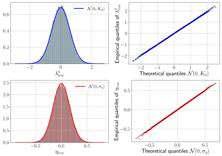
## Statistical Distribution Analysis: Histograms and Q-Q Plots
### Overview
The image is a 2x2 grid of four statistical plots. The top row analyzes a variable labeled \( \mathcal{X}_{\text{out}} \), and the bottom row analyzes a variable labeled \( \theta_{\text{out}} \). For each variable, the left plot is a histogram with an overlaid theoretical probability density function (PDF), and the right plot is a Quantile-Quantile (Q-Q) plot comparing the empirical data distribution to a theoretical normal distribution. The plots are used to assess how well the empirical data for each variable fits a specified normal distribution.
### Components/Axes
**Layout:** A 2x2 grid. Top row (blue theme) corresponds to \( \mathcal{X}_{\text{out}} \). Bottom row (red theme) corresponds to \( \theta_{\text{out}} \).
**Top-Left Plot (Histogram for \( \mathcal{X}_{\text{out}} \)):**
* **X-axis Label:** \( \mathcal{X}_{\text{out}} \)
* **Y-axis:** Unlabeled, but represents probability density (scale from 0.0 to 0.6).
* **Legend:** Located in the top-right corner. Contains a blue line symbol and the text \( \mathcal{N}(0, K_d) \).
* **Data Representation:** Light blue histogram bars. A dark blue curve representing the theoretical normal distribution \( \mathcal{N}(0, K_d) \) is overlaid.
**Top-Right Plot (Q-Q Plot for \( \mathcal{X}_{\text{out}} \)):**
* **X-axis Label:** "Theoretical quantiles \( \mathcal{N}(0, K_d) \)"
* **Y-axis Label:** "Empirical quantiles of \( \mathcal{X}_{\text{out}} \)"
* **Data Representation:** Blue data points plotted against a dashed black diagonal reference line (y=x).
**Bottom-Left Plot (Histogram for \( \theta_{\text{out}} \)):**
* **X-axis Label:** \( \theta_{\text{out}} \)
* **Y-axis:** Unlabeled, but represents probability density (scale from 0.0 to 2.5).
* **Legend:** Located in the top-right corner. Contains a red line symbol and the text \( \mathcal{N}(0, \sigma_\theta) \).
* **Data Representation:** Light red histogram bars. A dark red curve representing the theoretical normal distribution \( \mathcal{N}(0, \sigma_\theta) \) is overlaid.
**Bottom-Right Plot (Q-Q Plot for \( \theta_{\text{out}} \)):**
* **X-axis Label:** "Theoretical quantiles \( \mathcal{N}(0, \sigma_\theta) \)"
* **Y-axis Label:** "Empirical quantiles of \( \theta_{\text{out}} \)"
* **Data Representation:** Red data points plotted against a dashed black diagonal reference line (y=x).
### Detailed Analysis
**1. \( \mathcal{X}_{\text{out}} \) Analysis (Top Row, Blue):**
* **Histogram Trend:** The histogram is symmetric and unimodal, centered at approximately 0. The overlaid dark blue curve for \( \mathcal{N}(0, K_d) \) closely follows the shape of the histogram bars. The distribution appears to have a standard deviation (likely \( \sqrt{K_d} \)) of approximately 1, as the visible data spans roughly from -2 to 2 on the x-axis.
* **Q-Q Plot Trend:** The blue empirical quantile points align very closely with the black diagonal reference line across the entire range from approximately -2.5 to 2.5. This indicates an excellent fit between the empirical distribution of \( \mathcal{X}_{\text{out}} \) and the theoretical normal distribution \( \mathcal{N}(0, K_d) \).
**2. \( \theta_{\text{out}} \) Analysis (Bottom Row, Red):**
* **Histogram Trend:** The histogram is symmetric and unimodal, centered at approximately 0. The overlaid dark red curve for \( \mathcal{N}(0, \sigma_\theta) \) closely matches the histogram. The distribution is narrower than the top one, with the visible data spanning roughly from -0.5 to 0.5 on the x-axis, suggesting a smaller standard deviation (likely \( \sqrt{\sigma_\theta} \)) of approximately 0.2.
* **Q-Q Plot Trend:** The red empirical quantile points align very closely with the black diagonal reference line across the entire range from approximately -0.7 to 0.7. This indicates an excellent fit between the empirical distribution of \( \theta_{\text{out}} \) and the theoretical normal distribution \( \mathcal{N}(0, \sigma_\theta) \).
### Key Observations
1. **Excellent Distributional Fit:** For both variables, the empirical data shows a near-perfect match to their respective theoretical normal distributions. This is evidenced by the histograms being well-covered by the PDF curves and, more conclusively, by the Q-Q plots showing points lying almost exactly on the diagonal.
2. **Different Scales:** The variable \( \mathcal{X}_{\text{out}} \) has a much wider spread (range ~[-2, 2]) compared to \( \theta_{\text{out}} \) (range ~[-0.5, 0.5]). This is reflected in the y-axis scales of the histograms (max ~0.6 vs. max ~2.5) and the x-axis scales of the Q-Q plots.
3. **Zero Mean:** Both distributions are centered at zero, as indicated by the symmetry of the histograms around 0 and the theoretical distributions being specified as \( \mathcal{N}(0, \cdot) \).
### Interpretation
The plots provide strong visual evidence that the datasets for \( \mathcal{X}_{\text{out}} \) and \( \theta_{\text{out}} \) are normally distributed with means of zero. The parameters \( K_d \) and \( \sigma_\theta \) represent the variances of these distributions.
* **What it demonstrates:** This type of analysis is fundamental in statistics and machine learning for validating model assumptions. For instance, if \( \mathcal{X}_{\text{out}} \) and \( \theta_{\text{out}} \) represent residuals or errors from a model, these plots would confirm that the model's errors are normally distributed, a key assumption for many statistical tests and inference procedures.
* **Relationship between elements:** The left-column histograms provide a direct view of the data's frequency distribution, while the right-column Q-Q plots offer a more sensitive diagnostic for assessing normality, especially in the tails of the distribution. The consistent color coding (blue for \( \mathcal{X}_{\text{out}} \), red for \( \theta_{\text{out}} \)) links the two types of analysis for each variable.
* **Notable findings:** The primary finding is the lack of notable outliers or deviations from normality. The tight alignment in the Q-Q plots suggests the data is exceptionally well-behaved. The difference in scale between the two variables is the most significant contrast, indicating that \( \theta_{\text{out}} \) is measured on a finer scale or has inherently lower variability than \( \mathcal{X}_{\text{out}} \).
DECODING INTELLIGENCE...