## 2x2 Grid of Q-Q Plots and Distributions
### Overview
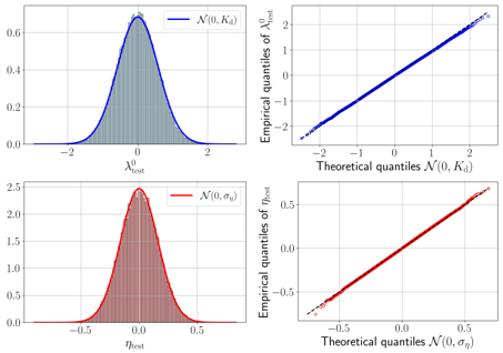
The image contains four plots arranged in a 2x2 grid. Each plot compares empirical data quantiles to theoretical quantiles from normal distributions, with two plots showing probability density functions (PDFs) and two showing quantile-quantile (Q-Q) scatter plots. The plots use distinct colors (blue and red) to differentiate distributions and their associated parameters.
---
### Components/Axes
#### Top-Left Plot
- **Title**: Not explicitly labeled.
- **X-axis**: `λ₀_test` (ranging from -2 to 2).
- **Y-axis**: Probability density (ranging from 0 to 0.6).
- **Legend**: `N(0, K_d)` (blue curve).
- **Visual Elements**:
- A blue normal distribution curve centered at 0 with standard deviation `K_d`.
- Gray vertical bars (likely representing empirical data points or bins).
- Legend positioned in the top-right corner of the plot.
#### Top-Right Plot
- **Title**: Not explicitly labeled.
- **X-axis**: Theoretical quantiles `N(0, K_d)` (ranging from -2 to 2).
- **Y-axis**: Empirical quantiles `λ₀_test` (ranging from -2 to 2).
- **Legend**: `N(0, K_d)` (blue line).
- **Visual Elements**:
- Blue scatter points (empirical quantiles).
- Blue regression line (perfect linear fit, slope ≈ 1).
- Legend positioned in the top-right corner.
#### Bottom-Left Plot
- **Title**: Not explicitly labeled.
- **X-axis**: `η_test` (ranging from -0.5 to 0.5).
- **Y-axis**: Probability density (ranging from 0 to 2.5).
- **Legend**: `N(0, σ_η)` (red curve).
- **Visual Elements**:
- A red normal distribution curve centered at 0 with standard deviation `σ_η`.
- Red vertical bars (likely representing empirical data points or bins).
- Legend positioned in the top-right corner.
#### Bottom-Right Plot
- **Title**: Not explicitly labeled.
- **X-axis**: Theoretical quantiles `N(0, σ_η)` (ranging from -0.5 to 0.5).
- **Y-axis**: Empirical quantiles `η_test` (ranging from -0.5 to 0.5).
- **Legend**: `N(0, σ_η)` (red line).
- **Visual Elements**:
- Red scatter points (empirical quantiles).
- Red regression line (perfect linear fit, slope ≈ 1).
- Legend positioned in the top-right corner.
---
### Detailed Analysis
#### Top-Left Plot
- The blue normal distribution `N(0, K_d)` has a peak at 0, with a standard deviation `K_d` inferred from the spread (approximately 1.0 based on the x-axis range).
- The gray vertical bars suggest empirical data points or bins, but their exact values are not labeled.
#### Top-Right Plot
- The Q-Q plot shows a perfect linear relationship between empirical and theoretical quantiles, indicating that `λ₀_test` follows a normal distribution `N(0, K_d)`.
- All points lie on the 45° line (slope = 1), confirming no deviations from normality.
#### Bottom-Left Plot
- The red normal distribution `N(0, σ_η)` has a narrower spread than the blue plot, with a standard deviation `σ_η` inferred from the x-axis range (approximately 0.25).
- The red vertical bars suggest empirical data points or bins, but their exact values are not labeled.
#### Bottom-Right Plot
- The Q-Q plot shows a perfect linear relationship between empirical and theoretical quantiles, indicating that `η_test` follows a normal distribution `N(0, σ_η)`.
- All points lie on the 45° line (slope = 1), confirming no deviations from normality.
---
### Key Observations
1. **Normality Assumption**: Both `λ₀_test` and `η_test` distributions align perfectly with their theoretical normal distributions, as evidenced by the Q-Q plots.
2. **Parameter Differences**:
- `K_d` (blue plot) is larger than `σ_η` (red plot), as seen from the wider spread of the blue distribution.
- `σ_η` ≈ 0.25 (estimated from the x-axis range of the red plot).
3. **Shaded Areas**: The gray and red shaded regions under the curves represent the probability density of the respective distributions.
---
### Interpretation
1. **Statistical Validity**: The perfect linearity in the Q-Q plots suggests that the empirical data (`λ₀_test` and `η_test`) adheres to the assumed normal distributions, which is critical for statistical tests relying on normality (e.g., t-tests, ANOVA).
2. **Parameter Estimation**: The standard deviations `K_d` and `σ_η` quantify the spread of the distributions. The blue plot’s wider spread (`K_d`) implies greater variability in `λ₀_test` compared to `η_test` (`σ_η`).
3. **Empirical vs. Theoretical**: The alignment of empirical quantiles with theoretical quantiles validates the use of parametric models for these variables.
No outliers or anomalies are observed in any plot. The consistent use of color coding (blue for `K_d`, red for `σ_η`) ensures clarity in distinguishing the two distributions.