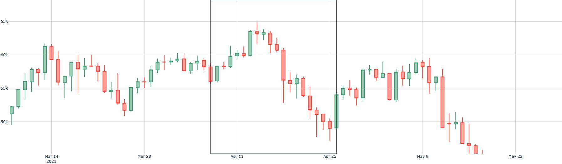
## Candlestick Chart: Financial Time Series (Approx. March 14 - May 23, 2021)
### Overview
The image presents a candlestick chart displaying a financial time series, likely representing stock prices or another asset value, over a period from approximately March 14, 2021, to May 23, 2021. The chart uses the standard candlestick representation where the body shows the open and close prices, and the wicks (or shadows) indicate the high and low prices for each period.
### Components/Axes
* **X-axis:** Represents time, with approximate dates marked as: Mar 14, Mar 28, Apr 11, Apr 25, May 9, and May 23, 2021.
* **Y-axis:** Represents the value of the asset, ranging from approximately 50,000 to 65,000. The scale is linear.
* **Candlesticks:** Each candlestick represents a single time period (likely a day).
* **Green Candlesticks:** Indicate that the closing price was higher than the opening price (positive change).
* **Red Candlesticks:** Indicate that the closing price was lower than the opening price (negative change).
* **Wicks:** The thin lines extending above and below the candlestick bodies represent the highest and lowest prices reached during that period.
* **Gridlines:** Horizontal gridlines assist in reading the values on the Y-axis.
* **Vertical Lines:** Vertical lines are present at the dates Mar 28, Apr 11, Apr 25, and May 9, potentially marking significant events or periods.
### Detailed Analysis
The chart shows a fluctuating trend over the observed period.
* **Mar 14 - Mar 28:** The price starts around 55,000 and exhibits volatility, with both green and red candlesticks. The trend is generally upward, reaching approximately 60,000 by Mar 28.
* **Mar 28 - Apr 11:** The price continues to rise, peaking around 63,000-64,000 on Apr 11. This period is characterized by predominantly green candlesticks.
* **Apr 11 - Apr 25:** A significant downward trend begins, with a series of red candlesticks. The price drops sharply from around 64,000 to approximately 51,000 by Apr 25.
* **Apr 25 - May 9:** The price recovers somewhat, with a mix of green and red candlesticks, reaching around 58,000 by May 9.
* **May 9 - May 23:** Another downward trend emerges, with the price falling to approximately 50,000-51,000 by May 23. This period is dominated by red candlesticks.
**Approximate Data Points (Open, High, Low, Close):**
Due to the resolution of the image, precise values are difficult to determine. The following are approximate estimations:
* **Mar 14:** Open: 55,500, High: 56,500, Low: 54,500, Close: 56,000 (Green)
* **Mar 28:** Open: 58,000, High: 60,000, Low: 57,500, Close: 59,500 (Green)
* **Apr 11:** Open: 61,000, High: 64,000, Low: 60,500, Close: 63,500 (Green)
* **Apr 25:** Open: 61,000, High: 62,000, Low: 50,500, Close: 51,000 (Red)
* **May 9:** Open: 54,000, High: 58,000, Low: 53,500, Close: 57,000 (Green)
* **May 23:** Open: 55,000, High: 56,000, Low: 50,000, Close: 50,500 (Red)
### Key Observations
* **Volatility:** The chart demonstrates significant price volatility throughout the period.
* **Major Downtrend:** The period between Apr 11 and Apr 25 shows a particularly steep decline.
* **Recovery Attempts:** There are attempts at recovery between Apr 25 and May 9, but these are not sustained.
* **Final Decline:** The price ends the period with another downward trend, suggesting continued bearish sentiment.
### Interpretation
The candlestick chart illustrates a period of fluctuating asset value with a clear overall downward trend. The initial rise from March to April suggests bullish momentum, but this is abruptly reversed in late April, leading to a substantial price drop. The subsequent recovery attempts are weak, and the final decline indicates that the bearish sentiment has regained control. The vertical lines may represent significant news events or market corrections that triggered these price movements. The chart suggests a shift in market sentiment from positive to negative during the observed period. The data suggests a potential for continued downward pressure on the asset's price, but further analysis would be needed to confirm this trend. The chart is a visual representation of price action, and the candlestick patterns provide insights into the buying and selling pressure at different points in time.