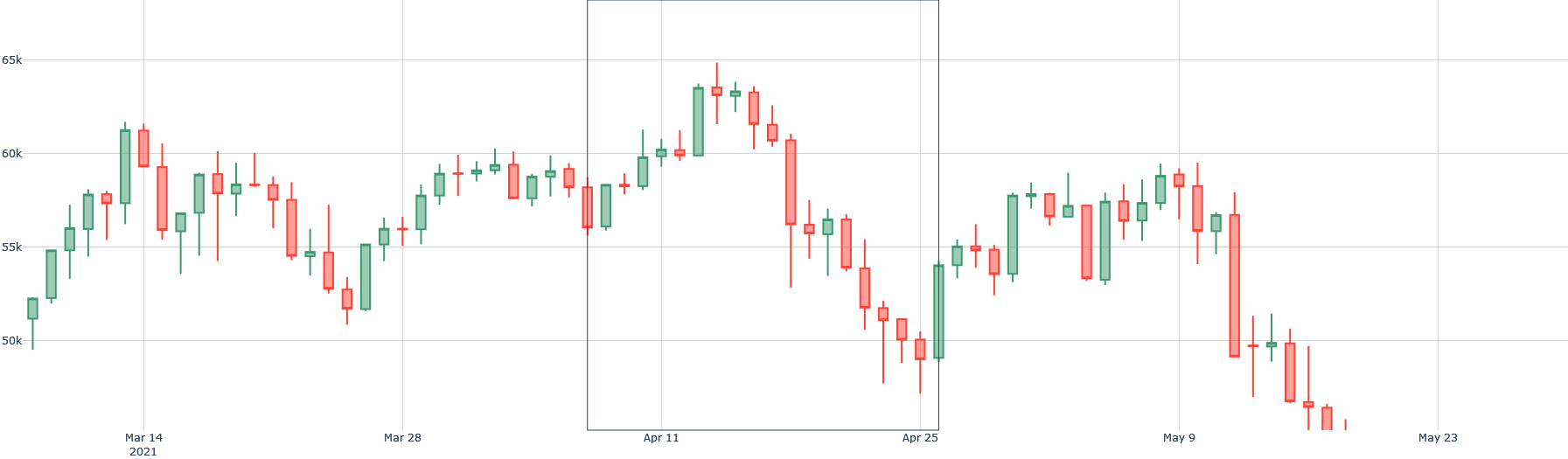
## Candlestick Chart: Price Fluctuations Over Time
### Overview
The image presents a candlestick chart illustrating price fluctuations over time. The chart spans from approximately March 14, 2021, to May 23, 2021. Each candlestick represents a trading day, with green candles indicating a price increase and red candles indicating a price decrease. The y-axis represents the price in thousands (k).
### Components/Axes
* **Y-Axis (Price):** The vertical axis represents the price, with markers at 50k, 55k, 60k, and 65k.
* **X-Axis (Time):** The horizontal axis represents time, with markers at March 14, 2021, March 28, April 11, April 25, May 9, and May 23.
* **Candlesticks:** Each candlestick shows the open, close, high, and low prices for a specific day.
* **Green Candlesticks:** Indicate that the closing price was higher than the opening price.
* **Red Candlesticks:** Indicate that the closing price was lower than the opening price.
* **Gridlines:** Light gray gridlines are present, aiding in the visual estimation of price levels.
### Detailed Analysis
* **March 14, 2021:** The price starts around 52k.
* **March 14 - March 28:** The price fluctuates, with a mix of green and red candlesticks, generally trending upwards to approximately 57k.
* **March 28 - April 11:** The price continues to fluctuate, with a mix of green and red candlesticks, generally trending upwards to approximately 64k.
* **April 11 - April 25:** The price experiences a significant drop, with predominantly red candlesticks, falling to approximately 49k.
* **April 25 - May 9:** The price recovers somewhat, with a mix of green and red candlesticks, rising to approximately 58k.
* **May 9 - May 23:** The price declines sharply again, with predominantly red candlesticks, falling to approximately 47k.
### Key Observations
* **Volatility:** The price exhibits significant volatility throughout the period, with alternating periods of increase and decrease.
* **Peak:** The highest price point is reached around April 11, at approximately 64k.
* **Trough:** The lowest price point is reached around May 23, at approximately 47k.
* **Sharp Decline:** There are two notable sharp declines: one between April 11 and April 25, and another between May 9 and May 23.
### Interpretation
The candlestick chart illustrates the price dynamics of an asset over a two-month period. The alternating green and red candlesticks indicate daily price fluctuations, while the overall trend reveals periods of growth and decline. The sharp declines suggest potential market corrections or negative news events impacting the asset's value. The volatility observed throughout the period indicates a degree of risk associated with this asset. The chart suggests that the asset experienced a significant correction in late April and mid-May, after reaching a peak in early April.