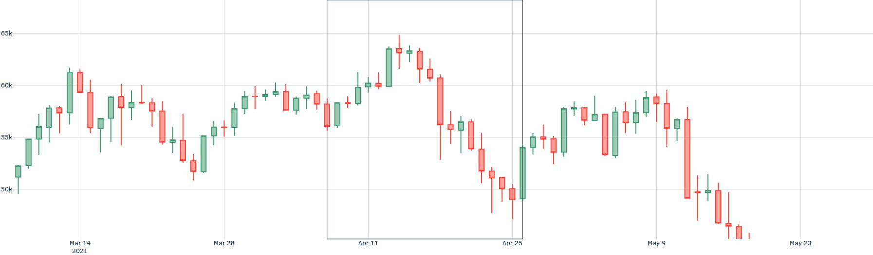
## Candlestick Chart: Price Movement (March - May 2021)
### Overview
This is a financial candlestick chart displaying the price action of an unspecified asset over a period from early March to late May 2021. The chart shows a general uptrend peaking in mid-April, followed by a significant downtrend into late May. A semi-transparent grey rectangle highlights a specific period from approximately April 11 to April 25.
### Components/Axes
* **Chart Type:** Candlestick chart.
* **X-Axis (Horizontal):** Represents time. Major date markers are labeled: "Mar 14 2021", "Mar 28", "Apr 11", "Apr 25", "May 9", "May 23". The axis spans from approximately March 7 to May 27.
* **Y-Axis (Vertical):** Represents price. Major gridlines and labels are at 50k, 55k, 60k, and 65k. The scale is linear.
* **Data Series:** Each candlestick represents a trading period (likely daily). The body color indicates the period's close relative to its open:
* **Green (Teal) Candle:** Close > Open (bullish period).
* **Red Candle:** Close < Open (bearish period).
* The thin vertical lines (wicks/shadows) show the high and low prices for the period.
* **Legend:** No explicit legend is present on the chart. The color coding (green for up, red for down) is standard for candlestick charts.
* **Highlighted Region:** A vertical, semi-transparent grey rectangle is positioned between the x-axis dates of approximately **Apr 11** and **Apr 25**. This region encapsulates the peak of the price movement and the beginning of a sharp decline.
### Detailed Analysis
**Trend Verification & Key Data Points (Approximate Values):**
The overall trend shows a rise from ~52k to a peak above 65k, followed by a decline to below 50k.
1. **Initial Uptrend (Early March - Mid-April):**
* The chart begins around **March 7** with a price near **52k**.
* A strong bullish (green) candle pushes the price above **60k** around **March 14**.
* The price consolidates between ~55k and 60k for the second half of March.
* A renewed uptrend begins in early April, culminating in the highest point on the chart.
* **Peak:** The highest wick reaches approximately **66k** around **April 12-13**, within the highlighted rectangle. The highest closing price (top of a green body) is near **65k**.
2. **Downtrend (Mid-April - Late May):**
* Following the peak, a series of red candles begins, signaling a reversal.
* A particularly large red candle around **April 20-21** shows a sharp drop from ~62k to ~57k.
* The decline continues, with the price falling below the **55k** support level by late April.
* A brief, weak recovery attempt occurs in early May, reaching just below **60k** around **May 7**.
* The downtrend resumes aggressively. A very long red candle around **May 12-13** drops from ~58k to ~51k.
* **Trough:** The lowest point on the chart is a wick reaching approximately **48k** around **May 19-20**. The final candles on the chart (around May 23-27) show prices consolidating near **49k-50k**.
### Key Observations
* **Volatility Increase:** The size of the candlestick bodies and wicks increases significantly during the downtrend (late April onwards) compared to the earlier consolidation phase, indicating heightened market volatility and selling pressure.
* **Highlighted Rectangle Significance:** The grey box from **Apr 11 to Apr 25** precisely frames the market top and the initial, decisive breakdown. This period contains the peak price and the first cluster of strong bearish candles that confirmed the trend reversal.
* **Failed Recovery:** The rally in early May failed to reclaim the 60k level and resulted in a lower high compared to the April peak, a classic technical signal of a continuing downtrend.
* **Support/Resistance:** The **55k** level acted as support in March and early April, then became resistance after being broken in late April. The **60k** level was a key resistance zone in March and again in early May.
### Interpretation
This chart depicts a complete market cycle over approximately three months: a bullish phase, a climax top, and a bearish reversal.
* **Market Sentiment:** The data suggests a shift from optimism (steady buying in March) to euphoria (sharp rise to peak in April), followed by a rapid shift to pessimism and panic selling (large red candles in late April and May).
* **The Highlighted Period:** The rectangle likely marks a period of critical technical importance. It could represent a distribution phase where informed investors sold to late buyers, or it may simply be highlighting the most volatile turning point for analysis. The price action within it—a peak followed by a breakdown—is the chart's pivotal event.
* **Underlying Narrative:** Without the asset name, the specific cause is unknown, but the pattern is typical of speculative assets experiencing a "blow-off top" followed by a correction. The failure to hold the 55k support and the subsequent freefall suggest a loss of fundamental confidence or a broader market downturn affecting this asset.
* **Future Implications (from a technical perspective):** The chart ends in a consolidation near the lows. Traders would watch to see if this forms a base for a potential rebound or is merely a pause before further decline. The previous support levels (55k, 60k) would now be expected to act as strong resistance in any future recovery attempt.