\n
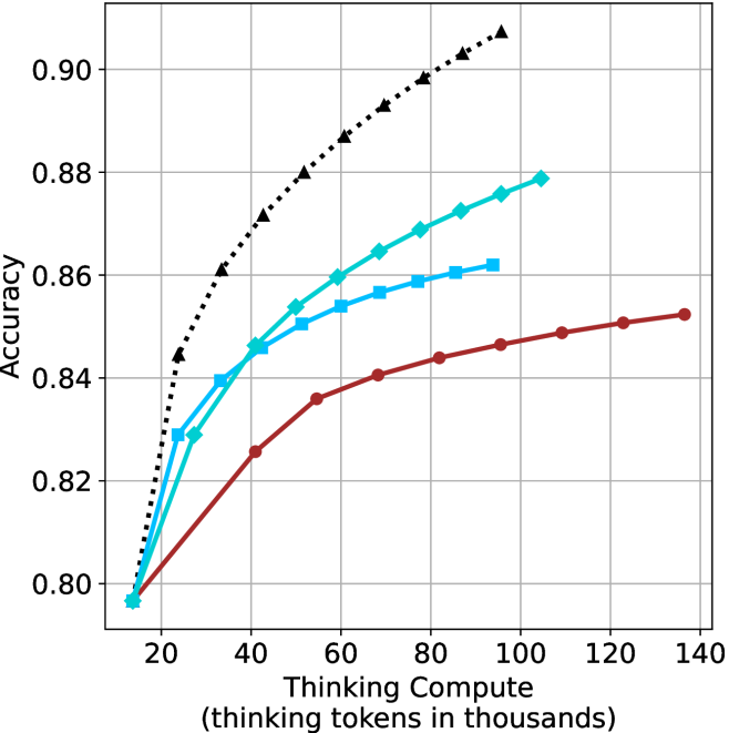
## Line Chart: Accuracy vs. Thinking Tokens
### Overview
This image presents a line chart illustrating the relationship between "Thinking Tokens" (in thousands) and "Accuracy". Four distinct data series are plotted, each represented by a different colored line with a unique marker style. The chart appears to demonstrate how accuracy improves with an increasing number of thinking tokens, with varying rates of improvement for each series.
### Components/Axes
* **X-axis:** "Thinking Compute (thinking tokens in thousands)". Scale ranges from approximately 0 to 140, with markers at 20, 40, 60, 80, 100, 120, and 140.
* **Y-axis:** "Accuracy". Scale ranges from approximately 0.80 to 0.90, with markers at 0.80, 0.82, 0.84, 0.86, 0.88, and 0.90.
* **Data Series:**
* Black dotted line with diamond markers.
* Teal line with circular markers.
* Blue line with square markers.
* Red line with circular markers.
* **Gridlines:** A grid is present to aid in reading values.
### Detailed Analysis
Let's analyze each data series individually:
* **Black (Diamond):** This line exhibits the steepest upward slope, indicating the fastest rate of accuracy improvement with increasing thinking tokens.
* At 20 tokens: Approximately 0.86 accuracy.
* At 40 tokens: Approximately 0.88 accuracy.
* At 60 tokens: Approximately 0.89 accuracy.
* At 80 tokens: Approximately 0.90 accuracy.
* At 100 tokens: Approximately 0.91 accuracy.
* At 120 tokens: Approximately 0.91 accuracy.
* At 140 tokens: Approximately 0.91 accuracy.
* **Teal (Circle):** This line shows a moderate upward slope, with a decreasing rate of improvement as the number of tokens increases.
* At 20 tokens: Approximately 0.80 accuracy.
* At 40 tokens: Approximately 0.85 accuracy.
* At 60 tokens: Approximately 0.87 accuracy.
* At 80 tokens: Approximately 0.88 accuracy.
* At 100 tokens: Approximately 0.88 accuracy.
* At 120 tokens: Approximately 0.88 accuracy.
* At 140 tokens: Approximately 0.88 accuracy.
* **Blue (Square):** This line demonstrates a moderate upward slope, similar to the teal line, but starts at a slightly higher accuracy.
* At 20 tokens: Approximately 0.82 accuracy.
* At 40 tokens: Approximately 0.85 accuracy.
* At 60 tokens: Approximately 0.86 accuracy.
* At 80 tokens: Approximately 0.86 accuracy.
* At 100 tokens: Approximately 0.87 accuracy.
* At 120 tokens: Approximately 0.87 accuracy.
* At 140 tokens: Approximately 0.87 accuracy.
* **Red (Circle):** This line exhibits the slowest upward slope, indicating the smallest improvement in accuracy with increasing thinking tokens.
* At 20 tokens: Approximately 0.80 accuracy.
* At 40 tokens: Approximately 0.82 accuracy.
* At 60 tokens: Approximately 0.83 accuracy.
* At 80 tokens: Approximately 0.84 accuracy.
* At 100 tokens: Approximately 0.85 accuracy.
* At 120 tokens: Approximately 0.85 accuracy.
* At 140 tokens: Approximately 0.85 accuracy.
### Key Observations
* The black data series consistently outperforms the other three, achieving the highest accuracy levels.
* The red data series consistently underperforms, showing the smallest gains in accuracy.
* All series demonstrate diminishing returns; the rate of accuracy improvement decreases as the number of thinking tokens increases.
* The teal and blue lines converge towards similar accuracy levels as the number of tokens increases.
### Interpretation
The chart suggests that increasing the number of "thinking tokens" generally improves accuracy, but the effectiveness of this approach varies significantly depending on the specific data series. The black series indicates a highly efficient process where additional tokens yield substantial accuracy gains. Conversely, the red series suggests a less efficient process with limited benefits from increased token usage.
The diminishing returns observed across all series imply that there's a point beyond which adding more thinking tokens provides only marginal improvements in accuracy. This could be due to factors such as the inherent limitations of the model, the quality of the data, or the complexity of the task.
The differences between the series could represent different algorithms, model configurations, or training datasets. Further investigation would be needed to determine the underlying reasons for these performance variations. The chart provides valuable insights into the trade-offs between computational cost (thinking tokens) and accuracy, which is crucial for optimizing performance in machine learning applications.