## Line Chart: On-Policy GRPO with Zero Variance Masking (π_k)
### Overview
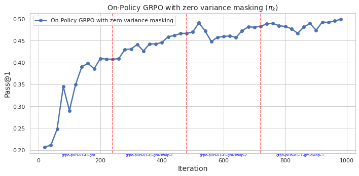
The image is a line chart plotting the performance metric "Pass@1" against training "Iteration" for an algorithm labeled "On-Policy GRPO with zero variance masking". The chart shows a generally increasing trend with some fluctuations, punctuated by four vertical dashed red lines that appear to mark specific phases or version changes in the training process.
### Components/Axes
* **Chart Title:** "On-Policy GRPO with zero variance masking (π_k)"
* **Y-Axis:**
* **Label:** "Pass@1"
* **Scale:** Linear, ranging from 0.20 to 0.50.
* **Major Ticks:** 0.20, 0.25, 0.30, 0.35, 0.40, 0.45, 0.50.
* **X-Axis:**
* **Label:** "Iteration"
* **Scale:** Linear, ranging from 0 to 1000.
* **Major Ticks:** 0, 200, 400, 600, 800, 1000.
* **Legend:**
* **Location:** Top-left corner of the plot area.
* **Label:** "On-Policy GRPO with zero variance masking"
* **Symbol:** A blue line with circular markers.
* **Data Series:** A single blue line with circular data points at each iteration step.
* **Annotations:** Four vertical, dashed red lines extending from the x-axis to the top of the plot. Each is labeled at the bottom with blue text:
1. At approximately Iteration 250: `grpo-plus-v1.1t-gn`
2. At approximately Iteration 500: `grpo-plus-v1.1t-gn-swap-1`
3. At approximately Iteration 750: `grpo-plus-v1.1t-gn-swap-2`
4. At approximately Iteration 900: `grpo-plus-v1.1t-gn-swap-3`
### Detailed Analysis
* **Trend Verification:** The blue line shows a strong, positive, non-linear trend. It rises steeply in the initial phase (Iterations 0-200), then continues to increase at a more moderate, fluctuating rate for the remainder of the chart.
* **Data Point Extraction (Approximate Values):**
* **Start (Iteration ~20):** Pass@1 ≈ 0.205
* **First Major Peak (Iteration ~150):** Pass@1 ≈ 0.40
* **First Major Dip (Iteration ~175):** Pass@1 ≈ 0.29
* **At First Red Line (~250):** Pass@1 ≈ 0.41
* **At Second Red Line (~500):** Pass@1 ≈ 0.47
* **At Third Red Line (~750):** Pass@1 ≈ 0.49
* **At Fourth Red Line (~900):** Pass@1 ≈ 0.48
* **End (Iteration ~1000):** Pass@1 ≈ 0.50 (the highest point on the chart).
* **Phase Analysis:** The performance appears to improve across the phases demarcated by the red lines. The "swap" phases (1, 2, 3) generally maintain or slightly improve upon the performance level achieved at the end of the previous phase, despite local fluctuations.
### Key Observations
1. **Initial Rapid Learning:** The most dramatic improvement occurs in the first 200 iterations, where Pass@1 more than doubles from ~0.20 to ~0.40.
2. **Performance Dip:** A significant, sharp dip occurs around iteration 175, where performance drops from ~0.40 to ~0.29 before recovering.
3. **Plateau and Fluctuation:** After iteration 400, the rate of improvement slows. The line exhibits a "sawtooth" pattern of small rises and falls, but the overall trajectory remains upward.
4. **Phase Transitions:** The vertical red lines do not coincide with immediate, dramatic jumps in performance. Instead, they seem to mark points where the training configuration or model version changed, with the subsequent performance building upon the prior level.
5. **Final Performance:** The algorithm achieves its highest measured Pass@1 score of approximately 0.50 at the final iteration shown (1000).
### Interpretation
This chart documents the training progression of a reinforcement learning or optimization algorithm (GRPO) using a technique called "zero variance masking." The "Pass@1" metric likely measures success rate on a task.
* **What the data suggests:** The algorithm is effective, showing substantial learning over 1000 iterations. The "zero variance masking" technique, as applied in this "On-Policy" setting, leads to a final performance of ~50% success (Pass@1=0.50).
* **How elements relate:** The vertical red lines are critical for understanding the training narrative. They indicate that the training was not a single, continuous run but was segmented into distinct phases (`gn`, `gn-swap-1`, `gn-swap-2`, `gn-swap-3`). The "swap" suffix suggests a modification was introduced at each phase, possibly to the model, objective, or data distribution. The chart shows that performance was generally maintained or improved after each swap, indicating the modifications were likely beneficial or at least not detrimental.
* **Notable anomalies:** The sharp dip around iteration 175 is the most prominent anomaly. This could represent a period of instability, a change in training parameters, or the introduction of a more difficult subset of data. The algorithm's ability to recover and surpass its previous peak demonstrates robustness.
* **Underlying pattern:** The overall curve resembles a classic learning curve with diminishing returns—rapid initial gains followed by slower, incremental improvements. The segmentation via the red lines suggests an iterative development or ablation study process, where the core algorithm was progressively refined.