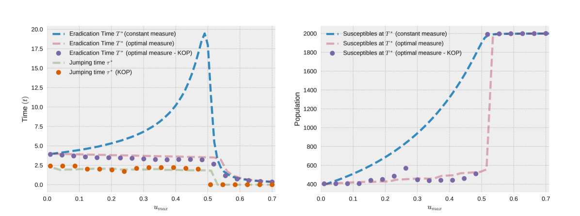
# Technical Document Extraction: Chart Analysis
## Left Chart: Time (t) vs. u_max
### Axes
- **Y-axis**: Time (t) [0.0 to 20.0]
- **X-axis**: u_max [0.0 to 0.7]
### Legend
1. **Eradication Time T* (constant measure)**
- Line style: Blue dashed
- Trend: Gradual increase to ~19 at u_max=0.5, then sharp decline to ~0.5 by u_max=0.7.
2. **Eradication Time T* (optimal measure)**
- Line style: Red dashed
- Trend: Flat at ~4 until u_max=0.5, then sharp decline to ~2 by u_max=0.7.
3. **Eradication Time T* (optimal measure - KOP)**
- Marker: Purple circles
- Trend: Starts at ~4, dips to ~1 by u_max=0.5, stabilizes near ~0.5.
4. **Jumping time τ* (KOP)**
- Line style: Green dashed
- Marker: Orange circles
- Trend: Flat at ~2 until u_max=0.5, then drops to ~0.5.
### Key Observations
- The **blue dashed line** (constant measure) exhibits a peak at u_max=0.5, followed by a rapid decline.
- The **red dashed line** (optimal measure) remains stable until u_max=0.5, then drops sharply.
- **Purple circles** (optimal measure - KOP) show a gradual decline with a notable dip at u_max=0.5.
- **Green dashed line** (jumping time) remains constant until u_max=0.5, then decreases.
---
## Right Chart: Population vs. u_max
### Axes
- **Y-axis**: Population [400 to 2000]
- **X-axis**: u_max [0.0 to 0.7]
### Legend
1. **Susceptibles at T* (constant measure)**
- Line style: Blue dashed
- Trend: Flat at ~400 until u_max=0.5, then sharp increase to ~1950.
2. **Susceptibles at T* (optimal measure)**
- Line style: Red dashed
- Trend: Flat at ~400 until u_max=0.5, then sharp increase to ~1900.
3. **Susceptibles at T* (optimal measure - KOP)**
- Marker: Purple circles
- Trend: Starts at ~400, peaks at ~550 at u_max=0.25, then declines to ~450.
### Key Observations
- The **blue dashed line** (constant measure) remains stable until u_max=0.5, then surges sharply.
- The **red dashed line** (optimal measure) mirrors the blue line but with a slightly lower peak (~1900 vs. ~1950).
- **Purple circles** (optimal measure - KOP) exhibit a bimodal pattern: a peak at u_max=0.25 (~550) followed by a decline.
---
## Cross-Reference Validation
- **Legend Colors/Labels**:
- Blue dashed lines correspond to "constant measure" in both charts.
- Red dashed lines correspond to "optimal measure" in both charts.
- Purple circles correspond to "optimal measure - KOP" in both charts.
- **Consistency**: All labels, axes, and trends align with the provided legends and visual data.
## Summary
- **Left Chart**: Focuses on time dynamics, with distinct behaviors for constant vs. optimal measures and KOP adjustments.
- **Right Chart**: Highlights population susceptibility, showing divergent outcomes based on measure type and KOP application.
- **Critical Data Points**:
- Left: Blue line peaks at ~19 (u_max=0.5); red line drops to ~2 (u_max=0.5).
- Right: Blue line jumps to ~1950 (u_max=0.5); purple circles peak at ~550 (u_max=0.25).