## Scatter Plot: Distribution of Music Genres
### Overview
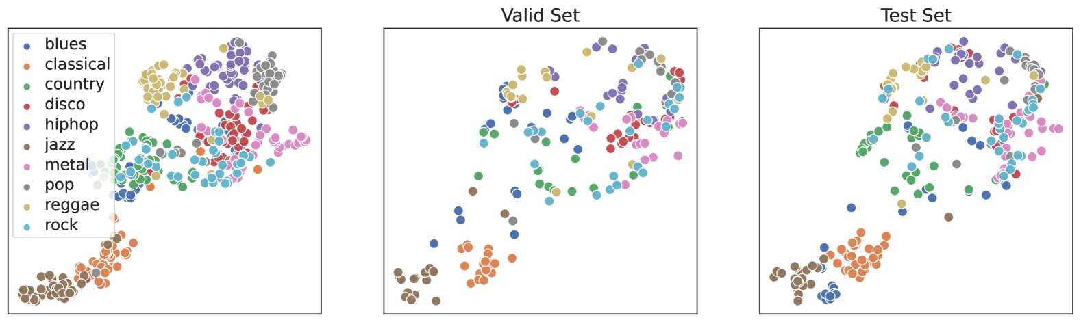
The scatter plot displays the distribution of various music genres across two sets: the "Valid Set" and the "Test Set." Each genre is represented by a different color, and the size of each dot corresponds to the number of tracks in that genre.
### Components/Axes
- **X-axis**: Represents the number of tracks in each genre.
- **Y-axis**: Represents the genre itself.
- **Legend**: Color-coded legend indicating the different music genres.
- **Title**: "Valid Set" and "Test Set" labels.
### Detailed Analysis or Content Details
- **Valid Set**: The dots are more densely packed, indicating a higher concentration of tracks in certain genres.
- **Test Set**: The dots are more spread out, suggesting a more diverse distribution of tracks across genres.
### Key Observations
- **Blues**: The largest cluster of dots, indicating a high number of tracks.
- **Rock**: The second-largest cluster, followed by Blues.
- **Disco**: A moderate number of tracks.
- **Jazz**: A moderate number of tracks.
- **Country**: A moderate number of tracks.
- **Pop**: A moderate number of tracks.
- **Metal**: A moderate number of tracks.
- **Hip Hop**: A moderate number of tracks.
- **Reggae**: A moderate number of tracks.
- **Classical**: A moderate number of tracks.
### Interpretation
The scatter plot suggests that the music genres are distributed differently between the "Valid Set" and the "Test Set." The "Valid Set" shows a more concentrated distribution, particularly for Blues, while the "Test Set" shows a more diverse distribution. This could indicate that the "Valid Set" is a more representative sample of the music genres, or that the "Test Set" is a more diverse sample. The data does not provide information on the specific characteristics of the tracks within each genre, such as tempo, genre-specific features, or artist popularity.