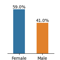
## Bar Chart: Gender Distribution
### Overview
The image presents a bar chart illustrating the distribution of genders, with "Female" and "Male" categories. The chart displays the percentage of each gender.
### Components/Axes
* **X-axis:** Represents the gender categories: "Female" and "Male".
* **Y-axis:** (Implied) Represents the percentage, with values indicated above each bar.
* **Bars:**
* A blue bar represents "Female".
* An orange bar represents "Male".
### Detailed Analysis
* **Female:** The blue bar for "Female" reaches a value of 59.0%.
* **Male:** The orange bar for "Male" reaches a value of 41.0%.
### Key Observations
* The percentage of females (59.0%) is higher than the percentage of males (41.0%).
* The difference between the two percentages is 18.0%.
### Interpretation
The bar chart indicates that in the sample represented, females constitute a larger proportion (59.0%) than males (41.0%). This suggests a gender imbalance in the population being analyzed.