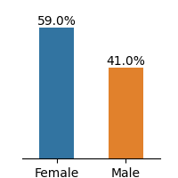
## Bar Chart: Gender Distribution Comparison
### Overview
The image displays a simple bar chart comparing the percentage distribution of two gender categories: Female and Male. The chart uses two vertical bars with distinct colors to represent each category, accompanied by percentage labels.
### Components/Axes
- **X-axis**: Categories labeled "Female" (left) and "Male" (right).
- **Y-axis**: Implicit percentage scale (0% to 100%), with no explicit numerical ticks shown.
- **Legend**: Located to the right of the bars, associating:
- **Blue** with "Female"
- **Orange** with "Male"
- **Bars**:
- **Female**: Tall blue bar occupying ~59% of the chart height.
- **Male**: Shorter orange bar occupying ~41% of the chart height.
- **Text Labels**: Percentages explicitly annotated above each bar:
- "59.0%" (Female)
- "41.0%" (Male)
### Detailed Analysis
- The Female bar is visually 1.44x taller than the Male bar (59.0% / 41.0%).
- The chart uses a binary categorical split, with no additional sub-categories or groupings.
- The total percentage sums to 100.0%, confirming mutual exclusivity and completeness of the dataset.
### Key Observations
1. Female representation dominates at 59.0%, while Male representation constitutes 41.0%.
2. The 18.0 percentage point gap suggests a significant imbalance between the two categories.
3. The explicit percentage labels eliminate ambiguity in interpretation.
### Interpretation
This chart likely represents a demographic split in a population, survey response, or organizational composition. The stark disparity (59% vs. 41%) could indicate:
- Underrepresentation of males in a specific context (e.g., workforce, leadership roles)
- A skewed distribution in a binary gender dataset
- Potential sampling bias if the data does not reflect broader population statistics
The use of distinct colors and explicit percentage labels ensures clarity, though the lack of contextual metadata (e.g., sample size, timeframe, or domain) limits deeper analysis. The chart adheres to best practices for categorical data visualization but would benefit from additional annotations explaining the data source and implications.